Extruded 3D Text Using CSS3 Text-Shadows
August 27, 2010
Works on desktop Safari, desktop Chrome, desktop Firefox, desktop Opera, Android, iPhone, iPad.
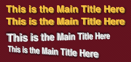
Remember the days when every home video had lousy 3D titles? Well, now you can have similar titles on your Website using CSS3. Excited? OK, here’s what I’m talking about (displayed in Safari):
Note: the last two titles have 3D perspective added using CSS3 3D transforms. At the moment that is only available on desktop Safari, iPhone and iPad. Also, at the moment only Webkit supports the text-stroke property.
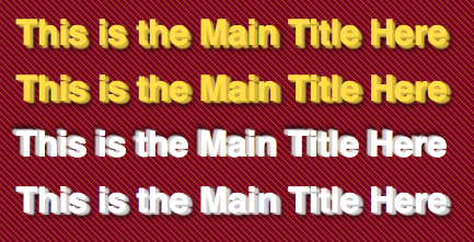
And here is how it looks in Firefox, Chrome and Opera:
So, the way way to make any text look extruded or 3D is to give the text a series of text shadows. We often use one or two text shadows combined to make text look embossed or beveled. But technically there is no limit to the number of text shadows you can add. The trick to to use a color with slightly more black in it than the font color. This will create the illusion of the side surface having a shadow and will make the face of the font more pronounced. Also, for those who get to enjoy Webkit browsers, you can add a text stroke using a slightly more saturated version of the font color. I usually use an RGBA value with an alpha opacity of 0.25 – 0.50.
So, you start with the first text shadow, say 1px 1px 1px. We done’ want to blur the shadow because we want to build up the depth of the font. The next value would be 2px 2px 1px and the third one 3px 3px 1px. You can extrude the font as much as you like, but don’t make it illegible. How much you extrude the text should depend on your font size. Here’s the style for the first title in the images above:
header > h1:first-of-type {
	text-align: center;
	color: #ffdc48;
	-webkit-text-stroke: 1px rgba(255,50,35,.25);
	text-shadow:
		1px 1px 1px #ceb23c,
		2px 2px 1px #ceb23c,
		3px 3px 1px #ceb23c,
		4px 4px 6px #000;
}
This creates a rather pronounced extrusion. If you want something more subtle, you can build out the extrusion more gradually as in the following example:
header > h1:nth-child(2) {
	text-align: center;
	color: #ffdc48;
	-webkit-text-stroke: 1px rgba(255,50,35,.25);
	text-shadow:
		1px 1px 1px #ceb23c,
		2px 1px 1px #ceb23c,
		3px 1px 1px #ceb23c,
		4px 2px 1px #ceb23c,
		4px 4px 6px #000;
}
Notice that the last value of each of the above text shadow definitions is to create a normal, blackish drop shadow. This adds some further depth to the text, making it appear more realistic.
You can try these out online or download the code to begin playing with your own 3d fonts.


You must be logged in to post a comment.