iPhone Style Tab Control with HTML, CSS and JavaScript


Works with Desktop Safari, Desktop Google Chrome, Desktop Firefox 4, Android, iPhone, iPod Touch and iPad.
Please not that this was originally designed for Android/iPhone/iPad use. It can be used on modern desktop browsers. Just note that the attached example will only work with Firefox 4 or later because it uses CSS3 transitions for navigation.

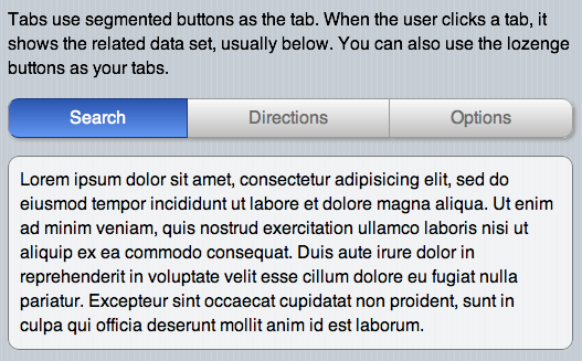
If you’ve used an iPhone or iPad, you’ve seen them. Actually, Apple uses them on the operating system. They even use them on their Website and online assets. As is usual for Apple, they take a very different approach to implementing tabs. They use segmented buttons to indicate tabs. This works especially well in the mobile space where you want the tab to stand out and be an easy target for a fat finger. It also eliminates all the futzing around to try to get all the border of tabs and tab panels to fit together properly. The panels have no borders, just their content. The segmented buttons capture your attentions as the device that toggles the content.

The interaction is simple and immediate. As soon as a user clicks or touches a segmented button, it reveals the new content below. On the iPhone, there are not even any special effects, not even a fade. It just directly switches out the data.

Let’s go over the markup for the tab control. Note that the class names it uses are important. By using standardized markup and classes, we can reuse the tab wherever we need it in our app, and initialize it with one line of JavaScript. The tab controls has two parts. The first is a div with the class “Tabs segmentedControlBase.” This is where the segmented buttons that hide and show the tab panels reside. Following this there is another div with the class “TabPanels,” with obviously holds the tab panels. Here’s the markup:

<div class="Tabs segmentedControlBase">
	<div class="button segmentedControl leftEnd tab"><span>Search</span></div>
	<div class="button segmentedControl tab"><span>Directions</span></div>
	<div class="button segmentedControl rightEnd tab"><span>Options</span></div>
</div>
<div class="TabPanels">
	<div class="tabPanel">
		<p class="rounded">Lorem ipsum dolor sit amet, consectetur adipisicing elit, sed do eiusmod tempor incididunt ut labore et dolore magna aliqua. Ut enim ad minim veniam, quis nostrud exercitation ullamco laboris nisi ut aliquip ex ea commodo consequat. Duis aute irure dolor in reprehenderit in voluptate velit esse cillum dolore eu fugiat nulla pariatur. Excepteur sint occaecat cupidatat non proident, sunt in culpa qui officia deserunt mollit anim id est laborum.</p>
	</div>
	<div class="tabPanel">
		<p class="rounded">Sed ut perspiciatis unde omnis iste natus error sit voluptatem accusantium doloremque laudantium, totam rem aperiam, eaque ipsa quae ab illo inventore veritatis et quasi architecto beatae vitae dicta sunt explicabo. Nemo enim ipsam voluptatem quia voluptas sit aspernatur aut odit aut fugit, sed quia consequuntur magni dolores eos qui ratione voluptatem sequi nesciunt.</p>
	</div>
	<div class="tabPanel">
		<p class="rounded">Neque porro quisquam est, qui dolorem ipsum quia dolor sit amet, consectetur, adipisci velit, sed quia non numquam eius modi tempora incidunt ut labore et dolore magnam aliquam quaerat voluptatem. Ut enim ad minima veniam, quis nostrum exercitationem ullam corporis suscipit laboriosam, nisi ut aliquid ex ea commodi consequatur?</p>
	</div>
</div>

As you can see, the markup is very straightforward and we can easily reuse the pattern through an application as necessary. Of course, this needs some styling so that it looks like something. The most visual part of the tab control is the set of segmented buttons which constitute the tabs. If you’re going to use these on a mobile phone, be aware the you can probably at maximum fit in four tabs. Two or three is optimal. If your tabs are cramped, hard to read or even hard to touch because there so many, you should probably rethink how you’re present your data. Maybe a drilldown menu would serve your purposes better. Realistically, the tab control is for a small number of data sets which you wish to present to the user.

Here’s the markup. Remember, the left and right ends of a segmented button set are normally rounded. They don’t have to be, but they definitely look more elegant that way. The button or buttons between the two ends are squared off.

.segmentedControlBase {
	display: -webkit-box;
	-webkit-box-orient: horizontal;
	-webkit-box-pack:justify;
	-webkit-box-sizing: border-box;
	display: -moz-box;
	-moz-box-orient: horizontal;
	-moz-box-pack:justify;
	-moz-box-sizing: border-box;
}
.button.segmentedControl {
	display: block;
	-webkit-box-flex: 1;
	-moz-box-flex: 1;
	border: solid 1px #9a9a99;
	border-left: none;
	-webkit-border-radius: 0px;
	-moz-border-radius: 0px;
	border-radius: 0px;
	text-align: center;
	background-image: 
		-webkit-gradient(linear, left top, left bottom, 
			from(#fbfbfb), 
			to(#bdbdbd));
	background-image: 
		-moz-linear-gradient(top, 
			#fbfbfb, 
			#bdbdbd);
	color: #6b6b6b;
	font-size: 16px;
	padding: 10px;
}
.button.segmentedControl:hover, .button.segmentedControl.hover, .button.segmentedControl.selected {
	background-image: 
		-webkit-gradient(linear, left top, left bottom, 
			from(#2a55b1), 
			to(#6297f2));
	background-image: 
		-moz-linear-gradient(top, 
			#2a55b1, 
			#6297f2);
	color: #fff;
	border-color: #193a7f;
}
.button.segmentedControl.leftEnd {
	-webkit-border-top-left-radius: 10px;
	-webkit-border-bottom-left-radius: 10px;
	-moz-border-radius-topleft: 10px;
	-moz-border-radius-bottomleft: 10px;
	border-top-left-radius: 10px;
	border-bottom-left-radius: 10px;
	border-left: solid 1px #9a9a99;
}
.button.segmentedControl.rightEnd {
	-webkit-border-top-right-radius: 10px;
	-webkit-border-bottom-right-radius: 10px;
	-webkit-border-top-right-radius: 10px;
	-webkit-border-bottom-right-radius: 10px;
	border-top-right-radius: 10px;
	border-bottom-right-radius: 10px;
}
/* Styles for Tab states */
.TabPanels .tabPanel {
	display: none;
}
.TabPanels .tabPanel.selected {
	display: block;
}
/* End Styles for Tab states */

This will give us a tab control that looks like this:

tabs

Now we’re going to create the JavaScript to make the tabs function. I’m going to use the ChocolateChip JavaScript framework because it’s tiny, just 12k, and does everything I need it to do in the mobile space. For those of you who would rather use jQuery, you should be able to replicate my control’s functionality fairly easily. If you don’t know jQuery good enough to do that, then maybe you want to give ChocolateChip a look. If you compare the two, you’ll see that ChocolateChip and jQuery code look very similar. The difference is that with ChocolateChip you’re always dealing with real JavaScript. ChocolateChip gives you some simple helpers to make it easier for you to write clean, maintainable and legible code. Yet everything ChocolateChip returns is normal JavaScript. With jQuery, you’re always dealing with an object wrapper and therefore have to do things the jQuery way. You cannot use normal JavaScript with what the jQuery returns.

Anyway, here’s the code that creates the tab:

/** 
* 
* A method to initialize a set of tabs using lozenge or segmented buttons to toggle data sets in a view. It takes one argument, a unique selector identifying the view or section where the tabs reside.
*
* @method
* 
* ### setupTabs
*
* syntax:
*
*  $.setupTabs(tabsSelector);
*
* arguments:
* 
*  - string: string A valid selector for the parent of the tab control.
* 
* example:
*
*  $.setupTabs("#buyerOptions");
*
*/
$.setupTabs = function( viewSelector ) {
	var tabsSelector = viewSelector + " .Tabs .tab";
	var panelsSelector = viewSelector + " .TabPanels .tabPanel";
	var tabs = $$(tabsSelector);
	var panels = $$(panelsSelector);
	
	tabs.forEach(function(tab) {
// Set the first tab and tab panel to the selected state automatically.
		tabs[0].addClass("selected");
		panels[0].addClass("selected");
		tab.bind("click", function() {
			var i = 0, len = tabs.length;
			var panelToHide = null;
			while(i < len) {
				tabs[i].removeClass("selected");
				panels[i].removeClass("selected");
				if (this == tabs[i]) {
					panelToHide = i;
				}
				i++
			}
			this.addClass("selected");
			panels[panelToHide].addClass("selected");
		});
		
		tab.bind("touchstart", function() {
			var i = 0, len = tabs.length;
			var panelToHide = null;
			while(i < len) {
				tabs[i].removeClass("selected");
				panels[i].removeClass("selected");
				if (this == tabs[i]) {
					panelToHide = i;
				}
				i++
			}
			this.addClass("selected");
			panels[panelToHide].addClass("selected");
		});
	});
};

If you look at the argument passed in, setupTabs expects a selector indicating the parent element that the tab control abides in. This can be the article tag, the section tag, or whatever you choose. I wouldn’t expect there to be more than one set of tabs in a particular view. If no selector is supplied, the script searches the entire document for the first occurrence of the tab control’s classes and initializes it. So, if you do have more than one tab control in your mobile app, you’ll need to pass in a selector indicating where it resides.

Since by default the tab control’s CSS sets the segmented buttons to unselected and the tab panels to hidden, the script does some initialization to select the first tab and show it’s tab panel. You don’t have to tell the script how many tabs there are or how many tab panels there are. It searches the markup and figures that out itself.

Now, its time to discuss the data in the tabs. How do you intend to get it in them? The simplest way is to do it on page load. If you have many tab controls, and your app is large, you might want to avoid that. In that case you code do something creative, such as binding an event listener to the transition effect of the view the first time the user navigates to it. You could use the webkitAnimationStart event to load your data with an Ajax call. You’d only want to do this the first time the user comes to the view, so you might want to use either a custom object or a value registered in the sessionStorage object to indicate that the user has visited the section already so you don’t need to reload the data.

You can see this tab control live, or download the code to pick it apart.

Update 9/1/10
What was I thinking? My bad. The two classes “leftEnd” and “rightEnd” are totally unnecessary. Using CSS3 selectors we can always target the first and last tabs using :first-of-type and :last-of-type. That way, you never have to worry about naming the first and last. Just put the tabs and the CSS will create the first and last. So the line:

.button.segmentedControl.leftEnd

should be:

.button.segmentedControl:first-of-type

and the line:

.button.segmentedControl.rightEnd

should be:

.button.segmentedControl:last-of-type

The online sample and downloadable code has been updated for this.
CSS3 Gradient Image Masks


Works on Desktop Safari, iPhone, iPod Touch, iPad.

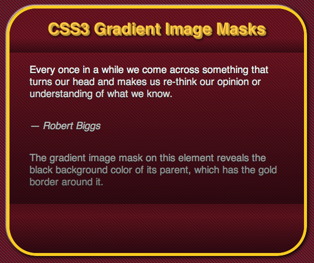
Besides using CSS3 gradients as background images, you can also use them as image masks. An image mask will reveal whatever is behind the element whose background it is applied to while simultaneously masking whatever is in its parent element. This affects both any background properties, colors, images or gradients, as well as the foreground content, whatever it may be. This allows for some interesting layered effects, but you do need to take care that your content gets masked by the mask. I’ll say that again, don’t let your content get masked by the mask. It can happen, so use masks sparingly and with care.

The notation for an image mask is fairly straightforward. First off, you can use an image, either a png or and svg graphics as a mask. The notation is like this:

-webkit-mask-box-image: url(image-mask.png) 75 stretch;

In this post we’re going to look at how to use CSS3 gradients to mask. So my little trick is to nest the element with the mask inside another element which has a background color, background image or background CSS3 gradient which the mask will reveal. In my first example I’m going to give the parent element a background color of #000 (black). The mask will therefore reveal that black to varying degrees added a patterned image burn effect to an otherwise flat foreground. So, here’s the styles for the parent:

article {
	width: 600px;
	height: 500px;
	margin: 40px auto;
	border: solid 6px gold;
	background: #000;
	border-radius: 60px;
	-moz-border-radius: 60px;
	-webkit-border-radius: 60px;
	-webkit-box-sizing: border-box;
	overflow: hidden;
	-webkit-background-clip: padding;
	box-shadow: 
		-2px -2px 2px rgba(255,255,255,.75), 
		2px 2px 10px #000;
	-webkit-box-shadow: 
		-2px -2px 2px rgba(255,255,255,.75), 
		2px 2px 10px #000;
	-moz-box-shadow: 
		-2px -2px 2px rgba(255,255,255,.75), 
		2px 2px 10px #000;
}

And its child element will get this style:

section { 
	-webkit-box-sizing: border-box;
	-moz-box-sizing: border-box;
	-o-box-sizing: border-box;
	-webkit-background-clip: padding;
	height: 100%;
	padding: 20px;
	border-radius: 54px;
	-moz-border-radius: 54px;
	-webkit-border-radius: 54px;
	background-color: #800023;
	background-image: 
		-webkit-gradient(linear, 100% 0%, 0% 100%, 
			color-stop(0.15, #8a3726),  
			color-stop(0.15, #800023), 
			color-stop(0.50, #800023), 
			color-stop(0.50, #8a3726), 
			color-stop(0.65, #8a3726),
			color-stop(0.65, #800023));
	-webkit-background-size: 6px 6px, 100% 20px;
	background-image: 
		-moz-linear-gradient(right top, 
			#8a3726,
			#8a3726 15%, 
			#800023 15%, 
			#800023 50%, 
			#8a3726 50%, 
			#8a3726 65%, 
			#800023 65%, 
			#800023);
	background-size: 6px 6px;
	-webkit-mask-image:
		-webkit-gradient(linear, left top, left bottom,
			color-stop(0.123, rgba(0,0,0,1)),
			color-stop(0.18, rgba(0,0,0,0.6)),
			color-stop(0.18, rgba(0,0,0,1)),
			color-stop(0.8, rgba(0,0,0,.5)),
			color-stop(0.8, rgba(0,0,0,0.8)),
			color-stop(0.85, rgba(0,0,0,.9)),
			color-stop(1, rgba(0,0,0,.5))); 
}

Notice in the code above the line beginning with “-webkit-mask-image.” What follows that property is a normal looking CSS3 gradient. Except that we’re using it as an image mask. Because we gave it no size or position, it will automatically stretch over the entire surface of the element. This is what the styles will produce:
CSS3 gradient image mask

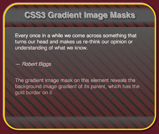
As you can see, the image mask reveals the black background color in the shape of the gradient image mask. Now if we want to get creative, we can put something more interesting in the parent element’s background, and image or a CSS gradient pattern. Here’s an example of a CSS3 background gradient pattern being revealed by a mask:
CSS3 gradient image mask

You can see the document live or download the file as you wish.

Extruded 3D Text Using CSS3 Text-Shadows


Works on desktop Safari, desktop Chrome, desktop Firefox, desktop Opera, Android, iPhone, iPad.

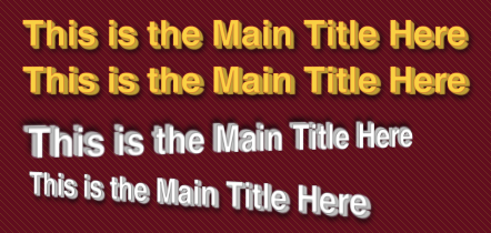
Remember the days when every home video had lousy 3D titles? Well, now you can have similar titles on your Website using CSS3. Excited? OK, here’s what I’m talking about (displayed in Safari):

3D Text Create with CSS3 Text Shadows

Note: the last two titles have 3D perspective added using CSS3 3D transforms. At the moment that is only available on desktop Safari, iPhone and iPad. Also, at the moment only Webkit supports the text-stroke property.

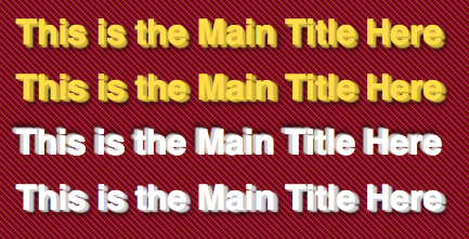
And here is how it looks in Firefox, Chrome and Opera:

3D Text Using CSS3 Text Shadows on Firefox

So, the way way to make any text look extruded or 3D is to give the text a series of text shadows. We often use one or two text shadows combined to make text look embossed or beveled. But technically there is no limit to the number of text shadows you can add. The trick to to use a color with slightly more black in it than the font color. This will create the illusion of the side surface having a shadow and will make the face of the font more pronounced. Also, for those who get to enjoy Webkit browsers, you can add a text stroke using a slightly more saturated version of the font color. I usually use an RGBA value with an alpha opacity of 0.25 – 0.50.

So, you start with the first text shadow, say 1px 1px 1px. We done’ want to blur the shadow because we want to build up the depth of the font. The next value would be 2px 2px 1px and the third one 3px 3px 1px. You can extrude the font as much as you like, but don’t make it illegible. How much you extrude the text should depend on your font size. Here’s the style for the first title in the images above:

header > h1:first-of-type {
	text-align: center;
	color: #ffdc48;
	-webkit-text-stroke: 1px rgba(255,50,35,.25);
	text-shadow: 
		1px 1px 1px #ceb23c, 
		2px 2px 1px #ceb23c, 
		3px 3px 1px #ceb23c, 
		4px 4px 6px #000;
}

This creates a rather pronounced extrusion. If you want something more subtle, you can build out the extrusion more gradually as in the following example:

header > h1:nth-child(2) {
	text-align: center;
	color: #ffdc48;
	-webkit-text-stroke: 1px rgba(255,50,35,.25);
	text-shadow: 
		1px 1px 1px #ceb23c, 
		2px 1px 1px #ceb23c, 
		3px 1px 1px #ceb23c, 
		4px 2px 1px #ceb23c, 
		4px 4px 6px #000;
}

Notice that the last value of each of the above text shadow definitions is to create a normal, blackish drop shadow. This adds some further depth to the text, making it appear more realistic.

You can try these out online or download the code to begin playing with your own 3d fonts.

CSS3 Progress Bar


Works in Desktop Safari, Desktop Chrome, Android, iPhone, iPad. Displays properly but does not animate in Firefox 3.5-4 because it lacks CSS3 keyframe animation.

Since CSS3 provides a way to create gradients, including striped repeating patterns, it is possible to create the barbershop striped progress bars used on Mac OS X. Using the technique described in a previous post about CSS3 striped gradient patterns, we can easily create a self-animated progress bar. To start with, the HTML5 markup is dead simple, just a div with a class:

<div class="progressBar"></div>

We’ll start off by giving the div some basic styling as the container for the gradient:

.progressBar {
	width: 300px;
	height: 15px;
	border: 1px solid #bfbfbf;
	margin: 40px auto;
	position: relative;
	-webkit-box-shadow: 0 2px 2px rgba(0,0,0,0.5);
	background-color: rgb(56,138,213);
}

This will result in:
progress bar base

This is the base upon which we will now proceed to lay various gradient patterns to create a progress bar. Luckily CSS3 provides a way to implement multiple backgrounds, so it is just a matter of creating and layering them correctly. We start with the first layer, consists of a repeating pattern of diagonal white stripes with transparent stripes between it. This will allow the background color to show through:

background-image:
	-webkit-gradient(linear, 18 0, 0 10,
		color-stop(0.23, rgba(255,255,255,0)),
		color-stop(0.3, rgba(255,255,255,0.8)),
		color-stop(0.3, rgba(255,255,255,1)),
		color-stop(0.7, rgba(255,255,255,1)),
		color-stop(0.7, rgba(255,255,255,0.8)),
		color-stop(0.77, rgba(255,255,255,0)));

This will give us:

progressbar with stripes

This is getting close to what we want, except that it’s very flat looking. We’ll add some more layers of gradients to add some depth. We’ll start with some shadows. To do this we’ll create a gradient with translucent black and the start and end with translucent white in the middle. This will make the progress bar appear to be cylindrical. Note that we set the background to repeat on the x axis and that we define a size for the repeating stripes using the background-size property:


.progressBar {
	width: 300px;
	height: 15px;
	border: 1px solid #ddd;
	border-bottom-color: #666;
	margin: 40px auto;
	position: relative;
	-webkit-box-shadow: 1px 1px 2px rgba(0,0,0,0.5);
	-moz-box-shadow: 1px 1px 2px rgba(0,0,0,0.5);
	box-shadow: 1px 1px 2px rgba(0,0,0,0.5);
	background-color: rgb(56,138,213);
	background-image:
		-webkit-gradient(linear, 18 0, 0 10,
			color-stop(0.23, rgba(255,255,255,0)),
			color-stop(0.3, rgba(255,255,255,0.8)),
			color-stop(0.3, rgba(255,255,255,1)),
			color-stop(0.7, rgba(255,255,255,1)),
			color-stop(0.7, rgba(255,255,255,0.8)),
			color-stop(0.77, rgba(255,255,255,0)))/,
		-webkit-gradient(linear, 0 0, 0 100%,
			color-stop(0.05, rgba(0,0,0,.3)),
			color-stop(0.06, rgba(255,255,255,.8)),
			color-stop(0.45, rgba(255,255,255,.05)),
			color-stop(0.55, rgba(0,0,0,.05)),
			color-stop(0.85, rgba(0,0,0,.2)),
			color-stop(0.98, rgba(0,0,0,.5)));
		background-repeat: repeat-x;
                -webkit-background-size: 20px 15px;

This gives us:

progress bar with shadow

We are going to give the progress bar one more gradient layer to add a highlight gloss to it. To do so we’ll create a white band across the top half with opacity set to 50%. So here’s the complete background image:


background-image:
	-webkit-gradient(linear, 18 0, 0 10,
		color-stop(0.23, rgba(255,255,255,0)),
		color-stop(0.3, rgba(255,255,255,0.8)),
		color-stop(0.3, rgba(255,255,255,1)),
		color-stop(0.7, rgba(255,255,255,1)),
		color-stop(0.7, rgba(255,255,255,0.8)),
		color-stop(0.77, rgba(255,255,255,0))),
	-webkit-gradient(linear, 0 0, 0 100%,
		color-stop(0.05, rgba(0,0,0,.3)),
		color-stop(0.06, rgba(255,255,255,.8)),
		color-stop(0.45, rgba(255,255,255,.05)),
		color-stop(0.55, rgba(0,0,0,.05)),
		color-stop(0.85, rgba(0,0,0,.2)),
		color-stop(0.98, rgba(0,0,0,.5))),
	-webkit-gradient(linear, 0 0, 0 100%,
		color-stop(0.25, transparent),
		color-stop(0.25, rgba(255,255,255,.5)),
		color-stop(0.47, rgba(255,255,255,.5)),
		color-stop(0.47, transparent));
        background-repeat: repeat-x;
	-webkit-background-size: 20px 15px;

And our final progress bar looks like this:

progress bar complete

Because it’s a progress bar, we want it to animate continuously while it’s displayed. This requires some initialization code in the CSS and two lines of CSS for the animation. Because we’ll animate the stripes on the progress bar across the length of it, we need to set the initial position of the background image, which will be 0. We define the animation to last ten seconds, to loop continuously, to use linear easing and to use an animation named “progressBarAnim.” We define the progressBarAnim using keyframes next:

-webkit-background-position-x: 0%;
-webkit-animation-duration: 10s;
-webkit-animation-iteration-count: infinite;
-webkit-animation-timing-function: linear;
-webkit-animation-name: progressBarAnim;

CSS3 keyframe animations have a start and end value. Unlike transitions, you can define whatever properties you with to at any point in the animation sequence. Because we are animate the progress bar’s stripes from one end to the other, the keyframe animation is very simple, we just need to animate the x position of the gradient from 0% to 100%. Because we set the iteration count to infinite, it will automatically loop back:


@-webkit-keyframes progressBarAnim {
	0% { background-position-x:  0%; }
	100% { background-position-x: 100%; }
}

You can see this in action on Safari, Chrome, Android, iPhone or iPad, or download the source files.

CSS3 Gradients and Patterns


Works in Desktop Safari, Google Chrome, Firefox, iPhone, Android, iPad
The ability to create CSS3 background gradients on any HTML element offers a lot of potential to create visually satisfying and engage experiences in the browser. But gradients are just about creating a 60s acid inspired rainbow of color. Because an HTML element can have multiple background images, you can do tricky things such as layering different gradients. If you use a background color and use rgba colors in your gradient stops, you can create some truly interesting effects. Oh, and there are also image masks. Using a gradient as an image mask allows you to add texture to an otherwise flat surface. You can think of CSS3 gradients and image masks like Photoshop layers in your browser. Right now the following browsers support CSS3 gradients: Firefox, Chrome, Safari, Android, iPhone, iPad.

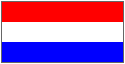
Having one giant gradient across an element is that exciting. But when you use the -webkit-background-size and -moz-background-size properties, you can creating interesting tiling patterns with your gradients. We start with a red, white and blue stripe gradient. This is a fairly straightforward pattern to create. It needs six color stops to create the stripes:

background-image:
	-webkit-gradient(linear, left top, left bottom,
		color-stop(.34, red),
		color-stop(.34, white),
		color-stop(.67, white),
		color-stop(.67, blue),
		color-stop(1, blue));

This will create a national flag filling the element.

Basic Red, White and Blue Pattern

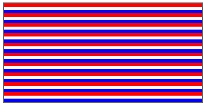
Nice start, but to get a pattern we need to define the background size. If you use a value of -webkit-background-size: 20px 20px;, we get the following pattern:
Horizontal Pattern

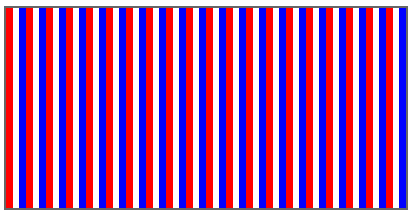
And by changing the orientation (-webkit-gradient(linear, left top, right top)), we get a vertical pattern:
Vertical Pattern

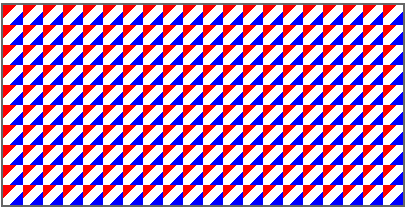
Now if we change the orientation to a diagonal(-webkit-gradient(linear, left top, right bottom), we get an interesting pattern:
Diagonal Pattern

If we reduce the background size down further (-webkit-background-size: 6px 6px), we get an subtler pattern:

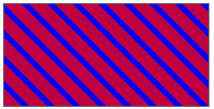
OK, this was all nice and good, but what about creating a diagonal pattern that fits together, like diagonal stripes? This takes a little planning. It isn’t an intuitive process to calculate the color stops to create diagonal repeating stripes that fit together seamlessly. Here’s the code. You can change the colors, or change the orientation, or use a background color and give the gradient colors transparency for some interesting effects:

background-color: #blue;
background-image: 
	-webkit-gradient(linear, 100% 0%, 0% 100%, 
	from(transparent), 
	color-stop(0.15, transparent),  
	color-stop(0.15, rgba(255,0,0,0.75)), 
	color-stop(0.50, rgba(255,0,0,0.75)), 
	color-stop(0.50, transparent), 
	color-stop(0.65, transparent),
	color-stop(0.65, rgba(255,0,0,0.75)),  
	to(rgba(255,0,0,0.75)));
	ffbackground-color: blue;
-webkit-background-size: 50px 50px;

This will give us:
Stripes

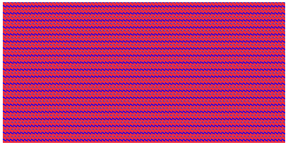
If we take this pattern and reduce its size to -webkit-background-size: 5px 5px, we get the following:

By changing the proportions of the background size (-webkit-background-size: 5px 10px), you can also create some interesting effects:
Pattern 10

So, take my patterns, play with the colors and background sizing and create your own patterns. You can try them out online, or download the source.

Update
I’ve updated code in the sample files to include the Mozilla gradient notation. This includes and update to work with the notation supported in the early betas of Firefox 4 (They’ve drop the -moz prefix off of the background-size property. CSS3 color gradients were first introduced by the Webkit team. After some time the Mozilla team began implement CSS gradients in Firefox as well. Then they came up with a simpler notation. Although the Webkit notation had already been submitted for standardization by the W3C, the Mozilla team pushed really hard to get their simpler notation accepted instead. They succeeded. The code below shows a Webkit gradient with its Mozilla equivalent.

.pattern-7 {
	background-image: 
		-webkit-gradient(linear, 100% 0%, 0% 100%, 
			color-stop(0.15, transparent),  
			color-stop(0.15, rgba(255,0,0,.5)), 
			color-stop(0.50, rgba(255,0,0,.5)), 
			color-stop(0.50, transparent), 
			color-stop(0.65, transparent),
			color-stop(0.65, rgba(255,0,0,.5)));
	background-image: 
		-moz-linear-gradient(left bottom, 
			transparent 15%, 
			rgba(255,0,0,.5) 15%, 
			rgba(255,0,0,.5) 50%, 
			transparent 50%, 
			transparent 65%, 
			rgba(255,0,0,.5) 65%);
	-webkit-background-size: 20px 10px;
	-moz-background-size: 20px 10px;
	background-size: 20px 10px;
}

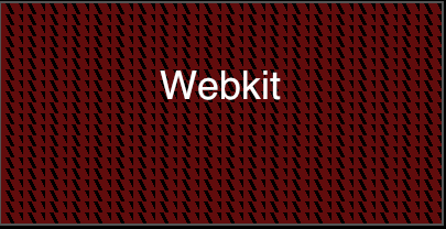
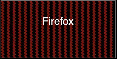
These are similar, but the patterns could not be reproduced identically with the two notation differences:
gradient-6-Webkitgradient-6-firefox

If you’ve already been using the Webkit notation to create gradients for desktop Safari, Chrome, iPhone, Android or iPad, you’ll notice how much easier it is to put together a basic gradient. That said, as you start to create more complicated repeating patterns, things start to get, well, more complicated. If you create a complex pattern first in Webkit and try to reproduce it Firefox, you may find that it is impossible, or the other way around. For simple gradients or the repeating stripe patterns, it’s fairly easy to create Fireox/Webkit versions. Both notations can do things that the other cannot. Hmmm… Remains me of the bad ole days of Netscape Navigator 4 and IE5: two completely different ways of doing DHTML.

If you’re target audience is Safari/Chrome, iPhone/iPad/Android, then you need to get comfortable with the Webkit notation. Although the W3C has ratified the Mozilla notation, which it’s huge installed base of users and developers already using the Webkit notation, it’s going to be around, well, until there isn’t a Webkit anymore. At some point I would expect the Webkit team to adopt the W3C recommended standard as well. When they do, I get a million dollars they’ll keep their own -webkit prefixed version of gradients around as well for backwards compatibility.

In conclusion, CSS3 gradients offer you a way to create rich graphical backgrounds that can be tweaked and update through a few CSS3 properties. Have a client that want to change the colors of some interface elements? Easy, open the CSS file. With CSS3 gradients you can create gradients that stretch across an entire page without having a gigantic image to download, just a few lines of CSS. Photoshop may have to go see a therapist due to not feeling needed as much anymore.

Introducing ChocolateChip – A Mobile JavaScript Framework

Desktop Safari, Desktop Chrome, Desktop Firefox, Desktop Opera, Desktop IE9, iPhone, iPad, Android.

After using practically every mobile Web framework out there, I finally threw in the towel and decided to create a JavaScript library for mobile that was light weight and fast and easy to use. To this end I would like to introduce you to ChocolateChip. It’s small, a little chip, and tasty like chocolate. Minified, it weights in at 8k. It’s syntax is similar to jQuery. Unlike jQuery and other libraries, nodes are not obfuscated by object wrappers. Everything is always normal JavaScript. No need to relearn how to write JavaScript according to a library. Write it the way it’s supposed to be written.

Because I’m not dealing with old or non-standard browsers and their quirks, I could concentrate on implementing only what was necessary and doing so optimally. ChocolateChip has a $ function, like jQuery, which returns the first instance of a node identified by a valid CSS3 selector. It also has a $$ function which returns an array of nodes matching the CSS3 selector. Most methods are attached directly to the base Element object. That means those methods are available to all nodes in a document, making it unnecessary to wrap the returned nodes in an object to provide extended functionality. This means that you can use normal JavaScript functions directly on the nodes. And the keyword “this” really is this. You don’t have to do $(this). The library allows you to chain load functions when the document finishes loading, or fire blocks of code when the document’s markup is ready for parsing.

Here is what ChococlateChip looks like in action:

$.ready(function() {
	$("#aboutDownButton").onclick = function() {
		$("#About").addClass("down");
	};
	$("#aboutUpButton").onclick = function() {
		$("#About").removeClass("down");
	};
	$$(".menuList li").forEach(function(item) {
		item.onclick = function() {
			$(navigation[navigation.length-1]).removeClass("current");
			$(navigation[navigation.length-1]).addClass("reverse");
			if (!$("#Home").hasClass("reverse")) {
				$("#Home").addClass("reverse");
			}
			$(this.getAttribute("rel")).addClass("current");
			navigation.push(this.getAttribute("rel"));
			hideURLbar(); 
		};
	}); 
	$$(".menuList li").forEach(function(item) {
                item.ontouchstart = function() {
		    this.addClass("hover");
                };
	});
	$$(".menuList li").forEach(function(item) {
                item.ontouchend = function() {
		    this.removeClass("hover");
                };
	});
	$$(".button.back").forEach(function(button) {
		button.onclick = function() {
			var parent = navigation[navigation.length-1];
			navigation.pop();
			$(navigation[navigation.length-1]).addClass("current");
			$(parent).removeClass("current");
			$(navigation[navigation.length-1]).removeClass("reverse");
			hideURLbar();
		};
	});
	$$(".button").forEach(function(button) {
		button.ontouchstart = function() {
			this.addClass("hover");
		};
	});
	$$(".button").forEach(function(button) {
		button.ontouchend = function() {
			this.removeClass("hover");
		}
	});
}); 

Update October 15, 2010
You can now learn about and download ChocolateChip from it’s own site: ChocolateChip-Mobile.net. The following paragraph refers to an early, developmental version.

Without further ado, here is ChocolateChip. Download the library with some samples. Remember, this is for mobile development on advanced devices like iPhone, iPad and Android, so on your desktop use a modern browser like Safari or Chrome, or test directly on an iPhone, iPad, or Android device.

Because the minified version is only 8k, you can include it in your document instead of as an external dependency. This means one less server hit to reduce latency and avoids the possibility of the library not being found and loaded.

One last thing, I’m sure some of you are scratching your heads wondering why I didn’t provide any namespacing to prevent collisions with the use of $ and $$ by other libraries. Well, that’s the point. Mobile is all about file size and memory constraints. You really shouldn’t be using ChocolateChip with any other library. They were not designed for mobile use, ChocolateChip was. You don’t need jQuery and its plugins, Prototype/Scriptaculous/ Dojo, YUI or any of the other big boys. Take a bite out of ChocolateChip and realize how good a developer’s life can be.

UPDATE: ChocolateChip 1.01 August 30, 2010
OK, I added in support for event binding using the methods “bind” and “unbind” and some basic initialization functions built in for forward and backward navigation. If you build out your Web app using my coding conventions, this will give you automatic forward and backward navigation without writing any code yourself. Here’s the uncompressed version with comments, and a minified version, which now weighs in at 12k. And here’s a sample document showing the new bind event in action.

UPDATE Oct 15, 2010: ChocolateChip now has it’s own blog
That’s right. ChocolateChip has it’s own blog with posts about how to use it. Learn how the little guy and help you get big stuff done. ChocolateChip will also soon have it’s own site dedicated to downloads of source code, controls, layouts and other goodies.
Visit ChocolateChip-Mobile.net and check out how 8k of JavaScript can help you create light weight mobile Web apps.