iPhone Buttons without Border Images

Works in Safari, Chrome, iPhone, iPad, Android

There are five frameworks for mobile Webkit Web app development: iUI, UiUIKit, iWebKit, jqTouch and Sencha. All of these frameworks provide a simple way to implement a common interface feature of the iPhone, the slightly translucent buttons used for implementing actions. By using the CSS3 border image property it becomes trivial to use a highly compact graphic as a border image to create the visual effect of a glossy, translucent button. It’s also economical because the images are single pieces. Here are the three main ones:

White Translucent ButtonBlack Translucent ButtonBlue Translucent Button

Using the CSS3 border image property, we can create fancy buttons that are dynamic. Here’s the necessary CSS:

.plasticButton {
	cursor: pointer;
	margin: 5px;	
	text-align: center;
	color: #ffffff;
	font: bold 16px/20px Helvetica, sans-serif;
	text-decoration: none;
	text-shadow: 1px 1px 1px #000;
	text-transform: capitalize;
	display: inline-block;
	font-size: 16px;
	border-width: 0 14px;
	padding: 12px 0px;
	min-width: 110px;
}
.plasticButton.white {
	color: #000;
	text-shadow: #fff 0px 1px 1px;
	-webkit-border-image: url(whiteButton.png) 0 14 0 14;
}
.plasticButton.gray {
	color: #fff;			
	text-shadow: #333 0px 1px 1px;
	-webkit-border-image: url(grayButton.png) 0 14 0 14;
}
.plasticButton:hover, .plasticButton.hover {
	color: #fff;
	text-shadow: #333 0px 1px 1px;
	-webkit-border-image: url(blueButton.png) 0 14 0 14;
}

This would give us buttons like these:
Example of translucent buttons using the border image property

Not too bad. Well, except for the images. What if we need to change the color of the buttons for a custom theme? These images are not easily modified in Photoshop. Without Apple releasing the original artwork for use by the general public, there is no way to fine tune them for different color schemes. Also, if you intend on using them in a Web app, you’ve got to include them in a cache.manifest, etc. After thinking about all the niggling aspects of buttons using border images, I started thinking about how I could reproduce their look using just the CSS3 features we have now. Here is what I came up with. All you need is a border-radius, a border, a gradient, a box-shadow and a text shadow:

.button.black {
	display: inline-block;
	-webkit-border-radius: 12px;
	-webkit-box-shadow: 2px 2px 3px #999; 
	border: solid 3px rgb(110,110,110);
	background-image: -webkit-gradient(linear, left top, left bottom, from(rgba(74,74,74,0.85)), color-stop(0.5, rgba(20,20,20,0.75)), color-stop(0.5, rgba(2,2,2,0.75)), to(rgba(14,14,14,0.75))); 
	color: #fff;
	text-shadow: #000 0 1px 0;
	font: bold 16px/20px Helvetica, Sans-serif;
	padding: 9px 11px;
}
.button.black:hover, .button.black.hover {
	background-image: -webkit-gradient(linear, left top, left bottom, from(rgba(135,148,203,0.85)), color-stop(0.5, rgba(34,56,159,0.75)), color-stop(0.5, rgba(0,27,145,0.75)), to(rgba(2,59,152,0.65)));  
	color: #fff;
	text-shadow: #000 0 1px 0;
	-webkit-box-shadow: inset rgba(207,207,255,0.75) 0px 1px 1px;
}

Because the gradients values use rbga colors with alpha values, they are slightly translucent. By changing the values of the gradient, you can easily create different colored buttons. I’ve upload a working example, and you can also download the code. Do so and play around with the values. I’ve included a number of different default colors: black, white, red, green, gold and blue. You can make other yourself.

CSS3 Page Flips

Works with Safari, iPhone, iPad.

In previous examples of page navigation we used various types of sliding effects to indicate to the use the transition from one section of a Web app to another. Now we’re going to look at how to indicate section transitions with various types of page flips. In order for these types of flips to work properly, we will need to enclose the items being rotated in a parent element that has the CSS3 property for transform style with a value of preserve-3d. We also need to define the perspective value. The higher the value, the further back from the element the viewer will be, reducing the perspective distortion. Similarly, the smaller the perspective value, the more pronounced the 3D effect will be. For something a little less pronounced I use a value of 1000, and for more pronounced: 500.

First we’re going to look at implementing a typical “card flip” effect. We’re going to implement this with the same basic layout that I created in earlier posts with backward and forwards navigation with a slide effect, except that the links will lead to pages with the various flips and rotations. So, the target of the menu items will contain a parent element, a div tag, which we’ll give a class of “card.” This will have the perspective values that will determine how the rotation looks with perspective distortion. Here’s the markup for the first section. The other section have the same markup, but a different identifier to allow for unique transforms on each section. One thing to bear in mind when implenting these types of transforms, the background of the body tag will show as the elements transition. So, you should make transforms elements’ backgrounds visually different from the background of your body tag so that you can see the elements as they are rotated easier.

<article id="Flip">
	<section class="card">
		<div class="face front">
			 <header>
				 <span class="button back"><span></span>Back</span>
				 <h1>Flip Page Over</h1>
				 <span  id="flipOverButton" class="button">Flip Over</span>
			 </header>
			 <div class="paddingWrapper">
				 <h2>This is the front</h2>
				 <p>Lorem ipsum dolor sit amet, consectetur adipisicing elit, sed do eiusmod tempor incididunt ut labore et dolore magna aliqua. Ut enim ad minim veniam, quis nostrud exercitation ullamco laboris nisi ut aliquip ex ea commodo consequat. Duis aute irure dolor in reprehenderit in voluptate velit esse cillum dolore eu fugiat nulla pariatur. Excepteur sint occaecat cupidatat non proident, sunt in culpa qui officia deserunt mollit anim id est laborum.</p>
		 </div>
		</div>
		<div class="face back">
			<header>
				<h1>Flip Page Over</h1>
				<span  id="flipBackButton" class="button">Flip Back</span>
			</header>
			<div class="paddingWrapper">
				<h2>This is the back</h2>
				<p>Lorem ipsum dolor sit amet, consectetur adipisicing elit, sed do eiusmod tempor incididunt ut labore et dolore magna aliqua. Ut enim ad minim veniam, quis nostrud exercitation ullamco laboris nisi ut aliquip ex ea commodo consequat. Duis aute irure dolor in reprehenderit in voluptate velit esse cillum dolore eu fugiat nulla pariatur. Excepteur sint occaecat cupidatat non proident, sunt in culpa qui officia deserunt mollit anim id est laborum.</p>
			</div>
		</div>
	</section>
</article>

Here’s the CSS we need to get the rotation flip to work:

#Flip {
	-webkit-perspective: 1000;
	position: absolute;
}
article .card {
	min-height: 100%;
	width: 100%;
	position: absolute;
}
.face {
	position: absolute;
	width: 100%;
	height: 100%;
	text-align: center;
	-webkit-backface-visibility: hidden;
	-webkit-transform-style: preserve-3d;
	-webkit-transition: all .5s ease-in-out;
}
#Flip .face.front {
	-webkit-transform: rotateY(0deg);
	background-color: #fffccf;
}
#Flip .face.back {
	-webkit-transform: rotateY(180deg);
	-webkit-box-sizing: border-box;
	background-color: rgba(0,0,0,0.125);
}
#Flip .face.front.flip  {
	-webkit-transform: rotateY(-180deg);	
}
#Flip .face.back.flip {
	-webkit-transform: rotateY(0deg);	
}

We define the perspective property -webkit-perspective: 1000 on the article tag with an id of #Flip. Then we set the initial rotation status of the two divs. For the frontmost div we give it a rotation of 0 degrees, and for the back one, a rotation of 180. We also give the div with the “face” class a CSS3 property to hide its rear side so that it doesn’t show when we rotate it: -webkit-backface-visibility: hidden;. Now, to initiate the flip effect all we have to do is use a little JavaScript to add and remove the “flip” class to the two elements.

Now let’s look at how to implement another flip effect that resembles a left page turn. This is basically the same as the card flip described above, except that we’re going to define the start position of the transform. By default the start position is at the center of the element’s y axis. We’re going to use -webkit-transform-origin: 0% 0%; If we used a value of -webkit-transform-origin: 100% 0%; the result would resemble doors swinging open and closed. Here’s the complete list of styles for the left page turn effect. Notice that we’ve decreased the perspective on the “card” class to 500:

#TurnLeft .card {
	height: 100%;
	-webkit-perspective: 500;
}
#TurnLeft {
	height: 100%;
	background: #cbd2d8;background-image: -webkit-gradient(linear, left top, right top, from(#c5ccd4), color-stop(0.75, #c5ccd4), color-stop(0.75, transparent), to(transparent)); 
	-webkit-background-size: 6px 100%;
}
#TurnLeft .face {
	position: absolute;
	width: 100%;
	height: 100%;
	-webkit-backface-visibility: hidden;
	-webkit-transform-style: preserve-3d;
	-webkit-transition: all .5s ease-in;
	-webkit-box-sizing: border-box
	text-align: center;
}
#TurnLeft .face.front {
	background-color: #fffccf;
	background-image: -webkit-gradient(linear, left top, right top, from(rgba(197, 204, 212, 0.5)), color-stop(0.75, rgba(197, 204, 212, 0.5)), color-stop(0.75, transparent), to(transparent)); 
	-webkit-background-size: 5px 100%;
	-moz-background-size: 7px 100%;
	-webkit-transform-origin: 0% 0%;
	-webkit-transform: rotateY(0deg);
}
#TurnLeft .face.back {
	-webkit-transform: rotateY(180deg);
	-webkit-box-sizing: border-box;
	background-color: rgba(122,137,212,0.25);
	-webkit-transform-origin: 0% 0%;
}
#TurnLeft .face.front.turnLeft  {
	-webkit-transform: rotateY(-180deg);	
}
#TurnLeft .face.back.turnLeft {
	-webkit-transform: rotateY(0deg);	
}

So, once again we can trigger the turn page left effect by adding and removing the “turnLeft” class to the necessary elements.

Lastly, we’ll look at how to do a swing back and down effect. Notice that we’re not rotating on the y-axis but on the x-axis. This causes the elements to rotate on their x-axis:


#SwingBack .card {
	min-height: 100%;
	-webkit-perspective: 500;
}
#SwingBack {
	height: 100%;
	background: #cbd2d8;background-image: -webkit-gradient(linear, left top, right top, from(#c5ccd4), color-stop(0.75, #c5ccd4), color-stop(0.75, transparent), to(transparent)); 
	-webkit-background-size: 6px 100%;
}
#SwingBack .face {
	position: absolute;
	width: 100%;
	height: 100%;
	-webkit-backface-visibility: hidden;
	text-align: center;
	-webkit-transform-style: preserve-3d;
	-webkit-transition: all .5s ease-in-out;
	-webkit-box-sizing: border-box
}
#SwingBack .face.front {
	background-color: #fffccf;
	background-image: -webkit-gradient(linear, left top, right top, from(rgba(197, 204, 212, 0.5)), color-stop(0.75, rgba(197, 204, 212, 0.5)), color-stop(0.75, transparent), to(transparent)); 
	-webkit-background-size: 5px 100%;
	-moz-background-size: 7px 100%;
	-webkit-transform-origin: 0% 0%;
	-webkit-transform: rotateX(0deg);
}

#SwingBack .face.back {
	background-color: #fffccf;
	background-image: -webkit-gradient(linear, left top, right top, from(rgba(197, 204, 212, 0.5)), color-stop(0.75, rgba(197, 204, 212, 0.5)), color-stop(0.75, transparent), to(transparent)); 
	-webkit-background-size: 5px 100%;
	-moz-background-size: 7px 100%;
	-webkit-transform: rotateX(180deg);
	-webkit-box-sizing: border-box;
	-webkit-transform-origin: 0% 100%;
}
#SwingBack .face.front.swingBack  {
	-webkit-transform: rotateX(-180deg);	
}
#SwingBack .face.back.swingBack {
	-webkit-transform: rotateX(0deg);	
}

And here’s a working example online, or you can download the source. Enjoy.

iPad Style Split Layout with Flexible Box Model

Works in Safari, Firefox, Chrome, iPhone, iPad, Android

In a previous post we looked at how CSS3’s flexible box model allowed us to create horizontal alignment of elements. There are several other features in the flexible box model that allow us to create layouts that would require complicated CSS hacks or JavaScript: equal height columns. You know the kind of layout I’m talking about. A header with several columns of material and a footer. You want the columns to always be the same height. You can use a table, but that can introduce a certain nasty kudginess to what you’re trying to achieve. Or you could use background images with nested divs, which is another type of kludginess. Or you could use some JavaScript, which introduces another type of kludginess.

With the flexible box model you can accomplish the equal height columns with a few CSS3 properties. What we’re going to do is show how to put together a typical split-level iPad layout with equal height sections. Here’s what we’re shooting for:
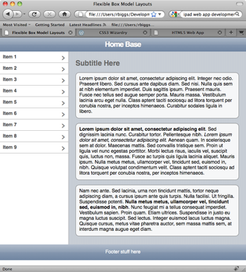
Example Layout with Equal Height Columns using CSS3 Flexible Box Model

To create the layout in this image, we’ll use the following markup:

<!DOCTYPE HTML>
<html lang="en">
<head>
	<meta charset="utf-8">
	<meta name="viewport" content="width=device-width; height=device-height; initial-scale=1.0, maximum-scale=1.0, user-scalable=0;">
	<meta name="apple-mobile-web-app-capable" content="yes">
	<title>Flexible Box Model Layouts</title>
	<style type="text/css">
	</style>
</head>
<body>
<article>
	<header>
		<h1>Home Base</h1>
	</header>
	<section>
		<aside>
			<nav>
				<ul>
					<li><a href="#">Item 1</a></li>
					<li><a href="#">Item 2</a></li>
					<li><a href="#">Item 3</a></li>
					<li><a href="#">Item 4</a></li>
					<li><a href="#">Item 5</a></li>
					<li><a href="#">Item 6</a></li>
					<li><a href="#">Item 7</a></li>
					<li><a href="#">Item 8</a></li>
					<li><a href="#">Item 9</a></li>
				</ul>
			</nav>
		</aside>
		<section>
			<h2>Subtitle Here</h2>
			<p>Lorem ipsum dolor sit amet, consectetur adipiscing elit. Integer nec odio. Praesent libero. Sed cursus ante dapibus diam. Sed nisi. Nulla quis sem at nibh elementum imperdiet. Duis sagittis ipsum. Praesent mauris. Fusce nec tellus sed augue semper porta. Mauris massa. Vestibulum lacinia arcu eget nulla. Class aptent taciti sociosqu ad litora torquent per conubia nostra, per inceptos himenaeos. Curabitur sodales ligula in libero. </p>

			<p><b>Lorem ipsum dolor sit amet, consectetur adipiscing elit</b>. Sed dignissim lacinia nunc. Curabitur tortor. Pellentesque nibh. <i>Lorem ipsum dolor sit amet, consectetur adipiscing elit</i>. Aenean quam. In scelerisque sem at dolor. Maecenas mattis. Sed convallis tristique sem. Proin ut ligula vel nunc egestas porttitor. Morbi lectus risus, iaculis vel, suscipit quis, luctus non, massa. Fusce ac turpis quis ligula lacinia aliquet. Mauris ipsum. Nulla metus metus, ullamcorper vel, tincidunt sed, euismod in, nibh. Quisque volutpat condimentum velit. Class aptent taciti sociosqu ad litora torquent per conubia nostra, per inceptos himenaeos. </p>
			
			<p>Nam nec ante. Sed lacinia, urna non tincidunt mattis, tortor neque adipiscing diam, a cursus ipsum ante quis turpis. Nulla facilisi. Ut fringilla. Suspendisse potenti. <b>Nulla metus metus, ullamcorper vel, tincidunt sed, euismod in, nibh</b>. Nunc feugiat mi a tellus consequat imperdiet. Vestibulum sapien. Proin quam. Etiam ultrices. Suspendisse in justo eu magna luctus suscipit. Sed lectus. Integer euismod lacus luctus magna. Quisque cursus, metus vitae pharetra auctor, sem massa mattis sem, at interdum magna augue eget diam. </p>
		</<span class="hiddenGrammarError" pre=""><span class="hiddenGrammarError" pre="">section>
	</section</span></span>>
	<footer>
		<p>Footer stuff here</p>
	</footer>
</article>
</body>
</html>

If you load this markup in a browser, it’ll be pretty plain. Let’s add some basic styling for the header, footer, list menu, etc. First we’ll get rid of the defaults for the body and list elements.

html, body {
	margin: 0px;
	padding: 0px;
	font: normal 14px/16px Helvetica, Sans-serif;
}
ul, li {
	list-style: none;
	padding: 0px;
	margin: 0px;
}

Next, for Firefox, we need to indicate that the HTML5 tags are block elements. The latest versions of Webkit in Safari, iPhone and iPad already recognize these tags and display them properly.

/* for Firefox */
article, header, section, nav, aside, footer {
	display: block;
}
/* end Firefox */

Now we need to add the styles to give are markup a more polished look. We’re going to add CSS3 background gradients, rgba color and border radius:

section > section {
	padding: 10px 20px;
	background-color: #cbd2d8;
	background-image: -webkit-gradient(linear, left top, right top, from(#c5ccd4), color-stop(0.75, #c5ccd4), color-stop(0.75, transparent), to(transparent)); 
	background-image: -moz-linear-gradient(left, #c5ccd4, #c5ccd4 75%, transparent 75%, transparent);
	-webkit-background-size: 5px 100%;
	-moz-background-size: 5px 100%;
}
header {
	background-color: #b0bccd;
	background-image: -webkit-gradient(linear, left top, left bottom, 
		from(#b0bccd), 
		color-stop(0.5, #889bb3), 
		color-stop(0.5, #8195af), 
		to(#6d84a2));
	background-image: -moz-linear-gradient(top, #b0bccd, #889bb3 50%, #8195af 50%, #6d84a2); 
	padding: 10px 10px;
}
header h1 {
	text-align: center;
	font: bold 21px/21px Helvetica, Arial, Sans-serif;
	letter-spacing: -1px;
	text-shadow: 0px -1px 0px rgba(0, 0, 0, 0.5);
	color: #fff;
	margin: 0px;
}
footer {
	background-color: #b0bccd;
	background-image: -webkit-gradient(linear, left top, left bottom, 
		from(#b0bccd), 
		color-stop(0.5, #889bb3), 
		color-stop(0.5, #8195af), 
		to(#6d84a2));
	background-image: -moz-linear-gradient(top, #b0bccd, #889bb3 50%, #8195af 50%, #6d84a2); 
	padding: 1px 0px;
	text-align: center;
	color: #fff;
}
nav li > a {
	text-decoration: none;
	display: block;
	padding: 8px 10px;
}
nav li > a {
	cursor: pointer;
	padding: 8px;
	border-bottom: 1px solid #acacac;
	background-color: #fff;
	font-weight: bold;
	color: rgba(0,0,0,.75);
}
nav li > a:after {
	content: "›";
	font: normal 28px/28px Verdana;
	color: rgba(0,0,0,.5);
	display: block;
	float: right;
	margin-top: -6px;
}
nav li > a:hover {
	background-image: -moz-linear-gradient(top, #4286f5, #194fdb);
	background-image: -webkit-gradient(linear, left top, left bottom, from(#4286f5), to(#194fdb));
	color: #fff;
}
nav li > a:hover:after {
	color: #fff;
}
h2 {
	color: #666;
	text-shadow: 0px -1px 1px #fff;
}
section > p {
	-webkit-border-radius: 10px;
	-moz-border-radius: 10px;
	background-color: rgba(255,255,255,0.85);
	border: solid 1px rgba(0,0,0,0.5);
	padding: 10px;
}

This gives us a layout that looks like this:
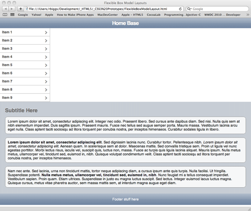
Style Layout Without Flexible Box Model Applied

This doesn’t look too bad, except that we want to the list to be on the left, and the content to be on the right. Normally, to achieve that we would need to put the content section before the list and float it right and then float the list left. Then we’d need to clear that float on the footer. That would work visually, except that neither the list nor the content would know about the other’s height. Or we could use relative and absolute position, and basically have the same problem. Or we could use CSS3’s flexible box model and have no problems at all, well, unless you really, really need to support IE, any version. You could use this for the god browsers and use conditional comments to give IE some crappy float arrangement. Honestly, I would to that to IE without thinking about it.

So, if you look at the document markup, we have an article tag with a header tag, section tag and footer tag as its children. The section tag has and aside tag and another section tag as its children. To make those work they way we want we need to give the parent section tag some flex power:

article > section {
	display: -webkit-box;
	-webikit-box-orient: horizontal;
	-webkit-box-align: stretch;
	display: -moz-box;
	-moz-box-orient: horizontal;
	-moz-box-align: stretch;
	-moz-box-lines: multiple;
}

This will give us cause the aside and section tags to align horizontally in their parent and each will have the same height. However in both Webkit and Firefox they both have some other issues with understanding how to deal with the long, wrapping content in the section tag.

Equal Height Columns in Firefox with Width Adjustment ProblemsEqual Height Columns in Safari with Width Adjustment Problems

To fix the problem with the browsers not knowing how to handle the wrapping content we just need to add a flexible box value to the section tag with the content:

section > section {
	-webkit-box-flex: 1;
	-moz-box-flex: 1;
}

What this does is tell the browser that the child section tag’s width should be whatever space is left over from that occupied by the aside tag, it’s sibling in the same container. Since the aside has a defined width of 200 pixels, the browser will give the rest to the section tag. Suddenly our layout is looking and acting the way you’d expect. It will even expanding dynamically as you resize the browser window.

You can try it out live or download the source.