Making an iPhone Switch Control without Images

Works on desktop Safari, Chrome and Firefox, iPhone, iPod Touch and iPad.

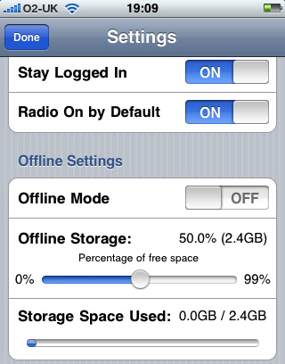
On the iPhone and iPad, Apple uses a control called switch. It’s actually a different take on the checkbox. Like radio buttons, checkboxes do not lend themselves to touch interfaces, especially guys with fat fingers, cough! Instead of making us suffer with those dinky checkboxes, Apple uses a more visual cue to what the user is actually doing, switching something on or off. As a matter of fact, that’s exactly how the control is labeled: “on” or “off”. They’re really easy to use, just swipe your finger to throw the switch, done. In case you’re not sure what I’m talking about, here they are:

switch control

OK, so all the mobile Web frameworks have a switch control. And I hate them all. They either do an instant switch between the on and off state, using an image sprite, or they do this really lame thing where they animate the horizontal background position of the image on a checkbox with its default styles removed. None of those implementations feels the same as when you swipe the switch control in a native iOS app.

So what am I going to do? I tell you, I’m going to throw the friggin’ image out and build the whole control from scratch using just HTML, CSS3 and some JavaScript to make it work. Bada-bing! To start with, here’s the basic markup for a checkbox:

<div class="checkbox unchecked" id="sleepSwitch">
	<div class="on">ON</div>
	<div class="thumb"><span></span></div>
	<div class="off">OFF</div>
	<input type="checkbox" value="ZZZZZZZZ!" offvalue="But, I need more sleep!">
</div>

As we did when we created iPhone style radios buttons, we’re using real checkboxes in our iPhone switch controls. And like in the radio button example, we’ll set the checkbox input’s display value to “none”. We’ll use CSS3 properties to style the markup to look like a real iOS switch control and we’ll attach event listeners to set the input checkbox’s check state to true or false, depending on whether we want it to be selected or not.

To create this switch control we’ll need to style the frame named “checkbox” with rounded corners. Notice that the markup above contains three parts: the on state, the thumb and the off state. The rounded frame will only be wide enough to show one state plus the thumb. Using CSS3 transitions and transforms, a click or touch will cause the three elements to side back and forth within the rounded frame. For positioning the switch’s elements and sliding them back and forth we’re going to use CSS3 3d transforms on the x axis. Here is the CSS to make this happen:

/* Checkbox */
.checkbox {
	display: -webkit-box;
	-webkit-box-orient: horizontal;
	-webkit-box-pack:justify;
	-webkit-box-sizing: border-box;
	-webkit-tap-highlight-color: transparent;
	width: 94px;
	overflow: hidden;
	-webkit-border-radius: 6px;
	text-align: center;
	line-height: 28px;
	cursor: pointer;
	-webkit-user-select: none;
	position: absolute;
	right: 10px;
	top: 7px;
}
.checkbox > input[type="checkbox"] {
	display: none;
}
.checkbox .thumb {
	-webkit-border-radius: 7px;
	position: relative;
	z-index: 3;
	border: solid 1px #919191;
	-webkit-transition: all 0.125s  ease-in-out;
	-webkit-transform: translate3d(0px,0%,0%);
}
.checkbox .thumb span {
	display: block;
	-webkit-box-sizing: border-box;
	height: 25px;
	width: 38px;
	border-top: solid 1px #efefef;
	-webkit-border-radius: 6px;
	background-image: -webkit-gradient(linear, left top, left bottom, from(#cecece), to(#fbfbfb));
	border-top: solid 1px #efefef;
	position:relative;
}
.checkbox .on {
	color: #fff;
	background-image: 
		-webkit-gradient(linear, left top, left bottom, 
			from(#295ab2), 
			to(#76adfc));
	width: 54px;
	padding-right: 4px;
	border: solid 1px #093889;
	-webkit-border-top-left-radius: 6px;
	-webkit-border-bottom-left-radius: 6px;
	margin-right: -6px;
	height: 25px;
	-webkit-transition: all 0.125s  ease-in-out;
	position: relative;
	-webkit-transform: translate3d(0px,0%,0%);
}
.checkbox .off {
	color: #666;
	background-image: -webkit-gradient(linear, left top, left bottom, from(#b5b5b5), color-stop(0.50, #fff));
	width: 54px;
	padding-left: 4px;
	border: solid 1px #a1a1a1;
	-webkit-border-top-right-radius: 6px;
	-webkit-border-bottom-right-radius: 6px;
	margin-left: -6px;
	height: 25px;
	-webkit-transition: all 0.125s  ease-in-out;
	position: relative;
	-webkit-transform: translate3d(-54px,0%,0%);
}
.checkbox.unchecked .thumb {
	-webkit-transform: translate3d(-54px,0%,0%);
}
.checkbox.checked .thumb {
	-webkit-transform: translate3d(0px,0%,0%);
}
.checkbox.unchecked .on {
	-webkit-transform: translate3d(-60px,0%,0%);
}
.checkbox.checked .on {
	-webkit-transform: translate3d(0px,0%,0%);
}
.checkbox.unchecked .off {
	-webkit-transform: translate3d(-54px,0%,0%);
}
.checkbox.checked .off {
	-webkit-transform: translate3d(6px,0%,0%);
}
/* For Very Important changes, use the orange checkbox */
.checkboxBase.important .on {
	border: solid 1px #d87100;
	background-image: -webkit-gradient(linear, left top, left bottom, from(#e75f00), color-stop(.5, #ff9c12));
}
/* End Checkbox */

To make the switch more realistic, I’m transforming all three pieces of the switch at the same time. This gives the switch a more realistic feeling. Notice the comment in at the end of the above CSS about the important class. You can use this to indicate a switch that makes a very important change. This class changes the default switch’s blue color to bright orange. This is the color Apple uses to show that a switch’s action is very important.

Having the CSS defined for the look and animation brings us close to the finished control, but we need to write some JavaScript to make the switch interactive. The JavaScript needs to do two things: toggle the classes “checked” and “unchecked” on the switch, and toggle the checked value of the checkbox between true and false. I’m using the ChocolateChip JavaScript framework to do this. You can switch my code to whatever library you want. If you know basic JavaScript, it shouldn’t be hard. Here’s the JavaScript to make it happen:

Element.prototype.toggleSwitch = function() {
	if (this.hasClass("switch")) {
		if (this.last().checked === true) {
			this.last().checked = false;
			this.toggleClass("checked", "unchecked");
		} else {
			this.last().checked = true;
			this.toggleClass("checked", "unchecked");
		}
	} else {
		return false;
	}
};

The last() used in the code above is a ChocolateChip method to return the last child of the control, which happens to be the checkbox input. That way we can set its checked state to true or false.

Now that we have the code to setup up the switch control, we can make it work as follows:

$(".switch").forEach(function(checkbox) {
	checkbox.bind("click", function() {
		this.toggleSwitch();
	});
	
	checkbox.bind("touchstart", function(e) {
		e.preventDefault();
		this.toggleSwitch();
	});
}); 

That’s it to make the switch switchable. But to make it do something you’d need a bit more as well. In my example, I’m getting some values from the switch and outputting it to a response field like this:

$(".switch").forEach(function(checkbox) {
	checkbox.bind("click", function() {
		if (this.last().checked === true) {
			$("#switchResponse").fill(
				this.last().getAttribute("value"));
		} else {
			$("#switchResponse").fill(
				this.last().getAttribute("offvalue"));
		} 
	});
	
	checkbox.bind("touchstart", function(e) {
		if (this.last().checked === true) {
			$("#switchResponse").fill(
				this.last().getAttribute("value"));
		} else {
			$("#switchResponse").fill(
				this.last().getAttribute("offvalue"));
		}
	});
}); 

You can try this out online or download the source code.
iPad Style Split Layout with Flexible Box Model

Works in Safari, Firefox, Chrome, iPhone, iPad, Android

In a previous post we looked at how CSS3’s flexible box model allowed us to create horizontal alignment of elements. There are several other features in the flexible box model that allow us to create layouts that would require complicated CSS hacks or JavaScript: equal height columns. You know the kind of layout I’m talking about. A header with several columns of material and a footer. You want the columns to always be the same height. You can use a table, but that can introduce a certain nasty kudginess to what you’re trying to achieve. Or you could use background images with nested divs, which is another type of kludginess. Or you could use some JavaScript, which introduces another type of kludginess.

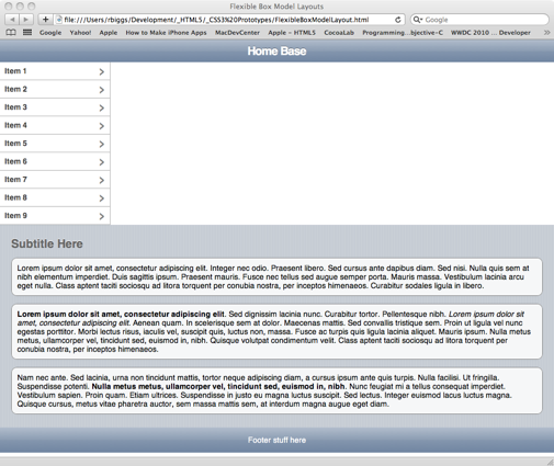
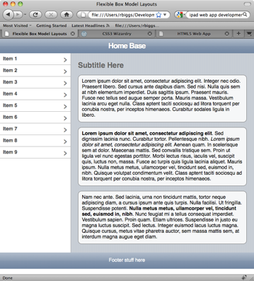
With the flexible box model you can accomplish the equal height columns with a few CSS3 properties. What we’re going to do is show how to put together a typical split-level iPad layout with equal height sections. Here’s what we’re shooting for:
Example Layout with Equal Height Columns using CSS3 Flexible Box Model

To create the layout in this image, we’ll use the following markup:

<!DOCTYPE HTML>
<html lang="en">
<head>
	<meta charset="utf-8">
	<meta name="viewport" content="width=device-width; height=device-height; initial-scale=1.0, maximum-scale=1.0, user-scalable=0;">
	<meta name="apple-mobile-web-app-capable" content="yes">
	<title>Flexible Box Model Layouts</title>
	<style type="text/css">
	</style>
</head>
<body>
<article>
	<header>
		<h1>Home Base</h1>
	</header>
	<section>
		<aside>
			<nav>
				<ul>
					<li><a href="#">Item 1</a></li>
					<li><a href="#">Item 2</a></li>
					<li><a href="#">Item 3</a></li>
					<li><a href="#">Item 4</a></li>
					<li><a href="#">Item 5</a></li>
					<li><a href="#">Item 6</a></li>
					<li><a href="#">Item 7</a></li>
					<li><a href="#">Item 8</a></li>
					<li><a href="#">Item 9</a></li>
				</ul>
			</nav>
		</aside>
		<section>
			<h2>Subtitle Here</h2>
			<p>Lorem ipsum dolor sit amet, consectetur adipiscing elit. Integer nec odio. Praesent libero. Sed cursus ante dapibus diam. Sed nisi. Nulla quis sem at nibh elementum imperdiet. Duis sagittis ipsum. Praesent mauris. Fusce nec tellus sed augue semper porta. Mauris massa. Vestibulum lacinia arcu eget nulla. Class aptent taciti sociosqu ad litora torquent per conubia nostra, per inceptos himenaeos. Curabitur sodales ligula in libero. </p>

			<p><b>Lorem ipsum dolor sit amet, consectetur adipiscing elit</b>. Sed dignissim lacinia nunc. Curabitur tortor. Pellentesque nibh. <i>Lorem ipsum dolor sit amet, consectetur adipiscing elit</i>. Aenean quam. In scelerisque sem at dolor. Maecenas mattis. Sed convallis tristique sem. Proin ut ligula vel nunc egestas porttitor. Morbi lectus risus, iaculis vel, suscipit quis, luctus non, massa. Fusce ac turpis quis ligula lacinia aliquet. Mauris ipsum. Nulla metus metus, ullamcorper vel, tincidunt sed, euismod in, nibh. Quisque volutpat condimentum velit. Class aptent taciti sociosqu ad litora torquent per conubia nostra, per inceptos himenaeos. </p>
			
			<p>Nam nec ante. Sed lacinia, urna non tincidunt mattis, tortor neque adipiscing diam, a cursus ipsum ante quis turpis. Nulla facilisi. Ut fringilla. Suspendisse potenti. <b>Nulla metus metus, ullamcorper vel, tincidunt sed, euismod in, nibh</b>. Nunc feugiat mi a tellus consequat imperdiet. Vestibulum sapien. Proin quam. Etiam ultrices. Suspendisse in justo eu magna luctus suscipit. Sed lectus. Integer euismod lacus luctus magna. Quisque cursus, metus vitae pharetra auctor, sem massa mattis sem, at interdum magna augue eget diam. </p>
		</<span class="hiddenGrammarError" pre=""><span class="hiddenGrammarError" pre="">section>
	</section</span></span>>
	<footer>
		<p>Footer stuff here</p>
	</footer>
</article>
</body>
</html>

If you load this markup in a browser, it’ll be pretty plain. Let’s add some basic styling for the header, footer, list menu, etc. First we’ll get rid of the defaults for the body and list elements.

html, body {
	margin: 0px;
	padding: 0px;
	font: normal 14px/16px Helvetica, Sans-serif;
}
ul, li {
	list-style: none;
	padding: 0px;
	margin: 0px;
}

Next, for Firefox, we need to indicate that the HTML5 tags are block elements. The latest versions of Webkit in Safari, iPhone and iPad already recognize these tags and display them properly.

/* for Firefox */
article, header, section, nav, aside, footer {
	display: block;
}
/* end Firefox */

Now we need to add the styles to give are markup a more polished look. We’re going to add CSS3 background gradients, rgba color and border radius:

section > section {
	padding: 10px 20px;
	background-color: #cbd2d8;
	background-image: -webkit-gradient(linear, left top, right top, from(#c5ccd4), color-stop(0.75, #c5ccd4), color-stop(0.75, transparent), to(transparent)); 
	background-image: -moz-linear-gradient(left, #c5ccd4, #c5ccd4 75%, transparent 75%, transparent);
	-webkit-background-size: 5px 100%;
	-moz-background-size: 5px 100%;
}
header {
	background-color: #b0bccd;
	background-image: -webkit-gradient(linear, left top, left bottom, 
		from(#b0bccd), 
		color-stop(0.5, #889bb3), 
		color-stop(0.5, #8195af), 
		to(#6d84a2));
	background-image: -moz-linear-gradient(top, #b0bccd, #889bb3 50%, #8195af 50%, #6d84a2); 
	padding: 10px 10px;
}
header h1 {
	text-align: center;
	font: bold 21px/21px Helvetica, Arial, Sans-serif;
	letter-spacing: -1px;
	text-shadow: 0px -1px 0px rgba(0, 0, 0, 0.5);
	color: #fff;
	margin: 0px;
}
footer {
	background-color: #b0bccd;
	background-image: -webkit-gradient(linear, left top, left bottom, 
		from(#b0bccd), 
		color-stop(0.5, #889bb3), 
		color-stop(0.5, #8195af), 
		to(#6d84a2));
	background-image: -moz-linear-gradient(top, #b0bccd, #889bb3 50%, #8195af 50%, #6d84a2); 
	padding: 1px 0px;
	text-align: center;
	color: #fff;
}
nav li > a {
	text-decoration: none;
	display: block;
	padding: 8px 10px;
}
nav li > a {
	cursor: pointer;
	padding: 8px;
	border-bottom: 1px solid #acacac;
	background-color: #fff;
	font-weight: bold;
	color: rgba(0,0,0,.75);
}
nav li > a:after {
	content: "›";
	font: normal 28px/28px Verdana;
	color: rgba(0,0,0,.5);
	display: block;
	float: right;
	margin-top: -6px;
}
nav li > a:hover {
	background-image: -moz-linear-gradient(top, #4286f5, #194fdb);
	background-image: -webkit-gradient(linear, left top, left bottom, from(#4286f5), to(#194fdb));
	color: #fff;
}
nav li > a:hover:after {
	color: #fff;
}
h2 {
	color: #666;
	text-shadow: 0px -1px 1px #fff;
}
section > p {
	-webkit-border-radius: 10px;
	-moz-border-radius: 10px;
	background-color: rgba(255,255,255,0.85);
	border: solid 1px rgba(0,0,0,0.5);
	padding: 10px;
}

This gives us a layout that looks like this:
Style Layout Without Flexible Box Model Applied

This doesn’t look too bad, except that we want to the list to be on the left, and the content to be on the right. Normally, to achieve that we would need to put the content section before the list and float it right and then float the list left. Then we’d need to clear that float on the footer. That would work visually, except that neither the list nor the content would know about the other’s height. Or we could use relative and absolute position, and basically have the same problem. Or we could use CSS3’s flexible box model and have no problems at all, well, unless you really, really need to support IE, any version. You could use this for the god browsers and use conditional comments to give IE some crappy float arrangement. Honestly, I would to that to IE without thinking about it.

So, if you look at the document markup, we have an article tag with a header tag, section tag and footer tag as its children. The section tag has and aside tag and another section tag as its children. To make those work they way we want we need to give the parent section tag some flex power:

article > section {
	display: -webkit-box;
	-webikit-box-orient: horizontal;
	-webkit-box-align: stretch;
	display: -moz-box;
	-moz-box-orient: horizontal;
	-moz-box-align: stretch;
	-moz-box-lines: multiple;
}

This will give us cause the aside and section tags to align horizontally in their parent and each will have the same height. However in both Webkit and Firefox they both have some other issues with understanding how to deal with the long, wrapping content in the section tag.

Equal Height Columns in Firefox with Width Adjustment ProblemsEqual Height Columns in Safari with Width Adjustment Problems

To fix the problem with the browsers not knowing how to handle the wrapping content we just need to add a flexible box value to the section tag with the content:

section > section {
	-webkit-box-flex: 1;
	-moz-box-flex: 1;
}

What this does is tell the browser that the child section tag’s width should be whatever space is left over from that occupied by the aside tag, it’s sibling in the same container. Since the aside has a defined width of 200 pixels, the browser will give the rest to the section tag. Suddenly our layout is looking and acting the way you’d expect. It will even expanding dynamically as you resize the browser window.

You can try it out live or download the source.

CSS3 Layouts with Horizontal Alignment

Works with Safari, Chrome, Firefox, iPhone, iPad, Android

One of the most common features in modern Web layouts is to have some with a fixed width on one side or on both sides, with the rest of the space taken up dynamically. This is usually accomplished by floating the first item to the right and the second item to the left, or by using relative and absolute position. With CSS3 there is another, better way. No floats, no clearing floats, no positioning. Instead we use the properties of the flexible box model. The magic all starts with a new display property: box. At the moment, you’ll need to use the -moz and -webkit prefixes to implement these features. They have been supported since version 3 of both Firefox and Safari. If the majority of your users are on Firefox, Chrome and Safari, or if you’re targeting the mobile Web, you can go ahead and use these properties today and achieve the kind of layouts that previously required complex CSS frameworks or JavaScript libraries like YUI or Ext.js. The flexible box model allows us to create the equivalent of stack panels and wrap panels with HTML.

Let’s get started. We’ll create and HTML5 document with a header tag. We’ll style the header and style two links inside it to look like buttons:

<!DOCTYPE HTML>
<html lang="en">
<head>
	<meta charset="utf-8">
	<title>Flexible Box Model Example One</title>
	<style type="text/css">
		html, body {
			margin: 0px;
			padding: 0px;
			font: normal 14px/16px Helvetica, Sans-serif;
		}
		header {
			/* The following line is for Firefox */
			width: 100%;
			padding: 5px 0px;
			background-image: -moz-linear-gradient(top, #b0bccd, #889bb3 50%, #8195af 50%, #6d84a2); 
			background-image: -webkit-gradient(linear, left top, left bottom, from(#b0bccd), color-stop(0.5, #889bb3), color-stop(0.5, #8195af), to(#6d84a2));
		}
		.button
		{
			color: #fff;
			text-decoration: none;
			display: block;
			padding: 4px 10px;
			-webkit-border-radius: 5px;
			-moz-border-radius: 5px;
			font: normal 14px/16px Helvetica, Arial, sans-serif;
			cursor: pointer;
		}
		
		.button.black {
			background-image: -webkit-gradient(linear, left top, left bottom, 	
				from(#7d828c),
				color-stop(0.5, #303749), 
				color-stop(0.5, #121a2e), 
				to(#121a2e));
			background-image: -moz-linear-gradient(top, #7d828c, #303749 50%, #121a2e 50%, #121a2e);
			border: solid 1px rgba(79, 79, 79, 0.75);
		}
		.button.black:hover {
			background-image: -webkit-gradient(linear, left top, left bottom, 
				from(#4286f5), 
				color-stop(0.5, #4286f5),
				color-stop(0.5, #194fdb),
				to(#194fdb));
			
			background-image: -moz-linear-gradient(top, #4286f5, #4286f5 50%, #194fdb 50%, #194fdb);
		}
		.button.back {
			margin-left: 20px;
		}
		.button.next {
			margin-right: 20px;
		}
	</style>
</head>
<body>
	<article>
		<header>
			<a class="button black back">Back</a>
			<a class="button black next">Next</a>
		</header>
	</article>
</body>
</html>

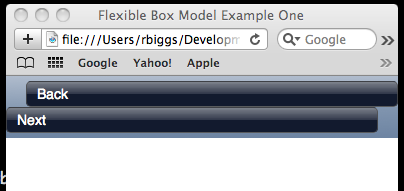
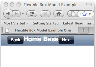
This will give us a layout like this:
Initial setup for a header tag that will use the flexible box model

Now we’ll add the magic. All we have to do is give the header tag a definition of display: box, then tell it which orientation to arrange its child elements and how to pack them in. We just need to add these properties to the header tag’s CSS:

display: -webkit-box;
-webkit-box-orient: horizontal;
-webkit-box-pack:justify;
display: -moz-box;
-moz-box-orient: horizontal;
-moz-box-pack:justify;

By telling the browser to pack the child elements with justification, the browser takes all the space not occupied by the buttons and spreads it out between them. This works as expected in all Webkit based browsers. Unfortunately, although Firefox has implemented every other feature of the flexible box model, they have not as yet implemented the box-pack: justify property. It’s listed on their developer site with a question mark: https://developer.mozilla.org/en/CSS/-moz-box-pack

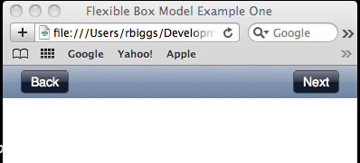
In the next section of this post I’ll introduce a technique that requires some extra markup that will make this work in Firefox too. For now, here is how this looks in Webkit:
Header tag with buttons aligned at both end using the flexible box model

You can see it in action, or download the document.

Adding Centered Content With Dynamic Width

Now we’ll look at how to add a title into our heading. Since we already have two buttons at either end, we’ll want our title to be centered. We’ll add an h1 tag to the header directly between the two buttons:

<body>
	<article>
		<header>
			<a class="button black back">Back</a>
			<h1>Home Base</h1>
			<a class="button black next">Next</a>
		</header>
	</article>
</body>

We also need to give the h1 some suitable styling. We’re going to make it white with an indented look using a text shadow:

h1 {
	font: bold 21px/21px Helvetica, Arial, Sans-serif;
	text-shadow: 0px -1px 0px rgba(0, 0, 0, 0.5);
	color: #fff;
	margin: 0px;
	-moz-box-flex: 1;
	text-align: center;
}

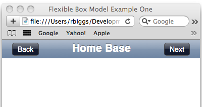
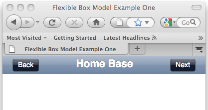
This gives us the following in Webkit:
Buttons on either end and title centered

Unfortunately, Firefox still needs a couple more lines of code to get it right. Here’s what we have at the moment:
Firefox having problems implementing the flexible box model

There is one more flexible box model property that we can apply to the h1 so that Firefox will display it as we want, that is box-flex. If we give this property a value of one, it tells the browser to have that elements width the equivalent of all left over space from whatever other sibling elements are in the same parent tag. We’ll also need to apply text-alignment to center the text:

h1 {
	font: bold 21px/21px Helvetica, Arial, Sans-serif;
	text-shadow: 0px -1px 0px rgba(0, 0, 0, 0.5);
	color: #fff;
	margin: 0px;
	-moz-box-flex: 1;
	text-align: center;
}

Now Firefox display the header as we want:
h1 { 	font: bold 21px/21px Helvetica, Arial, Sans-serif; 	text-shadow: 0px -1px 0px rgba(0, 0, 0, 0.5); 	color: #fff; 	margin: 0px; 	-moz-box-flex: 1; 	text-align: center; }

You can check out the finished page, or download it.

Update: October 5, 2010

I’ve update these buttons to use subpixel rendering. You can read about the technique here. You can try this out online or download the source code.
Apple’s HTML5 Demo

OK, there’s been so much controversy about Apple’s HTML5 demo page (http://www.apple.com/html5/). Of course, you can go to the Mozilla developer site and find links to their own CSS3 examples like this: https://developer.mozilla.org/En/CSS/Using_CSS_transforms. It only works in Firefox. Hmmm… You can find similar pages on the Opera developer site. Hmmm… You can find similar ones from Google as well, oh and from Microsoft too. Do you see a pattern? Every browser vendor is putting up examples of how their browser renders whatever it is they’re trying to show off. So is it disingenuous for Apple to post their HTML5 demo? No.

All of this started with a blog post by a Mozilla evangelist, Christopher Blizzard: http://www.0xdeadbeef.com/weblog/2010/06/intellectual-honesty-and-html5/

Since Netscape Navigator 6, the Mozilla team for years lead the charge in establishing new standards for the Web. However, in June of 2005 Apple release the source code of the rendering engine for their Safari browser as and open source project known as Webkit. Even before the creation of the Webkit project, the Safari team had managed to create code to pass the Acid 2 test, the first browser to do so. Since then the Webkit team has introduced many new feats for the Web: the canvas tag, multiple backgrounds, background sizing, background clipping, rounded corners, text shadow, box shadow, text stroke, CSS gradients, CSS image masks, border images, CSS transforms, CSS transitions, CSS keyframe animation, as well as support for multi-touch events, etc. David Hyatt from the Webkit team has submitted all of these to the W3C for standardization. Many of these have already been adopted by the Mozilla team into Firefox. That’s why it’s interesting to see Mozilla’s Christopher Blizzard reacting Apple HTML5 demos as follows:

“The demos that they put up are just filled with stuff that Apple made up, aren’t part of HTML5 and are only now getting to the standards process. Part of CSS3? Kind of, sort of, but under heavy development and still in a feedback process.”

Then he goes on to say:

“The most important aspect of HTML5 isn’t the new stuff like video and canvas (which Safari and Firefox have both been shipping for years) it’s actually the honest-to-god promise of interoperability. Even stodgy old Microsoft, who has been doing their best to hold back the web for nearly a decade, understands this and you’ll see it throughout their marketing for IE9. (Their marketing phrase is “same markup” – watch for it and you’ll see it everywhere in their messaging.) The idea that the same markup, even with mistakes, will be rendered exactly the same. HTML5 represents the chance for browsers to work together and find common ground.”

OK, then why are there so many sites that use only CSS3 with -moz prefixes, including stuff on mozilla.com? If he wants one code to work everywhere always, then why have the Mozilla guys tried to persuade the W3C to use different syntax from the CSS3 features that the Webkit team introduced? We’re talking border radius, gradients, etc. If we wanted one code that worked everywhere we would still be using HTML 1.0. Progress is always painful, like a snake outgrowing its skin and shedding it. To me it seems like his biggest gripe is that most innovation on the Web today that is impacting standards seems to be coming from the Webkit team. This has meant that the Mozilla team is now in react mode trying to play catch up or minimalize the perception of Webkit’s advances over the last five years.

If i download the alpha of Firefox 3.7 right now, it’s got built-in support for the stuff that he’s complaining about in the above paragraph, stuff that is still in early recommendation status. Then there’s Mozilla’s decision to dump the HTML5 client-side database API for their own JavaScript based API for database calls. They apparently thinks developers don’t know how or don’t feel comfortable writing SQL. Hmmmm… What kind of developers are those? Sounds like sounds to me like a lot of their developers only know JavaScript so they want a JavaScript API. Check out the reaction of real developers in the comments section of the above link.

So, it seems like the Mozilla team is heading down a path to somewhere. It’s just that I don’t see myself wanting to head down that path. I want innovation that adds new capabilities and makes things simpler. But I don’t want simpler to mean I can do the hard things because simple can only do simple.