CSS Gradients for IE9

This works with Desktop IE9, Desktop Firefox, Desktop Chrome, Desktop Safari, Desktop Opera, iOS, and Android.

Attention! IE9 will not destroy the world, kill babies, or take away your home or job.

Simply put, IE9 is the best browser Microsoft has ever released. Has it caught up to Chrome, Firefox and Safari? No. But that doesn’t matter. It’s still light years ahead of any other version of IE. All of us should be praying every day for IE users to upgrade to it as soon as possible.

Shortly after the initial launch of the beta of IE9, I began testing to see what kind of support it had for all the rich and exciting features CSS3 offers for Web layout and interaction. The earlier beta’s didn’t have much, but with each release it has gotten better. If you’re already using advanced CSS3 for Web development and never bothered supporting IE before, you’ll want to know what it supports and what it doesn’t. Here’s what it supports at present right from the horse’s mouth. In particular, it supports real CSS opacity, multiple background images, box shadows, border radius, background-clip, background-size, background-position, WOFF for Web fonts, RGBA and HSLA color, box sizing, as well as the full suite of CSS3 selectors. The above post also talks about support for CSS3 2d transforms, however, even with the -ms- vender prefix I am unable to get it to work with the present beta (7).
Update: Transforms are working in Platform Preview 6, which is different from the present public beta. Microsoft is taking a two track approach to releasing this: the public beta for general users to test and a platform preview where features are introduced but not necessary finalized.

So what didn’t make it into IE9? First up, the flexible box model. Once you’ve used the flexible box model for layout, it’s as painful as eating glass to go back to using floats and positioning for layout. No text shadow, which is a strange omission considering they have box shadow. No border images. No CSS transitions. The single-threaded nature of JavaScript makes it inefficient for complex animations. Offloading style animations to the browser’s CSS rendering engine frees up JavaScript and allows the browser to use threads and hardware acceleration for better optimization. In my opinion, CSS3 transitions are more important than CSS3 transforms. Since Firefox, Opera and Webkit all support CSS3 transitions to some degree, it’s a odd omission for IE9. No 2d or 3d transforms. As I mentioned before, transforms do not appear to be implemented in the current beta. (Someone correct me if I’m wrong on this.) The thing I love about CSS3 transitions and transforms is that they allow you to create user interactions that make a Web application feel like a native one, blurring the difference between desktop and Web. No CSS3 keyframe animation. If you thought CSS3 transitions were awesome, you be blown away by CSS keyframe animations.

When I look at IE9’s support for CSS3, it appears they decided to pick the low hanging fruit: border radius, drop shadow, multiple backgrounds, etc. But the flexible box model, gradients, transitions, transforms and keyframe animation are the things in CSS3 that really turn your head.

I have no experience working with Adobe Flash. I do have extensive experience working with Microsoft’s Silverlight platform. I love how it enables you to create rich, interactive user interfaces where you can customize every aspect of a control’s look and feel. Chrome, Firefox and Safari’s support for CSS3 enables a similar high level of possibilities for the creation of Web user interfaces. IE9 is attempting to achieve feature parity with the other browsers and is making good progress. But if you want to use the CSS3 features that IE9 doesn’t support, you’ll need to find workarounds.

Presently my main area of focus is the mobile Web on Android, Blackberry 6, iOS and WebOS. That’s a world ruled by Webkit. But I usually make efforts to ensure that my solutions can also work with modern desktop browsers: Chrome, Firefox and Safari. That involves a lot of vender prefixes: -moz, -webkit. And then you need to future proof it by supplying the same property without the vendor prefix. This technique allows browsers that understand the properties, like IE9, to also render them without any extra effort.

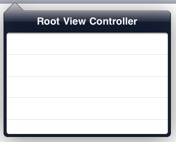
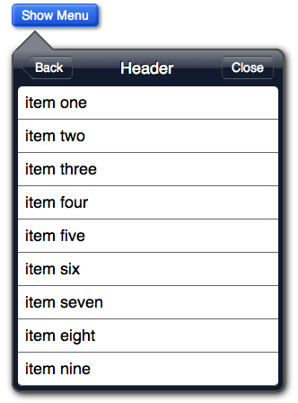
I’m going to take one example of an HTML/CSS3 implementation of iOS’s popup dialog box which I originally created for use on iOS devices and show how I got it to render equally in Chrome, Firefox, IE9, Opera and Safari. At the end of this post you’ll find links to try it out online or download it. One thing, I’m not using any image pieces, just CSS3 properties. Here’s the initial state of the page with the popup in Safari and Firefox:

popup Initial state

Here’s the page with the popup in view in Safari and Firefox:

Here’s the same markup in IE9. Notice how it understands border radius, box shadow and RGBA background color, but cannot render the flexible box model layout nor the CSS3 gradients.

ie9 initial state no styleie9 final state no style

IE9’s lack of support for the flexible box model can be resolved by using old-school layout techniques (floats/positioning). But there is no way to fake CSS3 gradients with pngs. When you stretch them they exhibit banding. Since I make extensive use of CSS3 gradients all the time, I felt pressed to find a solution for IE9. After spending some time experimenting with SVG in IE9, I hit on an idea. Using an IE9 specific stylesheet, I would try setting SVG gradients as background images on the element’s that use CSS3 gradients. The technique works quite well. Here’s IE9 with its custom CSS:

ie9 initial state fixedie9 final state fixed

First, here’s a CSS3 gradient used by Chrome, Firefox and Safari:

header {
	width: 100%;
	display: -webkit-box;
	display: -moz-box;
	display: box;
	-webkit-box-orient: horizontal;
	-webkit-box-pack:justify;
	-webkit-box-align: center;
	-webkit-box-sizing: border-box;
	-moz-box-orient: horizontal;
	-moz-box-align: center;
	-moz-box-pack:justify;
	-moz-box-sizing: border-box;
	box-orient: horizontal;
	box-align: center;
	box-pack:justify;
	box-sizing: border-box;
	height: 45px;
	margin: 0;
	padding: 0 10px;
	background-image: 
		-webkit-gradient(linear, left top, left bottom, 
			from(#b2bbca), 
			color-stop(0.25, #a7b0c3),
			color-stop(0.5, #909cb3), 
			color-stop(0.5, #8593ac), 
			color-stop(0.75, #7c8ba5),
			to(#73839f)); 
	background-image: 
		-moz-linear-gradient(top,
			#b2bbca, 
			#a7b0c3 25%,
			#909cb3 50%, 
			#8593ac 50%, 
			#7c8ba5 75%,
			#73839f); 
	border-top: 1px solid #cdd5df;
	border-bottom: 1px solid #2d3642; 
}

As you can see in the above code, we’re defining background images as gradients with a number of color stops. That all a CSS3 background gradient is. As a matter of fact, it’s rendered by the browser as a canvas background image. Since IE9 supports SVG, including as background images, I’ve come up with a way to use SVG gradient images as background gradients. Because SVG is vector-based, the gradients scale without banding. SVG is an XML markup language for describing vector graphics. The HTML5 parsing engine allows SVG to be directly embedded in HTML. But I want background images. By defining the height of the SVG document as 100%, I have an image that will scale to whatever the element is, just like the CSS3 gradient. Here’s the markup that I used to create the gradient for the header. Notice that the SVG gradient has color-stops and offsets like the CSS gradients. They aren’t that different.

<?xml version="1.0" ?>
<svg xmlns="http://www.w3.org/2000/svg" preserveAspectRatio="none" version="1.0" width="100%" 
   height="100%" 
     xmlns:xlink="http://www.w3.org/1999/xlink">

  <defs>
    <linearGradient id="myLinearGradient1"
                    x1="0%" y1="0%"
                    x2="0%" y2="100%"
                    spreadMethod="pad">
      <stop offset="0%"   stop-color="#b2bbca" stop-opacity="1"/>
      <stop offset="50%"   stop-color="#909cb3" stop-opacity="1"/>
      <stop offset="50%"   stop-color="#8593ac" stop-opacity="1"/>
      <stop offset="100%" stop-color="#73839f" stop-opacity="1"/>
    </linearGradient>
  </defs>

  <rect width="100%" height="100%"
     style="fill:url(#myLinearGradient1);" />
</svg>

The document has a height and width of 100%, the gradient is set to expand to 100% and the rectangle is defined with a height and width of 100%. It is possible to turn this SVG image into a datauri and put it directly in the CSS, using use any of the many resources available for datauri conversion. However, the SVG files are just simple text files. If you convert them to datauris, you will not be able to make any changes to them. While putting this demo together I had to constantly tweak the values in the SVG gradients to get them exact. Keeping the SVG files allows you to go back and modify the gradients at any time. Here’s how you use this for IE9:

header {
  background-image: url("svg-gradient.svg");
}

That’s it. IE9 will display the above SVG graphic in a manner indistinguishable from native CSS3 gradients.

For the repeating striped background gradient on the body tag, I’m using a CSS3 gradient with background sizing and letting it repeat across the page. For IE9 I do the same thing, using background sizing on the SVG equivalent to get the same effect.

Like IE9, Opera also does not support the flexible box model nor CSS3 gradients. Notice how Opera renders the demo basically the same as IE9:

Opera initial state no styleOpera final state no style

After creating the SVG workaround for IE9 to mimic CSS3 gradients, I started thinking about Opera’s lack of support for CSS3 gradients. Opera has the best support for SVG out of all the browsers. I therefore tried giving Opera the same CSS that I gave IE9. It worked as well as it did for IE9. You can see the results below:

Opera inital state fixedOpera final state fixed

There is very minimal browser sniffing required to make this work across modern browsers. One stylesheet for Chrome, Firefox and Safari, a conditional comment for IE9 and a browser agent sniff for Opera:

<!--[if IE 9]>
	 <link rel="stylesheet" type="text/css" href="popup-svg.css">
<![endif]-->

<script type="text/javascript">
    var Opera = /opera/i.test(navigator.userAgent);
    if (Opera) {
        var link = document.createElement("link");
        link.setAttribute("rel", "stylesheet");
        link.setAttribute("href", "popup-svg.css");
        document.getElementsByTagName("head")[0].appendChild(link);
}
</script>

Please Note: If you’re going to use this technique in a production environment you should use feature detection because at some point Opera will support CSS gradients. There are a number of ways to accomplish feature detection. Perhaps the easiest is to use Modernizr.

You can try out this demo online or download the source code. Feel free to use the included SVG files as templates for your own gradients.

Oh, and one last thing. I’m using the ChocolateChip mobile JavaScript framework for this demo. Originally I created it to work on mobile devices using Webkit browsers. I therefore provided no support for the JScript quirks of IE. But since IE9 has a completely rewritten JavaScript engine and uses the standard event model and DOM interfaces like the other browsers, ChocolateChip works fine on it without modification. That definitely put a smile on my face.

CSS3 Gradients and Patterns


Works in Desktop Safari, Google Chrome, Firefox, iPhone, Android, iPad
The ability to create CSS3 background gradients on any HTML element offers a lot of potential to create visually satisfying and engage experiences in the browser. But gradients are just about creating a 60s acid inspired rainbow of color. Because an HTML element can have multiple background images, you can do tricky things such as layering different gradients. If you use a background color and use rgba colors in your gradient stops, you can create some truly interesting effects. Oh, and there are also image masks. Using a gradient as an image mask allows you to add texture to an otherwise flat surface. You can think of CSS3 gradients and image masks like Photoshop layers in your browser. Right now the following browsers support CSS3 gradients: Firefox, Chrome, Safari, Android, iPhone, iPad.

Having one giant gradient across an element is that exciting. But when you use the -webkit-background-size and -moz-background-size properties, you can creating interesting tiling patterns with your gradients. We start with a red, white and blue stripe gradient. This is a fairly straightforward pattern to create. It needs six color stops to create the stripes:

background-image:
	-webkit-gradient(linear, left top, left bottom,
		color-stop(.34, red),
		color-stop(.34, white),
		color-stop(.67, white),
		color-stop(.67, blue),
		color-stop(1, blue));

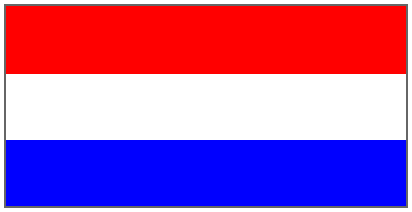
This will create a national flag filling the element.

Basic Red, White and Blue Pattern

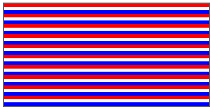
Nice start, but to get a pattern we need to define the background size. If you use a value of -webkit-background-size: 20px 20px;, we get the following pattern:
Horizontal Pattern

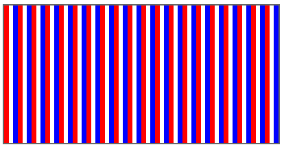
And by changing the orientation (-webkit-gradient(linear, left top, right top)), we get a vertical pattern:
Vertical Pattern

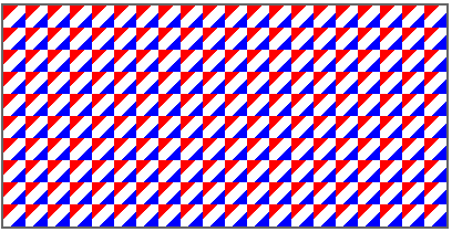
Now if we change the orientation to a diagonal(-webkit-gradient(linear, left top, right bottom), we get an interesting pattern:
Diagonal Pattern

If we reduce the background size down further (-webkit-background-size: 6px 6px), we get an subtler pattern:

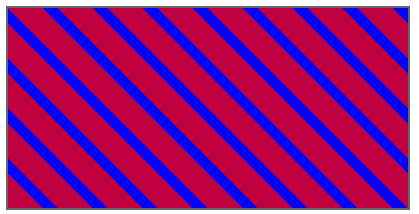
OK, this was all nice and good, but what about creating a diagonal pattern that fits together, like diagonal stripes? This takes a little planning. It isn’t an intuitive process to calculate the color stops to create diagonal repeating stripes that fit together seamlessly. Here’s the code. You can change the colors, or change the orientation, or use a background color and give the gradient colors transparency for some interesting effects:

background-color: #blue;
background-image: 
	-webkit-gradient(linear, 100% 0%, 0% 100%, 
	from(transparent), 
	color-stop(0.15, transparent),  
	color-stop(0.15, rgba(255,0,0,0.75)), 
	color-stop(0.50, rgba(255,0,0,0.75)), 
	color-stop(0.50, transparent), 
	color-stop(0.65, transparent),
	color-stop(0.65, rgba(255,0,0,0.75)),  
	to(rgba(255,0,0,0.75)));
	ffbackground-color: blue;
-webkit-background-size: 50px 50px;

This will give us:
Stripes

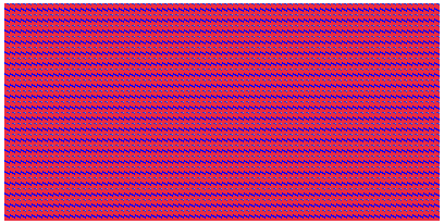
If we take this pattern and reduce its size to -webkit-background-size: 5px 5px, we get the following:

By changing the proportions of the background size (-webkit-background-size: 5px 10px), you can also create some interesting effects:
Pattern 10

So, take my patterns, play with the colors and background sizing and create your own patterns. You can try them out online, or download the source.

Update
I’ve updated code in the sample files to include the Mozilla gradient notation. This includes and update to work with the notation supported in the early betas of Firefox 4 (They’ve drop the -moz prefix off of the background-size property. CSS3 color gradients were first introduced by the Webkit team. After some time the Mozilla team began implement CSS gradients in Firefox as well. Then they came up with a simpler notation. Although the Webkit notation had already been submitted for standardization by the W3C, the Mozilla team pushed really hard to get their simpler notation accepted instead. They succeeded. The code below shows a Webkit gradient with its Mozilla equivalent.

.pattern-7 {
	background-image: 
		-webkit-gradient(linear, 100% 0%, 0% 100%, 
			color-stop(0.15, transparent),  
			color-stop(0.15, rgba(255,0,0,.5)), 
			color-stop(0.50, rgba(255,0,0,.5)), 
			color-stop(0.50, transparent), 
			color-stop(0.65, transparent),
			color-stop(0.65, rgba(255,0,0,.5)));
	background-image: 
		-moz-linear-gradient(left bottom, 
			transparent 15%, 
			rgba(255,0,0,.5) 15%, 
			rgba(255,0,0,.5) 50%, 
			transparent 50%, 
			transparent 65%, 
			rgba(255,0,0,.5) 65%);
	-webkit-background-size: 20px 10px;
	-moz-background-size: 20px 10px;
	background-size: 20px 10px;
}

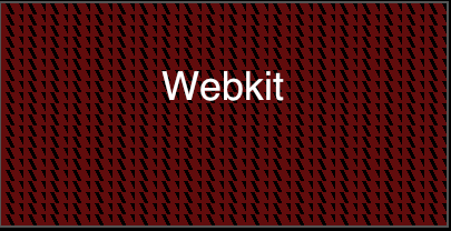
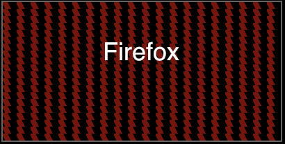
These are similar, but the patterns could not be reproduced identically with the two notation differences:
gradient-6-Webkitgradient-6-firefox

If you’ve already been using the Webkit notation to create gradients for desktop Safari, Chrome, iPhone, Android or iPad, you’ll notice how much easier it is to put together a basic gradient. That said, as you start to create more complicated repeating patterns, things start to get, well, more complicated. If you create a complex pattern first in Webkit and try to reproduce it Firefox, you may find that it is impossible, or the other way around. For simple gradients or the repeating stripe patterns, it’s fairly easy to create Fireox/Webkit versions. Both notations can do things that the other cannot. Hmmm… Remains me of the bad ole days of Netscape Navigator 4 and IE5: two completely different ways of doing DHTML.

If you’re target audience is Safari/Chrome, iPhone/iPad/Android, then you need to get comfortable with the Webkit notation. Although the W3C has ratified the Mozilla notation, which it’s huge installed base of users and developers already using the Webkit notation, it’s going to be around, well, until there isn’t a Webkit anymore. At some point I would expect the Webkit team to adopt the W3C recommended standard as well. When they do, I get a million dollars they’ll keep their own -webkit prefixed version of gradients around as well for backwards compatibility.

In conclusion, CSS3 gradients offer you a way to create rich graphical backgrounds that can be tweaked and update through a few CSS3 properties. Have a client that want to change the colors of some interface elements? Easy, open the CSS file. With CSS3 gradients you can create gradients that stretch across an entire page without having a gigantic image to download, just a few lines of CSS. Photoshop may have to go see a therapist due to not feeling needed as much anymore.

iPhone Buttons without Border Images

Works in Safari, Chrome, iPhone, iPad, Android

There are five frameworks for mobile Webkit Web app development: iUI, UiUIKit, iWebKit, jqTouch and Sencha. All of these frameworks provide a simple way to implement a common interface feature of the iPhone, the slightly translucent buttons used for implementing actions. By using the CSS3 border image property it becomes trivial to use a highly compact graphic as a border image to create the visual effect of a glossy, translucent button. It’s also economical because the images are single pieces. Here are the three main ones:

White Translucent ButtonBlack Translucent ButtonBlue Translucent Button

Using the CSS3 border image property, we can create fancy buttons that are dynamic. Here’s the necessary CSS:

.plasticButton {
	cursor: pointer;
	margin: 5px;	
	text-align: center;
	color: #ffffff;
	font: bold 16px/20px Helvetica, sans-serif;
	text-decoration: none;
	text-shadow: 1px 1px 1px #000;
	text-transform: capitalize;
	display: inline-block;
	font-size: 16px;
	border-width: 0 14px;
	padding: 12px 0px;
	min-width: 110px;
}
.plasticButton.white {
	color: #000;
	text-shadow: #fff 0px 1px 1px;
	-webkit-border-image: url(whiteButton.png) 0 14 0 14;
}
.plasticButton.gray {
	color: #fff;			
	text-shadow: #333 0px 1px 1px;
	-webkit-border-image: url(grayButton.png) 0 14 0 14;
}
.plasticButton:hover, .plasticButton.hover {
	color: #fff;
	text-shadow: #333 0px 1px 1px;
	-webkit-border-image: url(blueButton.png) 0 14 0 14;
}

This would give us buttons like these:
Example of translucent buttons using the border image property

Not too bad. Well, except for the images. What if we need to change the color of the buttons for a custom theme? These images are not easily modified in Photoshop. Without Apple releasing the original artwork for use by the general public, there is no way to fine tune them for different color schemes. Also, if you intend on using them in a Web app, you’ve got to include them in a cache.manifest, etc. After thinking about all the niggling aspects of buttons using border images, I started thinking about how I could reproduce their look using just the CSS3 features we have now. Here is what I came up with. All you need is a border-radius, a border, a gradient, a box-shadow and a text shadow:

.button.black {
	display: inline-block;
	-webkit-border-radius: 12px;
	-webkit-box-shadow: 2px 2px 3px #999; 
	border: solid 3px rgb(110,110,110);
	background-image: -webkit-gradient(linear, left top, left bottom, from(rgba(74,74,74,0.85)), color-stop(0.5, rgba(20,20,20,0.75)), color-stop(0.5, rgba(2,2,2,0.75)), to(rgba(14,14,14,0.75))); 
	color: #fff;
	text-shadow: #000 0 1px 0;
	font: bold 16px/20px Helvetica, Sans-serif;
	padding: 9px 11px;
}
.button.black:hover, .button.black.hover {
	background-image: -webkit-gradient(linear, left top, left bottom, from(rgba(135,148,203,0.85)), color-stop(0.5, rgba(34,56,159,0.75)), color-stop(0.5, rgba(0,27,145,0.75)), to(rgba(2,59,152,0.65)));  
	color: #fff;
	text-shadow: #000 0 1px 0;
	-webkit-box-shadow: inset rgba(207,207,255,0.75) 0px 1px 1px;
}

Because the gradients values use rbga colors with alpha values, they are slightly translucent. By changing the values of the gradient, you can easily create different colored buttons. I’ve upload a working example, and you can also download the code. Do so and play around with the values. I’ve included a number of different default colors: black, white, red, green, gold and blue. You can make other yourself.

Create Back & Next Buttons with CSS3

Works with Safari, iPhone, iPad

Update: March 21, 2011

I’ve update the method of create “Back” and “Next” button without the need for any extra markup, such as the span tag used in post below. Instead I use a CSS technique to create the pointer through only CSS. Read the new post and checkout the new example.

In an earlier post about the iPad’s distinctive dropdown menus I devised a scheme for creating an angular pointer. Now I’m going to use the same technique to create back and next buttons using only CSS3. Unfortunately, Android and Google Chrome do not presently support image masks, so this only works with iPhone, iPad and the Safari desktop browser. If you wish to reproduce this look for Android or Chrome, you’ll need to use image pieces, or be satisfied with simpler button styles. Eventually the CSS3 image mask will be supported on Android and Chrome.

To make the backward/forward pointer on the buttons possible we will need to add some extra markup to the basic button. The markup will look like this:

<a href="#" class="button back black"><span></span>Back</a>
<a href="#" class="button next black"><span></span>Next</a>

You’ll notice the inclusion of the span in the two link buttons above. We’ll be styling these spans to be the left and right pointing part of our buttons. First we’ll start with the basic button styles. We’ll start with the styles for our button class:

.button {
	color: #fff;
	text-decoration: none;
	display: inline-block;
	padding: 4px 10px;
	-webkit-border-radius: 5px;
}

This class gives us some basic properties for all our button styles. I’m using a black class to enhance this with border and background styles. But I could just as easily create some other color scheme using a different class, like blue or gold. So, here’s the style definitions for the black class:

 .button.black {
	 background-image: -webkit-gradient(linear, left top, left bottom, 
		 from(#7d828c),
		 color-stop(0.5, #303749), 
		 color-stop(0.5, #121a2e), 
		 to(#121a2e));
	 border: solid 1px rgba(79, 79, 79, 0.75);
 }

We’ve given the button a border color that is slightly transparent using RGBA values. We also styled the background of the button using a CSS3 gradient. It starts at the top, stop half way and changes to another color, creating a chiseled or beveled look. We’ll also add in a bright blue hover effect for mouse-based systems:

.button.black:hover {
	background-image: -webkit-gradient(linear, left top, left bottom, 
		from(#4286f5), 
		color-stop(0.5, #4286f5),
		color-stop(0.5, #194fdb),
		to(#194fdb));
}

This will give us a button with a hover state as indicated in the image below:
How the basic button class look with the addition of the black class.

As you can see, this creates a fairly slick looking button with a minimum of markup and can easily be adjust for other color schemes. We could also get fancy with the text by beveling it with an offset text shadow or give the button some depth with a box shadow.

Now let’s see how to create the pointer part that we need for back and next buttons. Because we’re using a basic, empty span, we can use the same span for either a back or next button, we just need to flip its styles to achieve the two effects.

Let’s do the back button first. First we need to do a little prep to the parent button. We’ll give it relative positioning because we’ll want to use absolute position on the span to move it into place. We’ll also want to change the default padding from 10px on the left to just 8. This is to balance out the space created by the back pointing part of the button the finished button.

.button.back {
	position: relative;
	padding-left: 5px;
	margin-left: 8px;
}

Now we’ll give the span some formatting styles and a matching background gradient. And, since we plan on rotating the span to the right and clipping off the right half, we only need a border on the left and bottom part of the span. Here’s the styles:

.back.black > span {
       display: block;
       height: 20px;
       width: 20px;
       background-image: -webkit-gradient(linear, left top, left bottom, 
              from(#7d828c),
              color-stop(0.5, #303749), 
              color-stop(0.5, #121a2e), 
              to(#121a2e));
       border-left: solid 1px rgba(79, 79, 79, 0.75);
       border-bottom: solid 1px rgba(79, 79, 79, 0.75);
}

Our styled span now looks like this:
Pointer span with gradient and borders

Since we’re going to rotate the span, we might as well realign the direction of the gradient so that it appears to be vertical. To do that we need to make it flow from left top to right bottom, creating a diagonal dragient:

.back.black > span {
       display: block;
       height: 20px;
       width: 20px;
       background-image: -webkit-gradient(linear, left top, right bottom, 
              from(#7d828c),
              color-stop(0.5, #303749), 
              color-stop(0.5, #121a2e), 
              to(#121a2e));
       border-left: solid 1px rgba(79, 79, 79, 0.75);
       border-bottom: solid 1px rgba(79, 79, 79, 0.75);
}

Now the span looks like this:

Pointer span with angled gradient

Next we’re going to rotate the span using -webkit-transform: rotate.

.back.black > span {
       display: block;
       height: 20px;
       width: 20px;
       background-image: -webkit-gradient(linear, left top, right bottom, 
              from(#7d828c),
              color-stop(0.5, #303749), 
              color-stop(0.5, #121a2e), 
              to(#121a2e));
       border-left: solid 1px rgba(79, 79, 79, 0.75);
       border-bottom: solid 1px rgba(79, 79, 79, 0.75);
      -webkit-transform: rotate(45deg);
}

This give us a rotated span:
Pointer span rotated 45 degrees.

.back.black > span {
       display: block;
       height: 20px;
       width: 20px;
       background-image: -webkit-gradient(linear, left top, right bottom, 
              from(#7d828c),
              color-stop(0.5, #303749), 
              color-stop(0.5, #121a2e), 
              to(#121a2e));
       border-left: solid 1px rgba(79, 79, 79, 0.75);
       border-bottom: solid 1px rgba(79, 79, 79, 0.75);
      -webkit-transform: rotate(45deg);
}

To get rid of the right half we’ll use a CSS3 image mask. But instead of using an actual image, we’ll use a CSS3 gradient. The gradient needs to go from black to transparent. To create the cut off effect we go from solid black halfway, stop, then go the rest of the way with full transparency. The syntax is fairly straightforward: -webkit-mask-image.

.back.black > span {
       display: block;
       height: 20px;
       width: 20px;
       background-image: -webkit-gradient(linear, left top, right bottom, 
              from(#7d828c),
              color-stop(0.5, #303749), 
              color-stop(0.5, #121a2e), 
              to(#121a2e));
       border-left: solid 1px rgba(79, 79, 79, 0.75);
       border-bottom: solid 1px rgba(79, 79, 79, 0.75);
      -webkit-transform: rotate(45deg);
      -webkit-mask-image: -webkit-gradient(linear, left bottom, right top, 
              from(#000000), 
              color-stop(0.5,#000000), 
              color-stop(0.5, transparent), 
              to(transparent));
}

The final, masked span now looks like this:
Masked pointer span

However, if we look at it inside of our regular button, it looks awful because of its rotation:

Since the parent button already has relative positioning, we just need to give the span absolute position with a left and top value to move it into place:

Back button with unpositioned pointer

.back.black > span {
       display: block;
       height: 20px;
       width: 20px;
       background-image: -webkit-gradient(linear, left top, right bottom, 
              from(#7d828c),
              color-stop(0.5, #303749), 
              color-stop(0.5, #121a2e), 
              to(#121a2e));
       border-left: solid 1px rgba(79, 79, 79, 0.75);
       border-bottom: solid 1px rgba(79, 79, 79, 0.75);
      -webkit-transform: rotate(45deg);
      -webkit-mask-image: -webkit-gradient(linear, left bottom, right top, 
              from(#000000), 
              color-stop(0.5,#000000), 
              color-stop(0.5, transparent), 
              to(transparent));
       position: absolute;
       left: -8px;
       top: 2px;
}

And here’s the finished button:
Completed back button

To create a next button, we can use the same button, but switch out a “next” class with all the values flipped to produce a button pointing the opposite way:

.back.black > span {
       display: block;
       height: 20px;
       width: 20px;
       background-image: -webkit-gradient(linear, left top, right bottom, 
              from(#7d828c),
              color-stop(0.5, #303749), 
              color-stop(0.5, #121a2e), 
              to(#121a2e));
       border-left: solid 1px rgba(79, 79, 79, 0.75);
       border-bottom: solid 1px rgba(79, 79, 79, 0.75);
      -webkit-transform: rotate(45deg);
      -webkit-mask-image: -webkit-gradient(linear, left bottom, right top, 
              from(#000000), 
              color-stop(0.5,#000000), 
              color-stop(0.5, transparent), 
              to(transparent));
       position: absolute;
       left: -8px;
       top: 2px;
}

You can view the file or download the complete file here to see the “back” and “next” buttons with their hover states.

NOTE
Although this technique does not work properly in Google Chrome because it presently lacks the CSS3 image mask property, you could make it work by enclosing the text of the link in a second span tag, give that span tag relative positioning with a z-index of 2 or greater. This would effectively position the text over the rotated span tag used a the pointer.

Update for Chrome and Android – August 29/2010
OK. Some good news, image masks are coming to Google Chrome 6. It has support for image masks the same as desktop Safari, iPhone, iPod Touch and iPad. The bad news is that this will most like not trickle down to the many Android devices out there. If you want to have the back and next buttons work on iOS and be backward compatible with existing Android devices, you can makes some slight changes to how the buttons are put together. Enclose the button’s text in a span and rename the empty span that gets used as a pointer to something sensible. I’m giving it a class of “pointer.” What we’ll do is give the text span relative positioning. Then we’ll give the pointer span a z-index of 1 and the text span a z-index of 2. That way the text will sit on top of the pointer and for Android devices that don’t support image masks you’ll still get the same look. Here’s the new markup:

<a href="#" class="button back black"><span class="pointer"></span><span>Back</span></a>
<a href="#" class="button next black"><span class="pointer"></span><span>Next</span></a>

With the CSS we’ll give all spans in the button relative positioning with a z-index of 2, then we’ll give the pointer span absolute positioning with a z-index of 1:

.back.black > span {
    position: relative;
    z-index: 2;
}
.back.black > span.pointer {
       display: block;
       height: 20px;
       width: 20px;
       background-image: -webkit-gradient(linear, left top, right bottom, 
              from(#7d828c),
              color-stop(0.5, #303749), 
              color-stop(0.5, #121a2e), 
              to(#121a2e));
       border-left: solid 1px rgba(79, 79, 79, 0.75);
       border-bottom: solid 1px rgba(79, 79, 79, 0.75);
      -webkit-transform: rotate(45deg);
      -webkit-mask-image: -webkit-gradient(linear, left bottom, right top, 
              from(#000000), 
              color-stop(0.5,#000000), 
              color-stop(0.5, transparent), 
              to(transparent));
       position: absolute;
       left: -8px;
       top: 2px;
       z-index: 1
}

Update: October 5, 2010

I’ve update these buttons to use subpixel rendering. You can read about the technique here. You can try this out online or download the source code.

iPad Dropdown Menu with CSS3

Works with Safari, iPhone, iPad

One thing noticeable about the iPad’s interface, in contrast to that of the iPhone, is the gorgeous dropdown menus. They have a highly polished look with their gradients and drop shadows. For a while now I was wondering if it would be possible to re-create their look using only CSS3. If you haven’t seen them yet, here is a sample:

Typical iPad dropdown menu

With CSS3 we can easily create the rounded corners, gradients and drop shadows. But what about the menu pointer? That part had me scratching my head for a while. I debated whether to use a canvas element. But I had already decided that I would pull this off using only CSS3. So, what I decided to do was use a rotated div. First I filled it with the last color at the top of the gradient that I used on the top of the menu. Since I was going to rotate the div, I didn’t need border on all four sides, just one two. I was rotating the div 90 degrees, so I gave it a border matching the menu on the left and bottom. Of course after rotating the div I still had the problem of the other half of the div. To remove it I used a CSS3 image mask. For the image I used a CSS3 gradient that went from solid black halfway and then turned transparent. Since the div was rotated 45 degrees, I needed to create a gradient mask from the bottom left to the top right:

-webkit-transform: rotate(45deg);
-webkit-mask-image: -webkit-gradient(linear, left top, right bottom, from(#000000), color-stop(0.5,#000000), color-stop(0.5, transparent), to(transparent));

This effective cut the div in half diagonally. I then used position to move the div to where it needed to be.

I originally designed this menu to work on desktop Safari/Chrome so that I could mimic the iPad menus. However, it also works on the iPad. The desktop version has some subtle differences because I used inset box shadows to create depth. That won’t be on the iPad until the iOS 4 update.

You can see the finished example or download the source to see how I put it together.

And here’s the finished menu using only CSS3:
An iPad style dropdown menu create with CSS3

Creating a Web App From a Single HTML5 Document

Works with Safari, Chrome, iPhone, iPad, Adroid

Because the focus of this blog is about CSS3 and HTML5, I will only be discussing their implementation on browsers that support these. If you’re using IE6, IE7 or IE8, you’re out of luck. These are very backwards as far as support for present day Web technologies are concerned. I’ll mostly be looking at the developments taking place on Safari/Chrome/Firefox/Opera. And if the IE team can ever ship IE9, we’ll include that as well.

With the widespread adoption of smart mobile devices the state of Web development has been transformed beyond recognition. First there was the Web 2.0 Ajax revolution. Instead of links leading off to another page, a click would result in only a part of the page being updated with new data retrieved from the server. The power of smart devices that are literally computers that fit in the hand has given rise to a new development module: Web apps. The Web part of the name can be misleading because, depending on its design and purpose, after the initial download, a Web app may not need any further connection to the Web. Also, a Web does not need to be for mobile devices. With special attention one could make an app that works for mobile and desktop/tablet.

To create a Web app can be quite complicated, or quite straightforward. I’m going to take the straightforward approach and show how with a minimum of code you can turn a single HTML page into a multipart Web app with cool CSS3-based animation during navigation. As a side benefit, no images shall be harmed in the creation of this app. All graphics will be created with CSS3. We’ll need to start with a basic document. For the purposes of this article I’m going to use HTML5. Actually, the markup and CSS3 code could be implemented in HTML 4 or XHTML. But since HTML5 is the new darling of techies and regular folks alike, I’m using it.

An HTML5 document starts with a doctype. We indicate what language the document uses and a meta tag to indicate the type of encoding used. For the purposes of this demo I’m also going to include a meta tag for viewport properties for mobile devices. This will affect the display of the app on iPhones, Adroids, and Palm Pres. Here’s the basic document structure:

<!DOCTYPE html>
<html lang="en">
   <head>
      <meta charset="utf-8">
      <meta name="viewport" content="width=device-width; height=device-height; initial-scale=1;">
      <title>My Kick Ass Web App</title>
   </head>
   <body>
   </body>
</html>

The next thing we need to do is implement the structure that will allow us to create the experience of a multi-page layout while having only one document. We can easily do this by using HTML5 semantic markup. The article tag makes this possible. In fact, the browser treats each article tag as if it were its own document. Each one can have its own h1. Similarly, search engines will treat each article as separate from the others so that the content is classified per article, not per document. I’m also going to use section tags for some fencing in of content, some buttons to return to the home page. Oh, well, and I’ll set up the home or landing page with its menu for accessing the other parts. Here’s the markup:

<!DOCTYPE html>
<html lang="en">
   <head>
      <meta charset="utf-8">
      <meta name="viewport" content="width=device-width; height=device-height; initial-scale=1;">
      <title>My Kick Ass Web App</title>
   </head>
   <body>
	<article id="Home" class="current">
		<section>
<h1>Home</h1>
<p>		   <nav></p>
<ul class="menuList">
<li rel="#Article1">News</li>
<li rel="#Article2">Things To Do</li>
<li rel="#Article3">Confidential</li>
<li rel="#Article4">What Next?</li>
</ul>
<p>		   </nav></p>
<p>Lorem ipsum dolor sit amet, consectetur adipisicing elit, sed do eiusmod tempor incididunt ut labore et dolore magna aliqua. Ut enim ad minim veniam, quis nostrud exercitation ullamco laboris nisi ut aliquip ex ea commodo consequat. Duis aute irure dolor in reprehenderit in voluptate velit esse cillum dolore eu fugiat nulla pariatur. Excepteur sint occaecat cupidatat non proident, sunt in culpa qui officia deserunt mollit anim id est laborum.</p>
<p>		</section>
	</article>
        <article id="Article1">
		<section></p>
<h1>Everything You Didn't Want to Know About</h1>
<p>		   <span class="button back">Back</span></p>
<p>Lorem ipsum dolor sit amet, consectetur adipisicing elit, sed do eiusmod tempor incididunt ut labore et dolore magna aliqua. Ut enim ad minim veniam, quis nostrud exercitation ullamco laboris nisi ut aliquip ex ea commodo consequat. Duis aute irure dolor in reprehenderit in voluptate velit esse cillum dolore eu fugiat nulla pariatur. Excepteur sint occaecat cupidatat non proident, sunt in culpa qui officia deserunt mollit anim id est laborum.</p>
<p>		</section>
	</article>
	<article id="Article2">
		<section></p>
<h1>Explain to Me Exactly Why You Came to This Page</h1>
<p>		   <span class="button back">Back</span></p>
<p>Lorem ipsum dolor sit amet, consectetur adipisicing elit, sed do eiusmod tempor incididunt ut labore et dolore magna aliqua. Ut enim ad minim veniam, quis nostrud exercitation ullamco laboris nisi ut aliquip ex ea commodo consequat. Duis aute irure dolor in reprehenderit in voluptate velit esse cillum dolore eu fugiat nulla pariatur. Excepteur sint occaecat cupidatat non proident, sunt in culpa qui officia deserunt mollit anim id est laborum.</p>
<p>		</section>
	</article>
	<article id="Article3">
		<section></p>
<h1>I Know What You Did and I'm Telling</h1>
<p>		   <span class="button back">Back</span></p>
<p>Lorem ipsum dolor sit amet, consectetur adipisicing elit, sed do eiusmod tempor incididunt ut labore et dolore magna aliqua. Ut enim ad minim veniam, quis nostrud exercitation ullamco laboris nisi ut aliquip ex ea commodo consequat. Duis aute irure dolor in reprehenderit in voluptate velit esse cillum dolore eu fugiat nulla pariatur. Excepteur sint occaecat cupidatat non proident, sunt in culpa qui officia deserunt mollit anim id est laborum.</p>
<p>		</section>
	</article>
	<article id="Article4">
		<section></p>
<h1>How Do I Get Out of Here?</h1>
<p>		   <span class="button back">Back</span></p>
<p>Lorem ipsum dolor sit amet, consectetur adipisicing elit, sed do eiusmod tempor incididunt ut labore et dolore magna aliqua. Ut enim ad minim veniam, quis nostrud exercitation ullamco laboris nisi ut aliquip ex ea commodo consequat. Duis aute irure dolor in reprehenderit in voluptate velit esse cillum dolore eu fugiat nulla pariatur. Excepteur sint occaecat cupidatat non proident, sunt in culpa qui officia deserunt mollit anim id est laborum.</p>
<p>		</section>
	</article>
   </body>
</html>

You’ll notice on the Home page section that I have a nav tag with a menu. Not that unusual except that the menu items are just plain old list items, not anchor tags with href attributes. Note that each list item has a rel attribute with the value that it corresponds to. With a little bit of JavaScript this will create my navigation system. Similarly, the back buttons are not inputs or anchor tags but just basic span tags with classes. Using CSS3 I’ll use those classes to make those spans look and act like buttons, and a bit of JavaScript will make them facilitate backward navigation.

If you opened the above markup in an HTML5 capable browser, you wouldn’t see much, pretty plain Jane stuff. We need some CSS to make it look like some. We’ll also need some CSS3 to make it look better than something. I’m going to use CSS3 to create repeating background patterns, as well as background gradients, box shadows, text shadows, border radii and transforms. The basic look we’re going for initially is something like following image. Later we’ll make each article zoom full screen and allow navigation between them.

Basic rendering of styled articles

We’ll start off by getting rid of default padding and margins on the html and body tags. Then we’ll give the body tag the basic underling styling for our app:

html, body {
    padding: 0px;
    margin: 0px;
}
body {
    background: #cbd2d8;
    background-image: -moz-linear-gradient(left, #c5ccd4, #c5ccd4 75%, transparent 75%, transparent);
    background-image: -moz-linear-gradient(90deg, #496178, #2E4960);
    background-image: -webkit-gradient(linear, left top, right top, from(#c5ccd4), color-stop(0.75, #c5ccd4), color-stop(0.75, transparent), to(transparent));
    -webkit-background-size: 7px 100%;
    -moz-background-size: 7px 100%;
    font: normal 16px/22px Helvetica, Arial, Sans-serif;
   -webkit-text-size-adjust: 100%;
}
section, nav {
    display: block;
    padding: 20px;
}
article {
    display: block;
}

Next let’s style the h1 tags so they look like a typical app title header. Using a fancy background gradient and some text shadow will do the trick:

h1 {
	padding: 10px 20px;
	margin: -20px -20px 20px -20px;
	background-image: -moz-linear-gradient(top, #b0bccd, #889bb3 50%, #8195af 50%, #6d84a2);
	background-image: -webkit-gradient(linear, left top, left bottom, from(#b0bccd), color-stop(0.5, #889bb3), color-stop(0.5, #8195af), to(#6d84a2));
	text-shadow: 1px 1px 1px rgba(250,250,250,0.5);
	font: bold 24px/26px "Lucida Grande";
	letter-spacing: -1px;
	border-top: 1px solid #cdd5df;
	border-bottom: 1px solid #2d3642;
	text-shadow: 2px 2px 1px rgba(0,0,0,0.4);
	color: #fff;
}

Rather than going bit by bit I’m giving you all the styling parts now, except for a couple of pieces that will add navigation transitions.

html, body {
	padding: 0px;
	margin: 0px;
}
body {
	background: #cbd2d8;
	background-image: -moz-linear-gradient(left, #c5ccd4, #c5ccd4 75%, transparent 75%, transparent);
	background-image: -moz-linear-gradient(90deg, #496178, #2E4960);
	background-image: -webkit-gradient(linear, left top, right top, from(#c5ccd4), color-stop(0.75, #c5ccd4), color-stop(0.75, transparent), to(transparent)); 
	-webkit-background-size: 7px 100%;
	-moz-background-size: 7px 100%;
	font: normal 16px/22px Helvetica, Arial, Sans-serif;
	-webkit-text-size-adjust: 100%;
}
section, nav {
	display: block;
	padding: 20px;
}
article {
	display: block;
}
.button {
	-webkit-box-shadow: 2px 2px 3px #999; 
	-moz-box-shadow: 2px 2px 3px #999; 
	border: solid 1px #000;
	display: inline-block;
	cursor: pointer;
	padding: 4px 15px;
	-webkit-transition: all 0.5s  ease-in-out;
	-moz-transition: all 0.5s  ease-in-out;
}
.button:hover {
	-webkit-box-shadow: 0px 0px 8px #000; 
	-moz-box-shadow: 0px 0px 8px #000; 
}
.back {
	-webkit-border-radius: 10px;
	-moz-border-radius: 10px;
	background-image: -moz-linear-gradient(top, lightblue, darkblue 50%, blue);
	background-image: -webkit-gradient(linear, left top, left bottom, from(lightblue), to(blue), color-stop(0.5, darkblue));
	color: #fff;
}
ul, li {
	list-style: none;
	margin: 0px;
	padding: 0px;
}
.menuList {
}
.menuList li {
	cursor: pointer;
	padding: 8px;
	border-left:  1px solid #AAA;
	border-right: 1px solid #AAA;
	border-bottom: 1px solid #AAA;
	background-color: #fff;
}
.menuList li:hover {
	background-color: lightblue;
}
.menuList li:first-of-type {
	border-top: 1px solid #AAA;
	-webkit-border-top-right-radius: 10px;
	-webkit-border-top-left-radius: 10px;
	-moz-border-radius-topright: 10px;
	-moz-border-radius-topleft: 10px;
}
.menuList li:last-of-type {
	-webkit-border-bottom-left-radius: 10px;
	-webkit-border-bottom-right-radius: 10px;
	-moz-border-radius-bottomleft: 10px;
	-moz-border-radius-bottomright: 10px;
}
#Home {
	background: #cbd2d8;
	background-image: -moz-linear-gradient(left, #c5ccd4, #c5ccd4 75%, transparent 75%, transparent);
	background-image: -webkit-gradient(linear, left top, right top, from(#c5ccd4), color-stop(0.75, #c5ccd4), color-stop(0.75, transparent), to(transparent)); 
	-webkit-background-size: 7px 100%;
	-moz-background-size: 7px 100%;
}
#Article1 {
	background-color: #f8ffac;
}
#Article2 {
	background-color: #beffca;
}
#Article3 {
	background-color: #dbfff4;
}
#Article4 {
	background-color: #c2bfd4;
	background-image: -moz-linear-gradient(top, #c3c6cc, #c3c6cc 50%, transparent 50%, transparent); 
	background-image: -webkit-gradient(linear, left top, left bottom, from(#c3c6cc), color-stop(0.5, #c3c6cc), color-stop(0.5, transparent), to(transparent)); 
	-webkit-background-size: 10px 10px;
	-moz-background-size: 10px 10px;
}
#Article3 p {
	border: solid 2px #666;
	-webkit-border-radius: 20px;
	-webkit-box-shadow: 2px 2px 6px #666;
	-moz-border-radius: 20px;
	-moz-box-shadow: 2px 2px 6px #666;
	background-color: #fff;
	padding: 10px;
}
#More p {
	border: solid 2px #666;
	-webkit-border-radius: 20px;
	-moz-border-radius: 20px;
	background-color: rgba(120,120,120, 0.75);
	padding: 10px;
	-webkit-box-shadow: 2px 2px 6px #666;
	-moz-box-shadow: 2px 2px 6px #666;
	color: #fff;
	text-shadow: 1px 1px 1px #000;
}
h1 {
	padding: 10px 20px;
	margin: -20px -20px 20px -20px;
	background-image: -moz-linear-gradient(top, #b0bccd, #889bb3 50%, #8195af 50%, #6d84a2); 
	background-image: -webkit-gradient(linear, left top, left bottom, from(#b0bccd), color-stop(0.5, #889bb3), color-stop(0.5, #8195af), to(#6d84a2)); 
	text-shadow: 1px 1px 1px rgba(250,250,250,0.5);
	font: bold 24px/26px "Lucida Grande";
	letter-spacing: -1px;
	border-top: 1px solid #cdd5df;
	border-bottom: 1px solid #2d3642;
	text-shadow: 2px 2px 1px rgba(0,0,0,0.4);
	color: #fff;
}

These styles give us everything to create the image above. But now we need to add a bit more to create some transitions for navigation. Before we can navigate from one article to another, we’ll need to style the articles so that they can behave like separate parts. We’ll use absolute positioning and give each article a height and width of 100%. This would by default cause all the articles to stack on top of each other. Therefore what we’re going to do is move them offscreen. We’ll create a special class called “current” for the article we want to display, otherwise they’ll be offscreen. OK, so to do this we’ll need a little bit of JavaScript. This is just for one purpose, to change which article has a class of “current”. Then we’ll use CSS3 transitions to move the not current article off the screen and the current article onto the screen. I’ve already introduced a CSS3 transition for the .button class and .button:hover. But instead of targeting the box shadow, we’re going to target the left position of the article.

So, as I had mentioned earlier, we’re going to put the articles offscreen by using absolute positioning and negative left. Then we’ll transition them onto the screen when we add the “current” class to the article by giving it a left value of 0. The animation is all accomplished very efficiently by the CSS3 transition rendering without any of the problems of trying to do this with JavaScript. So, we need to update the CSS for the article tag and add a new class for “current”:

article {
	display: block;
	wwidth: 100%;
	wheight: 100%;
	wposition: absolute;
	left: -10000px;
	-webkit-transition: all 0.5s  ease-in-out;
	-moz-transition: all 0.5s  ease-in-out;
}
.current {
	left: 0px;
}

Now all we need is the JavaScript to add and remove the “current” class from the articles. Although I’m using jQuery for this, you could just as easily write the necessary JavaScript to do this. Here’s the code:

var sectionStack = ["#Home", "#Article1", "#Article2", "#Article3", "#Article4"];
$(document).ready(function() {
	$(".menuList li").click(function() {
		$.each(sectionStack,
			function(index, value) {
				$(value).removeClass("current");
			}
		);
		$($(this).attr("rel")).addClass("current");
	});
	$(".back").click(function() {
		$(this).parents().removeClass("current");
		$("#Home").addClass("current");
	});
});

This code only does two things. When the user clicks on a menu list item, the code grabs that list items rel attribute, which indicates which article to show. Then it removes the “current” class from all articles and sets that class to the target article. When the browser sees that class has been added, it renders the CSS3 transition, sliding the article that was current (Home) off the screen and sliding in the target article. Similarly, when the user clicks on the back button, the code removes the “current” class from the article and puts it on the home article, causing a CSS3 transition to take place. If you wanted to have deeper, nested navigation, you would have to use an array to keep tract of where you came from and were you’re heading. Just use the JavaScript array’s built in push and pop methods. I’ll probably show this in a later post.

This was not that much JavaScript or CSS, yet the result was a slick Web app. At the moment this demo works with Firefox 3.6, Safari 3, Google Chrome, iPhone, iPad, Android and Palm Pre. Firefox 3.6 does not have CSS3 transitions, although it does have transforms. I could have refactored the JavaScript to animate the transforms for Firefox 3.6, but I didn’t want to fork the code. Firefox 3.7, presently a downloadable alpha build, does support CSS3 transitions and this works fine with it. I could have implemented support for Opera, but since it still doesn’t have support for gradients, it looks awfully flat. I didn’t want to use images just for Opera, so I left it out for now. Everything else in Opera works fine: text-shadow, box-shadow, border radius and CSS3 transitions.

You can try the app out online or download the complete file.