ChocolateChip-UI

Learn more about ChocolateChip-UI

ChocolateChip.js is now ChUI (pronounced “chewy”)

In the course of time I’ve created a lot of POCs (proof of concepts) on this blog. Some where fairly good, some where flaky one-offs. In the process I also created a small JavaScript library — ChocolateChip.js — that I used for actualizing most of these demos. Seeing how many people come to this humble blog in search of solutions to their development projects, I though about taking all the good ideas in these demos and putting them together as a one stop solution for mobile Web app development. I’m therefore today announcing ChocolateChip-UI. At present it’s a beta, but I intend to keep developing it to add more useful features over time. I

ChocolateChip-UI consists of ChocolateChip.js plus two other files: ChUI.js and ChUI.css. ChUI.js is a collection of JavaScript methods built on top of ChocolateChip.js. ChUI.js provides controls and widgets enlivened with behaviors needed for Web app development. ChUI.css is the magical CSS that makes simple markup look and act in a amazing way.

ChocolateChip-UI also introduces a new concept: WAML (Web App Markup Language). This is a specialized set of tags and attributes that get around the limits of HTML. HTML tags are really about creating documents, like books and other text publications. In contrast, WAML is a collection of tags and attributes that make sense for Web app development. ChUI.js and ChUI.css are built around the implementation of WAML as the key to how ChocolateChip-UI works.

WAML takes the paradigms of mobile application development and transfers those over to the development of mobile Web apps. There’s no need to smother and bury HTML tags with tons of classes trying to make markup meant for publishing documents work for creating applications. At the same time, WAML is really just a superset of HTML5 markup. You can therefore use any HTML5 tags and attributes along with WAML and ChocolateChip-UI to implement your solution.

ChocolateChip-UI is about making Web app development more straightforward. It provides common controls which have built in functionalities. Instead of having to figure out how to build these yourself, you can spend that time providing the data you want through ChocolateChip-UI’s controls easy to use controls.

The interfaces and controls which ChocolateChip-UI provides are all created using only markup and CSS. No images are required, no gifs or pngs. This means that everything you build with ChocolateChip-UI will be resolution independent. It will look good on a handheld mobile device and on a big HDMI screen. ChocolateChip-UI also provides a set of 52 SVG icons for use with buttons. Because these are vector based, they too are resolution independent. ChocolateChip-UI is therefore the first resolution independent mobile Web app framework.

ChocolateChip Has Its Own Blog

ChocolateChip, the little guy that does big things

So, ChocolateChip, the tiny JavaScript mobile Web framework that is only 8k when minified, now has its own blog: ChocolateChip-Mobile.net. I put this blog together to show how ChocolateChip works and how you can use it to accomplish your coding needs. I also talk about best coding practices with ChocolateChip.

ChocolateChip can be so small because it doesn’t have to support ancient browsers or compensate for cross-browser nightmares. Instead it takes advantage of modern browsers’ implementation of the features in ECMAScript 5 and DOM level 3. The idea was to keep ChocolateChip simple, avoiding object wrappers and object obfuscation, and making everything interchangeable with regular JavaScript. That means you can adjust ChocolateChip to your coding style, not the other way around. You can substitute any ChocolateChip for your own code at any time. As a matter of fact, if you don’t like the default $, $$ aliases that ChocolateChip uses, open up the files and change them to whatever you want. ChocolateChip is open source with a BSD license, so if you want to add some feature, feel free to. And if you feel like sharing your feature with the rest of us, feel free to contact me.

Have a great day and enjoy your ChocolateChip.

User Controled Color Theme

Works on Desktop Safari, desktop Google Chrome, desktop Firefox 3.6-4, iPhone, iPod Touch, iPad.

So, in the last blog post I showed how to make RGB slides with HTML, CSS and some JavaScript. I thought about it and, while interesting, it doesn’t have a whole lot of practical application. Sure you could take that and hook up any other type of value to get whatever result you might need for your interface. Well that got me to thinking, so I threw together an implementation of the RGB sliders that allow a user to change the color scheme of a Web app. No need to spend time creating different color themes. Let the user do it.

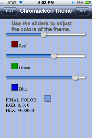
OK, before you think I’m crazy, especially you folks from the design community, let me explain. I came up with a basic theme technique. I call it chromaeleon &mdash because the app’s chrome can change colors like a chamaeleon. The way this works is, instead of solid color gradients, you create gradients with transparent values of black and white. Behind this you have a background color which shows through the transparent gradients. This way, when the user drags the sliders, the background colors update and the look of the interface changes. Now in the real world you’d want to provide a way for the user to save their color choice. You could save the choice to localStorage. Then when the app loads, it checks to see it the user saved a color choice, if not, it goes to the default. Sorry, I didn’t do all of that. Just the part to update the background colors. Here’s what it will look like:

iPhone Chromaeleon Interface

The structure we’re going to use is pretty must standard as we’ve used elsewhere, a header, a section, some buttons.

<body>
	<header>
		<a href="http://css3wizardry.com" class="button back"><span class="pointer"></span><span>Back</span></a>
		<h1>Chromaeleon Theme</h1>
		<span class="button">Click Here</span>
	</header>
	<section>
		<h2>Use the sliders to adjust the colors of the theme.</h2>
		<div class="colorRow">
			<div id="redSlider" class="slider">
				<div class="thumb"></div>
			</div>
			<div id="redColor" class="colorOutput"></div>
			<span> Red</span>
		</div>
		<div class="colorRow">
			<div id="greenSlider" class="slider">
				<div class="thumb"></div>
			</div>
			<div id="greenColor" class="colorOutput"></div>
			<span> Green</span>
		</div>
		<div class="colorRow">
			<div id="blueSlider" class="slider">
				<div class="thumb"></div>
			</div>
			<div id="blueColor" class="colorOutput"></div>
			<span> Blue</span>
		</div>
		<div class="colorRow finalResult">
			<span>Final Color: </span>
			<div id="rgbColor" class="colorOutput"></div>
			<br />
			<span>RGB: </span><span id="rgbResult">0, 0, 0</span>
			<br />
			<span>HEX: </span><span id="hexResult">#000000</span>
		</div>
	</section>
</body>

So, for the header and the buttons, we need to change their default gradients, as I mentioned above, to have RGBA transparency values. This is my basic gradient:

background-image: 
	-moz-linear-gradient(top, 
		rgba(255,255,255,.5), 
		rgba(30,30,30,.65) 50%, 
		rgba(0,0,0,.7) 50%, 
		rgba(0,0,0,.8)); 
background-image: 
	-webkit-gradient(linear, left top, left bottom, 
		from(rgba(255,255,255,.5)), 
		color-stop(0.5,rgba(30,30,30,.65)), 
		color-stop(0.5, rgba(0,0,0,.7)), 
		to(rgba(0,0,0,.8)));

And for the hover state of the button, we use this gradient:

background-image: 
	-webkit-gradient(linear, left top, left bottom, 
		from(rgba(0,0,0,.1)), 
		color-stop(0.5,rgba(0,0,0,.5)), 
		color-stop(0.5, rgba(0,0,0,.6)), 
		to(rgba(255,255,255,.2)));
background-image: 
	-moz-linear-gradient(top,
		rgba(0,0,0,.1), 
		rgba(0,0,0,.5) 50%, 
		rgba(0,0,0,.6) 50%, 
		rgba(255,255,255,.2));

Now to change the color, all we need to do is introduce a new method to our existing code:

/**
*
* Method to update chrome colors according to the RGB value of the sliders.
*
*/
$.updateInterfaceColors = function() {
	$("header").css("background-color: rgb(" + $.rgbColor[0] + "," + $.rgbColor[1] + "," + $.rgbColor[2] + ")");
	$$(".button").forEach(function(button) {
		button.css("background-color: rgb(" + $.rgbColor[0] + "," + $.rgbColor[1] + "," + $.rgbColor[2] + ")");
	});
	$("section").css("background-color: rgb(" + $.rgbColor[0] + "," + $.rgbColor[1] + "," + $.rgbColor[2] + ")");
	$(".pointer").css("background-color: rgb(" + $.rgbColor[0] + "," + $.rgbColor[1] + "," + $.rgbColor[2] + ")");
};

To execute this method, we invoke it in the slide mouse event handlers for each slider, and for touch-based mobile devices we invoke it in the updateSliderTouch method:

/**
*
* This is for the red slider's mouse interaction, you'd do the same for the green and blue sliders' setup scripts as well.
*/
// Set up three sliders for Red, Green and Blue:
$.slider("#redSlider", { 
	onDrag : function() {
		$("#redSlider").setColorFromSlider("red");
		$.updateInterfaceColors();
	},
	// onDragEnd function necessary to remove hover state off of slider thumb when drag ends.
	onDragEnd : function() {},
	top : -6
});
/**
*
* This is for touch-enabled devices. You invoke the $.updateInterfaceColors() method just once inside the updateSliderTouch method's definition, at the very end.
*/
Element.prototype.updateSliderTouch = function( color ) {
	this.style.left =  curX + 'px'; 
	if (color === "red") {
		$("#" + color + "Color").css("background-color: rgb(" + curX +",0,0)");
		$.rgbColor[0] = curX;
	}
	if (color === "green") {
		$("#" + color + "Color").css("background-color: rgb(0," + curX +",0)");
		$.rgbColor[1] = curX;
	}
	if (color === "blue") {
		$("#" + color + "Color").css("background-color: rgb(0,0," + curX +")");
		$.rgbColor[2] = curX;
	}
	$("#" + color + "Slider").css("-webkit-background-size:" + (curX + 1) + "px 9px, 100% 9px");
	$("#" + color + "Slider").css("background-size:" + (curX + 1) + "px 9px, 100% 9px");
	$("#rgbColor").css("background-color: rgb(" + $.rgbColor[0] + "," + $.rgbColor[1] + "," + $.rgbColor[2] + ")");
	$("#rgbResult").fill($.rgbColor[0] + ", " + $.rgbColor[1] + ", " + $.rgbColor[2]);
	$("#hexResult").fill("#" + $.rgb2hex($.rgbColor[0]) + $.rgb2hex($.rgbColor[1]) + $.rgb2hex($.rgbColor[2]));
	$.updateInterfaceColors();
};

This works great on desktop Safari, Chrome and even Firefox (Yay!), and fine on the iPad. For iPod Touch or iPhone you need to load it in portrait mode. it’s a bit cramped due to the size of the sliders. I needed them to be at least 255px long for the RGB values, and then borders, box shadows and the extra space for the thumbs made them barely fit in the iPhone’s and iPod Touch’s default width. Try hitting the plus icon at the bottom of the browser and save it to you device’s desktop. Then run it from there, you’ll have more vertical space. You can try this out online or download the source code. Enjoy!

Range Slider with CSS and JavaScript

Works on desktop Safari, desktop Chrome, desktop Firefox 3.5 – 4, iPhone, iPod Touch, iPad.

In this post I’m going to show how to make a range slider using HTML, CSS and JavaScript that works with both a mouse and a finger. The mouse-enabled version required a small drag-and-drop JavaScript framework. Fortunately I had already put that together several years back. After spending some time playing around with touch events on mobile Webkit, I was able to come up with a way to implement horizontal dragging for the range slider.
range slider

I’m not going to go into details about my mouse-enable drag-and-drop framework. You can popup it open and read the copious comments in the example. However, I will explain how I implemented the touch-enabled drag for the slider.

The structure for a slider is fairly straightforward. You need a track and a thumb:

<div id="redSlider" class="slider">
	<div class="thumb"></div>
</div>

Since the structure is so simple, you might be wondering how we give it the look. The thumb gets border radius to make it round, along with a box shadow and a background-gradient, including a blue background gradient for hover. The slider track is styled with two background gradients, the bottom-most gradient is the default grey which swans the width of the slider. Layered on top of the same track is a second, bluish gradient. By using CSS3’s background sizing property, we will dynamically resize it as the slider’s thumb is dragged.

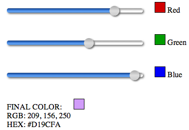
Of course, just dragging a slider thumb back in forth is not suck a big deal. I therefore created three sliders implemented as RGB pickers. By dragging each thumb, you add or subtract from a red, green or blue value. Down below you’ll see the final RGB and Hex values.
RGB Slider

Here are the basic styles for the slider:

.slider {
	display: inline-block;
	-webkit-box-sizing: border-box;
	-moz-box-sizing: padding-box;
	box-sizing: padding-box;
	-webkit-box-shadow: 2px 2px 4px #666;
	-moz-box-shadow: 2px 2px 4px #666;
	box-shadow: 2px 2px 4px #666;
	height: 9px;
	width: 277px; 
	padding: 1px;
	-webkit-border-radius: 4px;
	-moz-border-radius: 4px;
	border-radius: 4px;
	background-image: 
		-webkit-gradient(linear, left top ,left bottom,
		   from(#0a3a86),
		   color-stop(.5, #4c8de7),
		   color-stop(.95, #6babf5),
		   to(#0a3a86)),
		-webkit-gradient(linear, left top ,left bottom,
			from(#919191),
			color-stop(.5, #f0f0f0),
			color-stop(.5, #fff),
			color-stop(.95, #fff),
			to(#919191));
	background-image: 
		-moz-linear-gradient(top,
		   #0a3a86,
		   #4c8de7 50%,
		   #6babf5 95%,
		   #0a3a86),
		-moz-linear-gradient(top,
			#919191,
			#f0f0f0 50%,
			#fff 50%,
			#fff 95%,
			#919191);
	background-repeat: no-repeat, repeat-x;
}
.thumb {
	position:relative;
	-webkit-box-shadow: 2px 2px 3px #666;
	-moz-box-shadow: 2px 2px 3px #666;
	box-shadow: 2px 2px 3px #666;
	height:20px;
	width:20px;
	left: 0px; 
	top: -6px;
	-webkit-border-radius: 10px;
	-moz-border-radius: 10px;
	border-radius: 10px;
	background-image: 
	   -webkit-gradient(linear, left top, left bottom,
		   from(#aaa),
		   color-stop(.5, #ddd),
		   to(#ccc));
	background-image: 
	   -moz-linear-gradient(top,
		   #aaa,
		   #ddd 50%,
		   #ccc);
	cursor: move;
	-webkit-tap-highlight-color: transparent;
}
.thumb:hover, .thumb.hover {
	background-image: 
	   -webkit-gradient(linear, left top, left bottom,
		   from(#6297f2),
		   color-stop(.5, #0251ae),
		   to(#6297f2));
	background-image: 
	   -moz-linear-gradient(top,
		   #6297f2,
		   #0251ae 50%,
		   #6297f2);
}

Notice the slider’s background gradient style. The first background gradient will be the top-most. The last will be the bottom-most. But the top-most is going to be the blue part of the track that appears to the left of the thumb as it is dragged away from the left start of the range slider.

We also need some styles to set the initial states of the three thumbs. Notice that I’ve used background sizing to control the two background gradients. The first is for the blue top-most gradient, the second is for the full width grey gradient.

#redSlider .thumb {
	left: 121px;
}
#redSlider {
	-webkit-background-size: 123px 9px, 100% 9px;
	-moz-background-size: 123px 9px, 100% 9px;
	background-size: 123px 9px, 100% 9px;
}
#greenSlider .thumb {
	left: 156px;
}
#greenSlider {
	-webkit-background-size: 158px 9px, 100% 9px;
	-moz-background-size: 158px 9px, 100% 9px;
	background-size: 158px 9px, 100% 9px;
}
#blueSlider .thumb {
	left: 230px;
}
#blueSlider {
	-webkit-background-size: 232px 9px, 100% 9px;
	-moz-background-size: 232px 9px, 100% 9px;
	background-size: 232px 9px, 100% 9px;
}

So, I’ve defined two gradients with different background repeats: background-repeat: no-repeat, repeat-x; and background sizing with values such as: 123px 9px, 100% 9px. 9px is the height of the slider track. The bottom-most gradient has a width of 100%, and the top-most bluish one gets a width of 123px. By using these values, with very little markup, we can create visually and functionally complex structures.

/**
* Touch enabled support:
*/
/**
*
* Method to set the colors of color swatches and width of the slider progress track when the slider thumb is dragged.
*/
Element.prototype.setupSliderTouch = function( event ) {
	event.preventDefault();
	var el = event.target;
	var touch = event.touches[0];
	curX = touch.pageX - this.parentNode.offsetLeft;
	if (curX <= 0) { 
		curX = 0;
	}
	if (curX > 255) {
		curX = 255;
	}
};
Element.prototype.updateSliderTouch = function( color ) {
	this.style.left =  curX + 'px'; 
	if (color === "red") {
		$("#" + color + "Color").css("background-color: rgb(" + curX +",0,0)");
		$.rgbColor[0] = curX;
	}
	if (color === "green") {
		$("#" + color + "Color").css("background-color: rgb(0," + curX +",0)");
		$.rgbColor[1] = curX;
	}
	if (color === "blue") {
		$("#" + color + "Color").css("background-color: rgb(0,0," + curX +")");
		$.rgbColor[2] = curX;
	}
	
	$("#" + color + "Slider").css("-webkit-background-size:" + (curX + 1) + "px 9px, 100% 9px");
	$("#" + color + "Slider").css("background-size:" + (curX + 1) + "px 9px, 100% 9px");
	
	$("#rgbColor").css("background-color: rgb(" + $.rgbColor[0] + "," + $.rgbColor[1] + "," + $.rgbColor[2] + ")");
	$("#rgbResult").fill($.rgbColor[0] + ", " + $.rgbColor[1] + ", " + $.rgbColor[2]);
	$("#hexResult").fill("#" + $.rgb2hex($.rgbColor[0]) + $.rgb2hex($.rgbColor[1]) + $.rgb2hex($.rgbColor[2]));
};

$("#redSlider > .thumb").bind('touchmove', function(event) {
	this.setupSliderTouch(event);
	this.updateSliderTouch("red");
});
$("#greenSlider > .thumb").bind('touchmove', function(event) {
	this.setupSliderTouch(event);
	this.updateSliderTouch("green");
});
$("#blueSlider > .thumb").bind('touchmove', function(event) {
	this.setupSliderTouch(event);
	this.updateSliderTouch("blue");
});

Basically, I attach a touchmove event to the slider thumbs. The event listener passes the event to the setupSliderTouch method. The first thing the setupSliderTouch method does is to prevent the default interaction from taking place, such as page scrolling. We want the user to be able to move the thumb without scrolling the page. From the event passed in to setupSliderTouch we get the touch event and calculate its x coordinate on the screen. To calculate the touch’s position in relation to the slider, we subtract the left offset of the slider from the pageX of the touch. This gives us the left-most edge of the slider’s thumb. We store this as curX. We check the value of curX. If it is less than zero, we set it back to zero. We do this because this value will be used to set the position of the thumb and one of the RGB values. We don’t want either the thumb being dragged off of the left edge of the slider, nor a value less than zero, since RGB values start at zero. We do the same thing when the curX value is greater than 255 for the same reasons.

The updateSliderTouch method uses the value of the slider’s thumb to calculate and update RGB and Hex values, giving the user visual feedback as the thumb is dragged. Then we use the value of curX to update the background size of the blues background gradient on the slider track:

$("#" + color + "Slider").css("-webkit-background-size:" + (curX + 1) + "px 9px, 100% 9px");
$("#" + color + "Slider").css("background-size:" + (curX + 1) + "px 9px, 100% 9px");

That’s all there is to it. You can try this out online using desktop Safari, Chrome, or Firefox for the mouse version, or on an iPhone, iPod Touch or iPad for the touch version. Or you can download the source code, which I recommend, so you can dig into the CSS and JavaScirpt.

Update: September 15, 2010
If you’re trying this out on an iPhone, I noticed that there seems to be a very slight delay before an initial touch is registered on the screen. This means that in order to slide the thumb, you need to press and hold for a very brief moment before sliding, otherwise no touch gets registered and nothing happens. This doesn’t seem to happen when performing the same action on the iPad. Touches seem more responsive.

iPhone Modal Popup with HTML5, CSS3 & JavaScript

Works on Desktop Safari, Desktop Google Chrome, iPhone, iPod Touch, iPad. Note that I’ve included some styling for Firefox, even though it has no presence to speak of in the mobile space. In particular, Firefox 4 beta still lacks support for CSS3 keyframe animation, although that will make it into a later update.

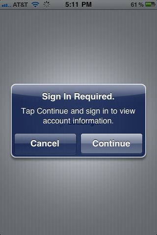
If you’ve used an iPhone, iPod Touch or iPad, then you’re familiar with the modal popup dialog boxes that the native system uses. Here’s a typical iPhone popup:
Native iPhone modal popup

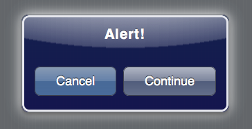
Notice the white radial gradient behind the popup. I was able to replicate this, but when the user was on a long document and scrolled down to do something that would trigger a popup, I could find no way to center that radial gradient based on the vertical page scroll. I therefore went with a whitesh blur around the popup itself using a CSS3 box shadow. Here’s what my HTML5/CSS3 version looks like:

Originally I thought I would use just one popup per app, re-assigning values to the popup’s part each time the popup was invoked. However I ran into the problem of events from different and I failed to find an elegant way to resolve this. I therefore came up with a scheme where you initialize a popup at the view level, allowing each view to have a custom popup. The initializing script creates the popup and injects it as the last child of the view. The setup script creates the markup for the popup and populates it with values passed as an argument to the initializing script. The setup script also adds basic functionality to the buttons so that clicking either of them will close the popup. The setup script also creates a screen cover which traps events to prevent user interaction with what is behind the popup until it is closed.

The setup script accepts a single argument—an object literal containing key/values pairs to populate the popup. In order for the setup script to create a popup, you must at least pass a value for a valid view in your Web app. This would be like selector: "#Popup". If no other values are passed, the script will produce a basic popup that looks like this:
Basic popup

I used the ChocolateChip mobile JavaScript library to add the interactive functionality to the popup. Here’s the JavaScript that creates the markup and functionality for the popup:

/** 
* 
* A method to initialize a modal popup. By passing a valid selector for a view, this method creates a view based popup with the properties supplied by the options argument. It automatically binds events to both popup buttons to close the popup when the user clicks either. If a callback is passed as part of the opts argument, it gets bound to the "Continue" button automatically.
*
* @method
* 
* ### setupPopup
*
* syntax:
*
*  $.setupPopup({selector: "#News", title: "Subscribe", cancel: });
*
* arguments:
* 
*  - string: string A valid selector for the parent of the tab control. By default the an object literal.
*  - string: string An object literal which can have the following properties:
	title: a string defining the title in the popup.
	message: a string defining the popup message.
	cancelButton: a string defining an alternate name for the cancel button.
	continueButton: a string defining an alternate name for the confirm button.
	callback: a function to run when the user touches the confirm button.
	If no title is supplied, it defaults to "Alert!".
	If no cancelButton value is supplied, it defaults to "Cancel".
	If no continueButton value is supplied, it defaults to "Continue".
* example:
*
*  $.setupPopup({selector: "#buyerOptions"});
*  $.setupPopup({
		selector: "#Popup",
		title: 'Attention Viewers!', 
		message: 'This is a message from the sponsors. Please be seated while we are getting ready. Thank you for your patience.', 
		cancelButton: 'Skip', 
		continueButton: 'Stay for it', 
		callback: function() {
			$('#popupMessageTarget').fill('Thanks for staying with us a bit longer.');
			$('#popupMessageTarget').removeClass("animatePopupMessage");
			$('#popupMessageTarget').addClass("animatePopupMessage");
		}
	});
*
*/
$.setupPopup = function( opts ) {
	if (opts.selector) {
		var selector = opts.selector;
	} else {
		return false;
	}
	var title = "Alert!";
	if (opts.title) {
		var title = opts.title;
	}
	var message = "";
	if (opts.message) {
		var message = opts.message;
	}
	var cancelButton = "Cancel";
	if (opts.cancelButton) {
		cancelButton = opts.cancelButton;
	}
	var continueButton = "Continue";
	if (opts.continueButton) {
		continueButton = opts.continueButton;
	}
	var popup = '<div class="screenCover hidden"></div>';
	popup += '<section class="popup hidden"><div>';
	popup += '<header><h1>' + title + '</h1></header>';
	popup += '<p>' + message +'</p><footer>';
	popup += '<div class="button cancel">' + cancelButton + '</div>';
	popup += '<div class="button continue">' + continueButton + '</div></footer></div></section>';
	$(selector).insertAdjacentHTML("beforeEnd", popup);
	// Bind event to close popup when either button is clicked.
	$$(selector + " .button").forEach(function(button) {
		button.bind("click", function() {
			$(selector + " .screenCover").addClass("hidden");
			$(selector + " .popup").addClass("hidden");
		});
	});
	
	if (opts.callback) {
		var callbackSelector = selector + " .popup .continue";
		$(callbackSelector).bind("click", function() {
			opts.callback();
		});
	}
	
};

And here is an initialization of a popup:

$.setupPopup(
	{
		selector: "#Popup",
		title: 'Attention Viewers!', 
		message: 'This is a message from the sponsors. Please be seated while we are getting ready. Thank you for your patience.', 
		cancelButton: 'Skip', 
		continueButton: 'Stay for it', 
		callback: function() {
			$('#popupMessageTarget').fill('Thanks for staying with us a bit longer.');
                        // Remove this class in case the popup was opened previously.
			$('#popupMessageTarget').removeClass("animatePopupMessage");
                        // Then add the class to trigger an animation of the message being displayed.
			$('#popupMessageTarget').addClass("animatePopupMessage");
		}
	}
);

Now that a popup has been created and populated with the desired values, we need a way to show it. Before actually showing the popup, the $.showPopup method display a screen cover which captures user interaction and thereby prevents the interface behind the popup from being accessed until the popup is dispelled. The showPopup method accepts one argument, a selector indicating a uniquely identifiable node that contains the popup as a descendant.

$.showPopup = function( selector ) {
	var screenCover = $(selector + " .screenCover");
        // Make the screen cover extend the entire width of the document, even if it extends beyond the viewport.
	screenCover.css("height:" + (window.innerHeight + window.pageYOffset) + "px");
	var popup = $(selector + " .popup");
	$(selector + " .popup").style.top = ((window.innerHeight /2) + window.pageYOffset) - (popup.clientHeight /2) + "px";
	$(selector + " .popup").style.left = (window.innerWidth / 2) - (popup.clientWidth / 2) + "px";
	$(selector + " .screenCover").removeClass("hidden");
	$(selector + " .popup").removeClass("hidden");
};

With this method defined we can now show the popup as need. Here’s a script that attaches an event handler to a button with a class of “openPopup” for a popup somewhere among the descendant nodes of a node with an id of “Tabs”:

$("#Tabs .openPopup").bind("click", function() {
	$.showPopup("#Tabs");
});

OK, so we have the markup and functionality for the popup, but we don’t have the look. We’ll take care of that next. In order to create the unique look of the iPhone popup, I use several layers for encasing borders and composited transparent background gradients. Originally I had two gradients, the dark blue linear gradient and the whitish radial gradient, layered on top of each other as multiple backgrounds. But Google Chrome had a problem rendering the underlying linear gradient, ignoring its transparent alpha values and rending the colors as opaque. I was therefore forced to break them out into separate elements. The end result is the same. When the popup is created by the setup script, it is given a class of “hidden.” This defines its scale as 0% and its opacity as 0%. When we execute the showPopup method, it removes that “hidden” class. Because the popup has basic transitions properties defined on it, its scale and opacity transition from zero to full, making it appear to popup out of no where. The scripts also always make sure that the popup is centered in the viewport, regardless of where it was displayed when scrolling down a long document.

For their modal popups, Apple always indicates the default button, what would be equivalent to a submit or OK button, with slightly lighter colors so that it stands out from the other button, which is the equivalent of a cancel/close button. I have the buttons located in a footer and I use CSS3’s flexible box model styles to make the buttons position and size them selves according to available space.

/* Modal Popup Styles */
section.popup {
	width: 75%;
	max-width: 300px;
	border: solid 1px #72767b;
	-webkit-box-shadow: 0px 4px 6px #666, 0 0 50px rgba(255,255,255,1);
	-moz-box-shadow: 0px 0px 1px #72767b,  0px 4px 6px #666;
	box-shadow: 0px 0px 1px #72767b, 0px 4px 6px #666;
	-webkit-border-radius: 10px;
	-moz-border-radius: 10px;
	border-radius: 10px;
	padding: 0px;
	opacity: 1;
	-webkit-transform: scale(1);
	-webkit-transition: all 0.25s  ease-in-out;
	position: absolute;
	z-index: 1001;
	margin-left: auto;
	margin-right: auto;
	background-image: 
		-webkit-gradient(linear, left top, left bottom,
			from(rgba(0,15,70,0.5)),
			to(rgba(0,0,70,0.5)));
}
section.popup.hidden {
	opacity: 0;
	-webkit-transform: scale(0);
	top: 50%;
	left: 50%;
	margin: 0px auto;
}
section.popup > div {
	border: solid 2px #e6e7ed;
	-webkit-border-radius: 10px;
	-moz-border-radius: 10px;
	border-radius: 10px;
	padding: 10px;
	background-image: 
	   -webkit-gradient(radial, 50% -1180, 150, 50% -280, 1400,
		   color-stop(0, rgba(143,150,171, 1)),
		   color-stop(0.48, rgba(143,150,171, 1)),
		   color-stop(0.499, rgba(75,88,120, .9)),
		   color-stop(0.5, rgba(75,88,120,0)));
	color: #fff;
	text-shadow: 0px -1px 1px #000;
}
section.popup header {
	background: none;
	-webkit-border-top-left-radius: 10px;
	-webkit-border-top-right-radius: 10px;
	-moz-border-radius-topleft: 10px;
	-moz-border-radius-topright: 10px;
	border-top-left-radius: 10px;
	border-top-right-radius: 10px;
	border: none;
	color: #fff;
	text-shadow: 0px -2px 1px #000;
}
section.popup header > h1 {
	letter-spacing: 1px;
}
section.popup footer
{
	display: -webkit-box;
	-webkit-box-orient: horizontal;
	-webkit-box-pack:justify;
	-webkit-box-sizing: border-box;
	display: -moz-box;
	-moz-box-orient: horizontal;
	-moz-box-pack:justify;
	-moz-box-sizing: border-box;
}
section.popup footer > .button {
	-webkit-box-flex: 2;
	-moz-box-flex: 1;
	display: block;
	text-align: center;
	-webkit-box-shadow: none;
	-moz-box-shadow: none;
	box-shadow: none;
	margin: 10px 5px;
	height: 32px;
	font-size: 18px;
	line-height: 32px;
	-webkit-border-radius: 8px;
}
section.popup footer > .button.cancel {
	background-image: 
		-webkit-gradient(linear, left top, left bottom, 
			from(#828ba3), 
			color-stop(0.5, #4c5a7c), 
			color-stop(0.5, #27375f), 
			to(#2e3d64));
}
section.popup footer > .button.continue {
	background-image: 
		-webkit-gradient(linear, left top, left bottom, 
			from(#b0b6c4), 
			color-stop(0.5, #7a839b), 
			color-stop(0.5, #515d7c), 
			to(#636e8a));
}
section.popup footer > .button:hover, .popup footer > .button.hover {
	background-image: 
		-webkit-gradient(linear, left top, left bottom, 
			from(#70747f), 
			color-stop(0.5, #424857), 
			color-stop(0.5, #171e30), 
			to(#222839));
}
.screenCover {
	width: 100%;
	height: 100%;
	display: block;
	background-color: rgba(0,0,0,0.5);
	position: absolute;
	z-index: 1000;
	top: 0px;
	left: 0px;
}
.screenCover.hidden {
	display: none;
}

You can try this out online or download the source code to play around with it.

iPhone Style Tab Control with HTML, CSS and JavaScript


Works with Desktop Safari, Desktop Google Chrome, Desktop Firefox 4, Android, iPhone, iPod Touch and iPad.
Please not that this was originally designed for Android/iPhone/iPad use. It can be used on modern desktop browsers. Just note that the attached example will only work with Firefox 4 or later because it uses CSS3 transitions for navigation.

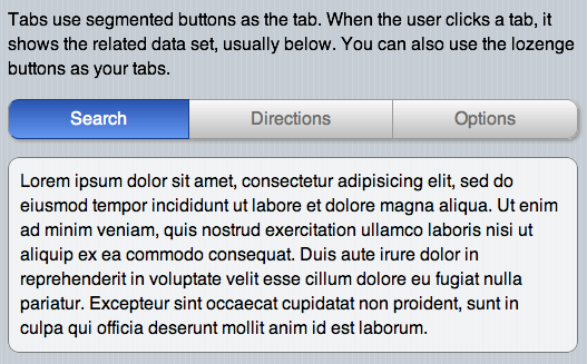
If you’ve used an iPhone or iPad, you’ve seen them. Actually, Apple uses them on the operating system. They even use them on their Website and online assets. As is usual for Apple, they take a very different approach to implementing tabs. They use segmented buttons to indicate tabs. This works especially well in the mobile space where you want the tab to stand out and be an easy target for a fat finger. It also eliminates all the futzing around to try to get all the border of tabs and tab panels to fit together properly. The panels have no borders, just their content. The segmented buttons capture your attentions as the device that toggles the content.

The interaction is simple and immediate. As soon as a user clicks or touches a segmented button, it reveals the new content below. On the iPhone, there are not even any special effects, not even a fade. It just directly switches out the data.

Let’s go over the markup for the tab control. Note that the class names it uses are important. By using standardized markup and classes, we can reuse the tab wherever we need it in our app, and initialize it with one line of JavaScript. The tab controls has two parts. The first is a div with the class “Tabs segmentedControlBase.” This is where the segmented buttons that hide and show the tab panels reside. Following this there is another div with the class “TabPanels,” with obviously holds the tab panels. Here’s the markup:

<div class="Tabs segmentedControlBase">
	<div class="button segmentedControl leftEnd tab"><span>Search</span></div>
	<div class="button segmentedControl tab"><span>Directions</span></div>
	<div class="button segmentedControl rightEnd tab"><span>Options</span></div>
</div>
<div class="TabPanels">
	<div class="tabPanel">
		<p class="rounded">Lorem ipsum dolor sit amet, consectetur adipisicing elit, sed do eiusmod tempor incididunt ut labore et dolore magna aliqua. Ut enim ad minim veniam, quis nostrud exercitation ullamco laboris nisi ut aliquip ex ea commodo consequat. Duis aute irure dolor in reprehenderit in voluptate velit esse cillum dolore eu fugiat nulla pariatur. Excepteur sint occaecat cupidatat non proident, sunt in culpa qui officia deserunt mollit anim id est laborum.</p>
	</div>
	<div class="tabPanel">
		<p class="rounded">Sed ut perspiciatis unde omnis iste natus error sit voluptatem accusantium doloremque laudantium, totam rem aperiam, eaque ipsa quae ab illo inventore veritatis et quasi architecto beatae vitae dicta sunt explicabo. Nemo enim ipsam voluptatem quia voluptas sit aspernatur aut odit aut fugit, sed quia consequuntur magni dolores eos qui ratione voluptatem sequi nesciunt.</p>
	</div>
	<div class="tabPanel">
		<p class="rounded">Neque porro quisquam est, qui dolorem ipsum quia dolor sit amet, consectetur, adipisci velit, sed quia non numquam eius modi tempora incidunt ut labore et dolore magnam aliquam quaerat voluptatem. Ut enim ad minima veniam, quis nostrum exercitationem ullam corporis suscipit laboriosam, nisi ut aliquid ex ea commodi consequatur?</p>
	</div>
</div>

As you can see, the markup is very straightforward and we can easily reuse the pattern through an application as necessary. Of course, this needs some styling so that it looks like something. The most visual part of the tab control is the set of segmented buttons which constitute the tabs. If you’re going to use these on a mobile phone, be aware the you can probably at maximum fit in four tabs. Two or three is optimal. If your tabs are cramped, hard to read or even hard to touch because there so many, you should probably rethink how you’re present your data. Maybe a drilldown menu would serve your purposes better. Realistically, the tab control is for a small number of data sets which you wish to present to the user.

Here’s the markup. Remember, the left and right ends of a segmented button set are normally rounded. They don’t have to be, but they definitely look more elegant that way. The button or buttons between the two ends are squared off.

.segmentedControlBase {
	display: -webkit-box;
	-webkit-box-orient: horizontal;
	-webkit-box-pack:justify;
	-webkit-box-sizing: border-box;
	display: -moz-box;
	-moz-box-orient: horizontal;
	-moz-box-pack:justify;
	-moz-box-sizing: border-box;
}
.button.segmentedControl {
	display: block;
	-webkit-box-flex: 1;
	-moz-box-flex: 1;
	border: solid 1px #9a9a99;
	border-left: none;
	-webkit-border-radius: 0px;
	-moz-border-radius: 0px;
	border-radius: 0px;
	text-align: center;
	background-image: 
		-webkit-gradient(linear, left top, left bottom, 
			from(#fbfbfb), 
			to(#bdbdbd));
	background-image: 
		-moz-linear-gradient(top, 
			#fbfbfb, 
			#bdbdbd);
	color: #6b6b6b;
	font-size: 16px;
	padding: 10px;
}
.button.segmentedControl:hover, .button.segmentedControl.hover, .button.segmentedControl.selected {
	background-image: 
		-webkit-gradient(linear, left top, left bottom, 
			from(#2a55b1), 
			to(#6297f2));
	background-image: 
		-moz-linear-gradient(top, 
			#2a55b1, 
			#6297f2);
	color: #fff;
	border-color: #193a7f;
}
.button.segmentedControl.leftEnd {
	-webkit-border-top-left-radius: 10px;
	-webkit-border-bottom-left-radius: 10px;
	-moz-border-radius-topleft: 10px;
	-moz-border-radius-bottomleft: 10px;
	border-top-left-radius: 10px;
	border-bottom-left-radius: 10px;
	border-left: solid 1px #9a9a99;
}
.button.segmentedControl.rightEnd {
	-webkit-border-top-right-radius: 10px;
	-webkit-border-bottom-right-radius: 10px;
	-webkit-border-top-right-radius: 10px;
	-webkit-border-bottom-right-radius: 10px;
	border-top-right-radius: 10px;
	border-bottom-right-radius: 10px;
}
/* Styles for Tab states */
.TabPanels .tabPanel {
	display: none;
}
.TabPanels .tabPanel.selected {
	display: block;
}
/* End Styles for Tab states */

This will give us a tab control that looks like this:

tabs

Now we’re going to create the JavaScript to make the tabs function. I’m going to use the ChocolateChip JavaScript framework because it’s tiny, just 12k, and does everything I need it to do in the mobile space. For those of you who would rather use jQuery, you should be able to replicate my control’s functionality fairly easily. If you don’t know jQuery good enough to do that, then maybe you want to give ChocolateChip a look. If you compare the two, you’ll see that ChocolateChip and jQuery code look very similar. The difference is that with ChocolateChip you’re always dealing with real JavaScript. ChocolateChip gives you some simple helpers to make it easier for you to write clean, maintainable and legible code. Yet everything ChocolateChip returns is normal JavaScript. With jQuery, you’re always dealing with an object wrapper and therefore have to do things the jQuery way. You cannot use normal JavaScript with what the jQuery returns.

Anyway, here’s the code that creates the tab:

/** 
* 
* A method to initialize a set of tabs using lozenge or segmented buttons to toggle data sets in a view. It takes one argument, a unique selector identifying the view or section where the tabs reside.
*
* @method
* 
* ### setupTabs
*
* syntax:
*
*  $.setupTabs(tabsSelector);
*
* arguments:
* 
*  - string: string A valid selector for the parent of the tab control.
* 
* example:
*
*  $.setupTabs("#buyerOptions");
*
*/
$.setupTabs = function( viewSelector ) {
	var tabsSelector = viewSelector + " .Tabs .tab";
	var panelsSelector = viewSelector + " .TabPanels .tabPanel";
	var tabs = $$(tabsSelector);
	var panels = $$(panelsSelector);
	
	tabs.forEach(function(tab) {
// Set the first tab and tab panel to the selected state automatically.
		tabs[0].addClass("selected");
		panels[0].addClass("selected");
		tab.bind("click", function() {
			var i = 0, len = tabs.length;
			var panelToHide = null;
			while(i < len) {
				tabs[i].removeClass("selected");
				panels[i].removeClass("selected");
				if (this == tabs[i]) {
					panelToHide = i;
				}
				i++
			}
			this.addClass("selected");
			panels[panelToHide].addClass("selected");
		});
		
		tab.bind("touchstart", function() {
			var i = 0, len = tabs.length;
			var panelToHide = null;
			while(i < len) {
				tabs[i].removeClass("selected");
				panels[i].removeClass("selected");
				if (this == tabs[i]) {
					panelToHide = i;
				}
				i++
			}
			this.addClass("selected");
			panels[panelToHide].addClass("selected");
		});
	});
};

If you look at the argument passed in, setupTabs expects a selector indicating the parent element that the tab control abides in. This can be the article tag, the section tag, or whatever you choose. I wouldn’t expect there to be more than one set of tabs in a particular view. If no selector is supplied, the script searches the entire document for the first occurrence of the tab control’s classes and initializes it. So, if you do have more than one tab control in your mobile app, you’ll need to pass in a selector indicating where it resides.

Since by default the tab control’s CSS sets the segmented buttons to unselected and the tab panels to hidden, the script does some initialization to select the first tab and show it’s tab panel. You don’t have to tell the script how many tabs there are or how many tab panels there are. It searches the markup and figures that out itself.

Now, its time to discuss the data in the tabs. How do you intend to get it in them? The simplest way is to do it on page load. If you have many tab controls, and your app is large, you might want to avoid that. In that case you code do something creative, such as binding an event listener to the transition effect of the view the first time the user navigates to it. You could use the webkitAnimationStart event to load your data with an Ajax call. You’d only want to do this the first time the user comes to the view, so you might want to use either a custom object or a value registered in the sessionStorage object to indicate that the user has visited the section already so you don’t need to reload the data.

You can see this tab control live, or download the code to pick it apart.

Update 9/1/10
What was I thinking? My bad. The two classes “leftEnd” and “rightEnd” are totally unnecessary. Using CSS3 selectors we can always target the first and last tabs using :first-of-type and :last-of-type. That way, you never have to worry about naming the first and last. Just put the tabs and the CSS will create the first and last. So the line:

.button.segmentedControl.leftEnd

should be:

.button.segmentedControl:first-of-type

and the line:

.button.segmentedControl.rightEnd

should be:

.button.segmentedControl:last-of-type

The online sample and downloadable code has been updated for this.

Introducing ChocolateChip – A Mobile JavaScript Framework

Desktop Safari, Desktop Chrome, Desktop Firefox, Desktop Opera, Desktop IE9, iPhone, iPad, Android.

After using practically every mobile Web framework out there, I finally threw in the towel and decided to create a JavaScript library for mobile that was light weight and fast and easy to use. To this end I would like to introduce you to ChocolateChip. It’s small, a little chip, and tasty like chocolate. Minified, it weights in at 8k. It’s syntax is similar to jQuery. Unlike jQuery and other libraries, nodes are not obfuscated by object wrappers. Everything is always normal JavaScript. No need to relearn how to write JavaScript according to a library. Write it the way it’s supposed to be written.

Because I’m not dealing with old or non-standard browsers and their quirks, I could concentrate on implementing only what was necessary and doing so optimally. ChocolateChip has a $ function, like jQuery, which returns the first instance of a node identified by a valid CSS3 selector. It also has a $$ function which returns an array of nodes matching the CSS3 selector. Most methods are attached directly to the base Element object. That means those methods are available to all nodes in a document, making it unnecessary to wrap the returned nodes in an object to provide extended functionality. This means that you can use normal JavaScript functions directly on the nodes. And the keyword “this” really is this. You don’t have to do $(this). The library allows you to chain load functions when the document finishes loading, or fire blocks of code when the document’s markup is ready for parsing.

Here is what ChococlateChip looks like in action:

$.ready(function() {
	$("#aboutDownButton").onclick = function() {
		$("#About").addClass("down");
	};
	$("#aboutUpButton").onclick = function() {
		$("#About").removeClass("down");
	};
	$$(".menuList li").forEach(function(item) {
		item.onclick = function() {
			$(navigation[navigation.length-1]).removeClass("current");
			$(navigation[navigation.length-1]).addClass("reverse");
			if (!$("#Home").hasClass("reverse")) {
				$("#Home").addClass("reverse");
			}
			$(this.getAttribute("rel")).addClass("current");
			navigation.push(this.getAttribute("rel"));
			hideURLbar(); 
		};
	}); 
	$$(".menuList li").forEach(function(item) {
                item.ontouchstart = function() {
		    this.addClass("hover");
                };
	});
	$$(".menuList li").forEach(function(item) {
                item.ontouchend = function() {
		    this.removeClass("hover");
                };
	});
	$$(".button.back").forEach(function(button) {
		button.onclick = function() {
			var parent = navigation[navigation.length-1];
			navigation.pop();
			$(navigation[navigation.length-1]).addClass("current");
			$(parent).removeClass("current");
			$(navigation[navigation.length-1]).removeClass("reverse");
			hideURLbar();
		};
	});
	$$(".button").forEach(function(button) {
		button.ontouchstart = function() {
			this.addClass("hover");
		};
	});
	$$(".button").forEach(function(button) {
		button.ontouchend = function() {
			this.removeClass("hover");
		}
	});
}); 

Update October 15, 2010
You can now learn about and download ChocolateChip from it’s own site: ChocolateChip-Mobile.net. The following paragraph refers to an early, developmental version.

Without further ado, here is ChocolateChip. Download the library with some samples. Remember, this is for mobile development on advanced devices like iPhone, iPad and Android, so on your desktop use a modern browser like Safari or Chrome, or test directly on an iPhone, iPad, or Android device.

Because the minified version is only 8k, you can include it in your document instead of as an external dependency. This means one less server hit to reduce latency and avoids the possibility of the library not being found and loaded.

One last thing, I’m sure some of you are scratching your heads wondering why I didn’t provide any namespacing to prevent collisions with the use of $ and $$ by other libraries. Well, that’s the point. Mobile is all about file size and memory constraints. You really shouldn’t be using ChocolateChip with any other library. They were not designed for mobile use, ChocolateChip was. You don’t need jQuery and its plugins, Prototype/Scriptaculous/ Dojo, YUI or any of the other big boys. Take a bite out of ChocolateChip and realize how good a developer’s life can be.

UPDATE: ChocolateChip 1.01 August 30, 2010
OK, I added in support for event binding using the methods “bind” and “unbind” and some basic initialization functions built in for forward and backward navigation. If you build out your Web app using my coding conventions, this will give you automatic forward and backward navigation without writing any code yourself. Here’s the uncompressed version with comments, and a minified version, which now weighs in at 12k. And here’s a sample document showing the new bind event in action.

UPDATE Oct 15, 2010: ChocolateChip now has it’s own blog
That’s right. ChocolateChip has it’s own blog with posts about how to use it. Learn how the little guy and help you get big stuff done. ChocolateChip will also soon have it’s own site dedicated to downloads of source code, controls, layouts and other goodies.
Visit ChocolateChip-Mobile.net and check out how 8k of JavaScript can help you create light weight mobile Web apps.

Deep Navigation with Push and Pop

As I showed in a previous post, it’s easy to create a simple back and forth navigation. That works for the simplest of situations, but what if you need deeper navigation? This is complicated since with the single document Web app approach, you’re always on the same page, moving from section to section. There is a simple way to make keeping track of where you’ve come from so you can make your way back. All you need is a dedicated JavaScript array. A JavaScript array has two very useful functions: push and pop. Consider an array like a tube into which you are going to stuff ping pong balls. One end of the tube is sealed, so you can only insert the ping pong balls through the open end. Let’s assume you’ve put all your ping pong balls into the tube and now you want to take one out. The last one in will be the first one out. That’s how arrays work. Push shoves data into an array, staking it on top of what is already there. Pop removes the last thing inserted in the array.

So, by using pushing data into an array as we navigate forward and popping items out when we navigate backwards, we can always tell what are navigation path is. Based on the example that I put together previously, we can create an array pre-populated with the home section’s id:

var navigation = ["#Home"];

Now what we’ll do is whenever the user clicks on a forward navigation element, we’ll push that into the navigation array:

$(".menuList li").click(function() {
    navigation.push($(this).attr("rel"));
});

Then, when we want to navigate back, we just need to use array.pop() to get the previous location. Since our array is navigation, we pop it first:

navigation.pop();
$(navigation[navigation.length-1]).addClass("current");

That will set the previous section as the current frame, firing off all the appropriate CSS3 transitions to bring it into view. You can see it in action here. And you can download it here.

Creating a Web App From a Single HTML5 Document

Works with Safari, Chrome, iPhone, iPad, Adroid

Because the focus of this blog is about CSS3 and HTML5, I will only be discussing their implementation on browsers that support these. If you’re using IE6, IE7 or IE8, you’re out of luck. These are very backwards as far as support for present day Web technologies are concerned. I’ll mostly be looking at the developments taking place on Safari/Chrome/Firefox/Opera. And if the IE team can ever ship IE9, we’ll include that as well.

With the widespread adoption of smart mobile devices the state of Web development has been transformed beyond recognition. First there was the Web 2.0 Ajax revolution. Instead of links leading off to another page, a click would result in only a part of the page being updated with new data retrieved from the server. The power of smart devices that are literally computers that fit in the hand has given rise to a new development module: Web apps. The Web part of the name can be misleading because, depending on its design and purpose, after the initial download, a Web app may not need any further connection to the Web. Also, a Web does not need to be for mobile devices. With special attention one could make an app that works for mobile and desktop/tablet.

To create a Web app can be quite complicated, or quite straightforward. I’m going to take the straightforward approach and show how with a minimum of code you can turn a single HTML page into a multipart Web app with cool CSS3-based animation during navigation. As a side benefit, no images shall be harmed in the creation of this app. All graphics will be created with CSS3. We’ll need to start with a basic document. For the purposes of this article I’m going to use HTML5. Actually, the markup and CSS3 code could be implemented in HTML 4 or XHTML. But since HTML5 is the new darling of techies and regular folks alike, I’m using it.

An HTML5 document starts with a doctype. We indicate what language the document uses and a meta tag to indicate the type of encoding used. For the purposes of this demo I’m also going to include a meta tag for viewport properties for mobile devices. This will affect the display of the app on iPhones, Adroids, and Palm Pres. Here’s the basic document structure:

<!DOCTYPE html>
<html lang="en">
   <head>
      <meta charset="utf-8">
      <meta name="viewport" content="width=device-width; height=device-height; initial-scale=1;">
      <title>My Kick Ass Web App</title>
   </head>
   <body>
   </body>
</html>

The next thing we need to do is implement the structure that will allow us to create the experience of a multi-page layout while having only one document. We can easily do this by using HTML5 semantic markup. The article tag makes this possible. In fact, the browser treats each article tag as if it were its own document. Each one can have its own h1. Similarly, search engines will treat each article as separate from the others so that the content is classified per article, not per document. I’m also going to use section tags for some fencing in of content, some buttons to return to the home page. Oh, well, and I’ll set up the home or landing page with its menu for accessing the other parts. Here’s the markup:

<!DOCTYPE html>
<html lang="en">
   <head>
      <meta charset="utf-8">
      <meta name="viewport" content="width=device-width; height=device-height; initial-scale=1;">
      <title>My Kick Ass Web App</title>
   </head>
   <body>
	<article id="Home" class="current">
		<section>
<h1>Home</h1>
<p>		   <nav></p>
<ul class="menuList">
<li rel="#Article1">News</li>
<li rel="#Article2">Things To Do</li>
<li rel="#Article3">Confidential</li>
<li rel="#Article4">What Next?</li>
</ul>
<p>		   </nav></p>
<p>Lorem ipsum dolor sit amet, consectetur adipisicing elit, sed do eiusmod tempor incididunt ut labore et dolore magna aliqua. Ut enim ad minim veniam, quis nostrud exercitation ullamco laboris nisi ut aliquip ex ea commodo consequat. Duis aute irure dolor in reprehenderit in voluptate velit esse cillum dolore eu fugiat nulla pariatur. Excepteur sint occaecat cupidatat non proident, sunt in culpa qui officia deserunt mollit anim id est laborum.</p>
<p>		</section>
	</article>
        <article id="Article1">
		<section></p>
<h1>Everything You Didn't Want to Know About</h1>
<p>		   <span class="button back">Back</span></p>
<p>Lorem ipsum dolor sit amet, consectetur adipisicing elit, sed do eiusmod tempor incididunt ut labore et dolore magna aliqua. Ut enim ad minim veniam, quis nostrud exercitation ullamco laboris nisi ut aliquip ex ea commodo consequat. Duis aute irure dolor in reprehenderit in voluptate velit esse cillum dolore eu fugiat nulla pariatur. Excepteur sint occaecat cupidatat non proident, sunt in culpa qui officia deserunt mollit anim id est laborum.</p>
<p>		</section>
	</article>
	<article id="Article2">
		<section></p>
<h1>Explain to Me Exactly Why You Came to This Page</h1>
<p>		   <span class="button back">Back</span></p>
<p>Lorem ipsum dolor sit amet, consectetur adipisicing elit, sed do eiusmod tempor incididunt ut labore et dolore magna aliqua. Ut enim ad minim veniam, quis nostrud exercitation ullamco laboris nisi ut aliquip ex ea commodo consequat. Duis aute irure dolor in reprehenderit in voluptate velit esse cillum dolore eu fugiat nulla pariatur. Excepteur sint occaecat cupidatat non proident, sunt in culpa qui officia deserunt mollit anim id est laborum.</p>
<p>		</section>
	</article>
	<article id="Article3">
		<section></p>
<h1>I Know What You Did and I'm Telling</h1>
<p>		   <span class="button back">Back</span></p>
<p>Lorem ipsum dolor sit amet, consectetur adipisicing elit, sed do eiusmod tempor incididunt ut labore et dolore magna aliqua. Ut enim ad minim veniam, quis nostrud exercitation ullamco laboris nisi ut aliquip ex ea commodo consequat. Duis aute irure dolor in reprehenderit in voluptate velit esse cillum dolore eu fugiat nulla pariatur. Excepteur sint occaecat cupidatat non proident, sunt in culpa qui officia deserunt mollit anim id est laborum.</p>
<p>		</section>
	</article>
	<article id="Article4">
		<section></p>
<h1>How Do I Get Out of Here?</h1>
<p>		   <span class="button back">Back</span></p>
<p>Lorem ipsum dolor sit amet, consectetur adipisicing elit, sed do eiusmod tempor incididunt ut labore et dolore magna aliqua. Ut enim ad minim veniam, quis nostrud exercitation ullamco laboris nisi ut aliquip ex ea commodo consequat. Duis aute irure dolor in reprehenderit in voluptate velit esse cillum dolore eu fugiat nulla pariatur. Excepteur sint occaecat cupidatat non proident, sunt in culpa qui officia deserunt mollit anim id est laborum.</p>
<p>		</section>
	</article>
   </body>
</html>

You’ll notice on the Home page section that I have a nav tag with a menu. Not that unusual except that the menu items are just plain old list items, not anchor tags with href attributes. Note that each list item has a rel attribute with the value that it corresponds to. With a little bit of JavaScript this will create my navigation system. Similarly, the back buttons are not inputs or anchor tags but just basic span tags with classes. Using CSS3 I’ll use those classes to make those spans look and act like buttons, and a bit of JavaScript will make them facilitate backward navigation.

If you opened the above markup in an HTML5 capable browser, you wouldn’t see much, pretty plain Jane stuff. We need some CSS to make it look like some. We’ll also need some CSS3 to make it look better than something. I’m going to use CSS3 to create repeating background patterns, as well as background gradients, box shadows, text shadows, border radii and transforms. The basic look we’re going for initially is something like following image. Later we’ll make each article zoom full screen and allow navigation between them.

Basic rendering of styled articles

We’ll start off by getting rid of default padding and margins on the html and body tags. Then we’ll give the body tag the basic underling styling for our app:

html, body {
    padding: 0px;
    margin: 0px;
}
body {
    background: #cbd2d8;
    background-image: -moz-linear-gradient(left, #c5ccd4, #c5ccd4 75%, transparent 75%, transparent);
    background-image: -moz-linear-gradient(90deg, #496178, #2E4960);
    background-image: -webkit-gradient(linear, left top, right top, from(#c5ccd4), color-stop(0.75, #c5ccd4), color-stop(0.75, transparent), to(transparent));
    -webkit-background-size: 7px 100%;
    -moz-background-size: 7px 100%;
    font: normal 16px/22px Helvetica, Arial, Sans-serif;
   -webkit-text-size-adjust: 100%;
}
section, nav {
    display: block;
    padding: 20px;
}
article {
    display: block;
}

Next let’s style the h1 tags so they look like a typical app title header. Using a fancy background gradient and some text shadow will do the trick:

h1 {
	padding: 10px 20px;
	margin: -20px -20px 20px -20px;
	background-image: -moz-linear-gradient(top, #b0bccd, #889bb3 50%, #8195af 50%, #6d84a2);
	background-image: -webkit-gradient(linear, left top, left bottom, from(#b0bccd), color-stop(0.5, #889bb3), color-stop(0.5, #8195af), to(#6d84a2));
	text-shadow: 1px 1px 1px rgba(250,250,250,0.5);
	font: bold 24px/26px "Lucida Grande";
	letter-spacing: -1px;
	border-top: 1px solid #cdd5df;
	border-bottom: 1px solid #2d3642;
	text-shadow: 2px 2px 1px rgba(0,0,0,0.4);
	color: #fff;
}

Rather than going bit by bit I’m giving you all the styling parts now, except for a couple of pieces that will add navigation transitions.

html, body {
	padding: 0px;
	margin: 0px;
}
body {
	background: #cbd2d8;
	background-image: -moz-linear-gradient(left, #c5ccd4, #c5ccd4 75%, transparent 75%, transparent);
	background-image: -moz-linear-gradient(90deg, #496178, #2E4960);
	background-image: -webkit-gradient(linear, left top, right top, from(#c5ccd4), color-stop(0.75, #c5ccd4), color-stop(0.75, transparent), to(transparent)); 
	-webkit-background-size: 7px 100%;
	-moz-background-size: 7px 100%;
	font: normal 16px/22px Helvetica, Arial, Sans-serif;
	-webkit-text-size-adjust: 100%;
}
section, nav {
	display: block;
	padding: 20px;
}
article {
	display: block;
}
.button {
	-webkit-box-shadow: 2px 2px 3px #999; 
	-moz-box-shadow: 2px 2px 3px #999; 
	border: solid 1px #000;
	display: inline-block;
	cursor: pointer;
	padding: 4px 15px;
	-webkit-transition: all 0.5s  ease-in-out;
	-moz-transition: all 0.5s  ease-in-out;
}
.button:hover {
	-webkit-box-shadow: 0px 0px 8px #000; 
	-moz-box-shadow: 0px 0px 8px #000; 
}
.back {
	-webkit-border-radius: 10px;
	-moz-border-radius: 10px;
	background-image: -moz-linear-gradient(top, lightblue, darkblue 50%, blue);
	background-image: -webkit-gradient(linear, left top, left bottom, from(lightblue), to(blue), color-stop(0.5, darkblue));
	color: #fff;
}
ul, li {
	list-style: none;
	margin: 0px;
	padding: 0px;
}
.menuList {
}
.menuList li {
	cursor: pointer;
	padding: 8px;
	border-left:  1px solid #AAA;
	border-right: 1px solid #AAA;
	border-bottom: 1px solid #AAA;
	background-color: #fff;
}
.menuList li:hover {
	background-color: lightblue;
}
.menuList li:first-of-type {
	border-top: 1px solid #AAA;
	-webkit-border-top-right-radius: 10px;
	-webkit-border-top-left-radius: 10px;
	-moz-border-radius-topright: 10px;
	-moz-border-radius-topleft: 10px;
}
.menuList li:last-of-type {
	-webkit-border-bottom-left-radius: 10px;
	-webkit-border-bottom-right-radius: 10px;
	-moz-border-radius-bottomleft: 10px;
	-moz-border-radius-bottomright: 10px;
}
#Home {
	background: #cbd2d8;
	background-image: -moz-linear-gradient(left, #c5ccd4, #c5ccd4 75%, transparent 75%, transparent);
	background-image: -webkit-gradient(linear, left top, right top, from(#c5ccd4), color-stop(0.75, #c5ccd4), color-stop(0.75, transparent), to(transparent)); 
	-webkit-background-size: 7px 100%;
	-moz-background-size: 7px 100%;
}
#Article1 {
	background-color: #f8ffac;
}
#Article2 {
	background-color: #beffca;
}
#Article3 {
	background-color: #dbfff4;
}
#Article4 {
	background-color: #c2bfd4;
	background-image: -moz-linear-gradient(top, #c3c6cc, #c3c6cc 50%, transparent 50%, transparent); 
	background-image: -webkit-gradient(linear, left top, left bottom, from(#c3c6cc), color-stop(0.5, #c3c6cc), color-stop(0.5, transparent), to(transparent)); 
	-webkit-background-size: 10px 10px;
	-moz-background-size: 10px 10px;
}
#Article3 p {
	border: solid 2px #666;
	-webkit-border-radius: 20px;
	-webkit-box-shadow: 2px 2px 6px #666;
	-moz-border-radius: 20px;
	-moz-box-shadow: 2px 2px 6px #666;
	background-color: #fff;
	padding: 10px;
}
#More p {
	border: solid 2px #666;
	-webkit-border-radius: 20px;
	-moz-border-radius: 20px;
	background-color: rgba(120,120,120, 0.75);
	padding: 10px;
	-webkit-box-shadow: 2px 2px 6px #666;
	-moz-box-shadow: 2px 2px 6px #666;
	color: #fff;
	text-shadow: 1px 1px 1px #000;
}
h1 {
	padding: 10px 20px;
	margin: -20px -20px 20px -20px;
	background-image: -moz-linear-gradient(top, #b0bccd, #889bb3 50%, #8195af 50%, #6d84a2); 
	background-image: -webkit-gradient(linear, left top, left bottom, from(#b0bccd), color-stop(0.5, #889bb3), color-stop(0.5, #8195af), to(#6d84a2)); 
	text-shadow: 1px 1px 1px rgba(250,250,250,0.5);
	font: bold 24px/26px "Lucida Grande";
	letter-spacing: -1px;
	border-top: 1px solid #cdd5df;
	border-bottom: 1px solid #2d3642;
	text-shadow: 2px 2px 1px rgba(0,0,0,0.4);
	color: #fff;
}

These styles give us everything to create the image above. But now we need to add a bit more to create some transitions for navigation. Before we can navigate from one article to another, we’ll need to style the articles so that they can behave like separate parts. We’ll use absolute positioning and give each article a height and width of 100%. This would by default cause all the articles to stack on top of each other. Therefore what we’re going to do is move them offscreen. We’ll create a special class called “current” for the article we want to display, otherwise they’ll be offscreen. OK, so to do this we’ll need a little bit of JavaScript. This is just for one purpose, to change which article has a class of “current”. Then we’ll use CSS3 transitions to move the not current article off the screen and the current article onto the screen. I’ve already introduced a CSS3 transition for the .button class and .button:hover. But instead of targeting the box shadow, we’re going to target the left position of the article.

So, as I had mentioned earlier, we’re going to put the articles offscreen by using absolute positioning and negative left. Then we’ll transition them onto the screen when we add the “current” class to the article by giving it a left value of 0. The animation is all accomplished very efficiently by the CSS3 transition rendering without any of the problems of trying to do this with JavaScript. So, we need to update the CSS for the article tag and add a new class for “current”:

article {
	display: block;
	wwidth: 100%;
	wheight: 100%;
	wposition: absolute;
	left: -10000px;
	-webkit-transition: all 0.5s  ease-in-out;
	-moz-transition: all 0.5s  ease-in-out;
}
.current {
	left: 0px;
}

Now all we need is the JavaScript to add and remove the “current” class from the articles. Although I’m using jQuery for this, you could just as easily write the necessary JavaScript to do this. Here’s the code:

var sectionStack = ["#Home", "#Article1", "#Article2", "#Article3", "#Article4"];
$(document).ready(function() {
	$(".menuList li").click(function() {
		$.each(sectionStack,
			function(index, value) {
				$(value).removeClass("current");
			}
		);
		$($(this).attr("rel")).addClass("current");
	});
	$(".back").click(function() {
		$(this).parents().removeClass("current");
		$("#Home").addClass("current");
	});
});

This code only does two things. When the user clicks on a menu list item, the code grabs that list items rel attribute, which indicates which article to show. Then it removes the “current” class from all articles and sets that class to the target article. When the browser sees that class has been added, it renders the CSS3 transition, sliding the article that was current (Home) off the screen and sliding in the target article. Similarly, when the user clicks on the back button, the code removes the “current” class from the article and puts it on the home article, causing a CSS3 transition to take place. If you wanted to have deeper, nested navigation, you would have to use an array to keep tract of where you came from and were you’re heading. Just use the JavaScript array’s built in push and pop methods. I’ll probably show this in a later post.

This was not that much JavaScript or CSS, yet the result was a slick Web app. At the moment this demo works with Firefox 3.6, Safari 3, Google Chrome, iPhone, iPad, Android and Palm Pre. Firefox 3.6 does not have CSS3 transitions, although it does have transforms. I could have refactored the JavaScript to animate the transforms for Firefox 3.6, but I didn’t want to fork the code. Firefox 3.7, presently a downloadable alpha build, does support CSS3 transitions and this works fine with it. I could have implemented support for Opera, but since it still doesn’t have support for gradients, it looks awfully flat. I didn’t want to use images just for Opera, so I left it out for now. Everything else in Opera works fine: text-shadow, box-shadow, border radius and CSS3 transitions.

You can try the app out online or download the complete file.