The Holy Grail of Mobile Layout

The Holy Grail of Mobile Layout

The perfect mobile layout should allow the presence of a navbar, a content area and maybe a footer toolbar. This layout should resize with orientation changes such that the bottom toolbar is always at the bottom and the content area resizes its width and height to fit the new dimensions. This is tough because, first off, there is not fixed positioning, and secondly, there is no single finger scrolling in Webkit for CSS defined scrolling regions.

it’s taken me a while to come up with a solution to these layout requirements. Any of you trying to make a Web app feel like a native mobile app know the frustration of trying to deal with orientation change and complex layout. Not being able to make a toxic mix of viewport meta tags, CSS media queries and onorientationchange events work to give me a fluidly resizing layout when the mobile device’s orientation changed drove me to despair. I compensated early on using JavaScript to resize everything, except I had to pay a performance penalty, especially if an app was complex. After a lot of sweat and blood and endless trial and error, I finally came up with a CSS only solution to making a layout that resizes smoothly with orientation changes.

So, the first big mistake, one that everyone and their brother recommends, is not to use the meta tag viewport settings of device width and device height. Instead, just use the initial scale, maximum scale and user scalability:

<meta name="viewport" content="initial-scale=1.0, maximum-scale=1.0, user-scalable=no">

The reason is that no matter what you set the width and height to with CSS, Webkit insists on thinking the document should have the height and width from when the document first loaded. This happens even if you use a CSS value of “width: 100%”. Switching from portrait to landscape, you’ll see that your layout fails to fill the width of the landscape screen:

iPhone Portrait Layout

iPhone Portrait Layout

iPhone Landscape Layout

iPhone Landscape Layout

As you can see with the landscape orientation the layout fails to fill the available width of the device. This app has its root elements’ widths set to 100% and a meta tag of:

<meta name="viewport" content="width=device-width; height=device-height; initial-scale=1.0, maximum-scale=1.0, user-scalable=no">

Removing the device width and height from the meta tag will give us the fluid layout we seek:

<meta name="viewport" content="initial-scale=1.0, maximum-scale=1.0, user-scalable=no">

With the above change, when switching this document loaded in portrait orientation to landscape mode orientation we get a resized document the way we would like:

iPhone Landscape Layout Correctly Resized

iPhone Landscape Layout Correctly Resized

OK, so we have a navbar on the top, but what if we want a toolbar on the bottom? No problem. We can accomplish that with a few adjustments. To fix the toolbar to the bottom we’ll use absolute positioning. One thing to remember about this layout technique, if you are going to have navbars or toolbars, you’ll need to adjust the height of the content so that it fits the space left over by the bars. I do this using a class or class on the content section. A navbar or toolbar has a default height of 45 pixels, so you’d want to position your content that distance from a navbar or toolbar. To make this work, we’re going to have to use absolute positioning on the content section and on any bottom toolbar. One thing rather frustrating about using absolute positioning on block elements is that it causes them to collapse to what their content is, even with they have a width of 100%. We can get around this by setting the appropriate side to 0 pixels. For a bottom toolbar this could be something like this:

.toolbar.bottom {
    height: 45px;
    position: absolute;
    bottom: 0;
    left: 0;
    right: 0;
}

With the above measurement, we have a toolbar that is 45px high fixed to the bottom and stretching from side to side. This toolbar will maintain these dimensions and placement even with an orientation change. We’ll need to do something similar for the content area. Like I said, we’ll need to use absolute positioning and account for any space taken up by a nav or toolbar. I use classes to do this, such as “withNavbar”, or “withNavbar withBottomToolbar”, or “withBottomToolbar”. The CSS for these classes would be something like this:

/* Definition for content area that fills the screen: */
#content {
    position: absolute;
    top: 0;
    right: 0;
    bottom: 0;
    left: 0;
}
#content.withNavbar {
    top: 45px;
    right: 0;
    bottom: 0;
    left: 0;
}
#content.withBottomToolbar {
    top: 0;
    right: 0;
    bottom: 45px;
    left: 0;
}
#content.withNavbar.withBottomToolbar {
    top: 45px;
    right: 0;
    bottom: 45px;
    left: 0;
}

We also need to make sure that the document’s content doesn’t bleed down below the bottom toolbar. We do this by wrapping the entire document in a div. I give it an id of #main:

<body>
	<div id="main">
		<div class="navbar">
			<h1>The Title</h1>
		</div>
		<div id="content" class="withNavbar withBottomToolbar">
			<ul class="table-view">
				<li><span class="title">Item One</span></li>
				<li><span class="title">Item Two</span></li>
				<li><span class="title">Item Three</span></li>
				<li><span class="title">Item Four</span></li>
				<li><span class="title">Item Five</span></li>
				<li><span class="title">Item Six</span></li>
				<li><span class="title">Item Seven</span></li>
				<li><span class="title">Item Eight</span></li>
			</ul>
		</div>
		<div class="toolbar placement-bottom">
			<div class="button">Edit</div>
			<div class="button">Save</div>
		</div>
	</div>
</body>

The styles for the div#main would be:

#main {
	width: 100%;
	display: -webkit-box;
	margin: 0 0 0 0;
	padding: 0;
	height: 100%;
	-webkit-box-orient: vertical;
	-webkit-box-align: stretch;
	-webkit-box-sizing: border-box;
	-webkit-transition: all 0.25s  ease-in-out;
	overflow: hidden;
	position: absolute;
	top: 0;
	left: 0;
	bottom: 0;
	right: 0;
}

Although the above arrangement solves the layout problems for mobile interfaces with automatic adjustment with orientation changes, it presents a new problem. That’s the problem of making the data in the content area reachable by the user. You’ll need to add a way for the user to scroll just that area. Normally the whole document would scroll with the browser, with the result that the top part would scroll out of view. Since we’ve fixed the toolbar to the bottom and have the height of the content area control by absolute position affecting its top, right, bottom and left, we need to provide a way to enable scrolling. Actually we could do this very simply using the CSS overflow property: #content { overflow-y: auto; }. However, on mobile Webkit this requires a two finger gesture. Most users would not expect this. They’ll use a single finger and think that the content is not scrollable.

There’s a simple way to provide single finger scrolling with a JavaScript module called “iScroll” created by Matteo Spinelli. This is a great implementation which provides deceleration animation of the scrolling, just like iOS, Android and other mobile OSes. One thing to be aware of when using iScroll, you don’t use it directly on the content container as this would cause that contain to slide up and down over the navbar and toolbar. Instead you’ll need to add an extra div tag inside it and use iScroll on that. iScroll will then enable scrolling of the div inside the content div. There are a number of options, my favorite is for desktop simulation. Here how you would do it:

<div id="content" class="withNavbar withBottomToolbar">
    <div id="scrollwrapper">
        <!-- Content In Here -->
    </div>
</div>
.........

<script type="text/javascript">
    var scroller = new iScroll(’scrollwrapper’, { desktopCompatibility : 
        true });
</script>

This gives you a basic mobile Web interface with a top navbar, a bottom toolbar and a content area with scroll that resizes quickly with orientation change.

Since publishing this article, I’ve created a framework for creating mobile Web apps. It uses many of the techniques explored in my blog posts. You can learn more about the framework by visiting ChocolateChip-UI.com. There are demos you can try in your desktop browser or on your mobile device.

Practical Examples of the Flexible Box Model

If there’s one thing in CSS3 that really gives me warm fuzzies, it’s the flexible box model. What it does is provides a way to create many layout affects that otherwise would require workarounds with float or positioning or both. And there are many types of layouts that without out it would require JavaScript to create the same effect. Sadly, at present the flexible box model is only implemented in Firefox, Safari and Chrome. As it turns out, Microsoft’s IE team approached the W3C standards teams with a proposal for a grid-based layout module. It appears to be based on experience implementing the Silverlight grid layout system, which is a good thing. Silverlight grids are a powerful layout tool and is the most important feature for creating interfaces with Silverlight. Because this grid proposal is very solid, the W3C has dropped all further work on the flexible box model and instead are moving ahead in finalizing the draft for the grid layout module. If you read that speck, you’ll realize how much we need a CSS grid system. For now, however, we do have the flexible box model working in Firefox, Chrome and Safari, as well as on mobile Webkit, which includes iOS, Android, WebOS, and Blackberry. This means that if you’re doing mobile development you can use the flexible box model today to help you implement your layout needs. Once you start using the flexible box model, you’ll hate having to go back to situations where it’s not available.

The flexible box model got a lot of attention from a post by Alex Russell back in August 2009. The good thing is that in his post he showed some of the practical things that the flexible box model addresses and provided a stylesheet with a small subset of the flexible box model properties that people could use right away. His post has been replicated and linked to all over the Web. Unfortunately a lot of people who are not familiar with the spec for the flexible box model are under the impression that what’s in his stylesheet is it. So, with that in mind I’m loosing another stylesheet on the public that allows a greater utilization of the flexible box model. I’ll also give you a layout where a lot of these are in use so that you can see how they work.

Before I get going let me say this. The flexible box model is not perfect. It isn’t supported by IE9 or Opera. And now it looks like the W3C is bypassing it for a more robust grid system. Personally, I’d like to see something like the Silverlight grid system combined with aspects of the flexible box model. That would be the best of both approaches. If you’re targeting the mobile Web, in other words you intend on target Webkit browsers, you can expect robust support for the flexible box model. I doubt it’s going to go away just because the W3C doesn’t include it in any recommendation. I expect it to remain in Webkit for the foreseeable future because it’s already been in use for a number of years.

The flexible box model is about the way a collection of child nodes gets laid out in relation to each other and their parent node. To achieve its layout goals, the flexible box model offers properties for the parent node as well as for the child nodes that determine the layout characteristics of the child nodes.

To work with the flexible box model you need to define its display property to box:

#myDiv {
    display: -webkit-box;
    display: -moz-box;
}

Elements with display set to box can order their child nodes in two orientations: vertical or horizontal. If no orientation is provided, the box defaults to vertical:

#myDiv {
    display: -webkit-box;
   -webkit-box-orient: horizontal;
    display: -moz-box;
    -moz-box-orient: horizontal;
}

Besides defining the orientation, you can also designate what direction the child elements stack, either normal or reverse. A box direction of reverse means the elements display in the opposite order in which they physically appear in the document, so that the first would be last and the last first. By default the box direction is normal stacking order.

Then there is the packing order. This allows you to define how the child elements are packed inside the parent. By default they are packed in from the beginning of the parent. For vertical orientation this is the top and for horizontal orientation this is the left. Other packing orders are end, center and justify. If the packing order is end, for a vertical orientation the elements will stack up from the bottom. For a box with horizontal alignment, the boxes will stack from the right. A packing order of center means that for vertical orientation the child elements will be centered vertical with any left over space displayed equally at the top and bottom. For horizontal orientation a packing order of center means the elements are centered horizontally with left over space equally divided on the left and right. A packing order of justified means that any available space is spread equally between the child elements, for vertical orientation this is vertical spacing, and for horizontal orientation this is horizontal spacing.

Box-align-start

A box with alignment set to "start"

box-align-end

A box with alignment set to "end"

box-align-center

A box with alignment set to "center"

And elements can have their box alignment defined. The default is stretch. This stretches the dimensions of the child elements to fill the parent box. If the alignment is start, for horizontal orientation the elements are aligned to the top of the parent. If the orientation is vertical, they are aligned to the left of the parent. An alignment of end will align elements with horizontal alignment to the bottom of the parent. With vertical orientation they will be aligned to the right of the parent. An alignment of center will align horizontal elements along the horizontal center of the parent and for vertical orientation it will center them along the vertical center of the parent. There is also an alignment of baseline, but this is only for horizontal orientation. It aligns the elements along their horizontal baseline.

Then there is a set of properties that you can define on the child elements. These are flex and ordinal group. The flex property tells the browser how to deal with the dimensions of the child element. If you have three child elements and they don’t fill their parent, giving one of the a value of flex:1 will cause that element to take up all the left over space. If you gave one element flex: 1 and another one flex: 2, the available space would be divided up such that the element with flex: 1 would get one third of the available space and the element with flex: 2 would get two thirds of the available space. Of course the element with no flex value would default to whatever its width is. The ordinal group property allows you to designate groups of elements so that they appear in a different order than their document order. I’m not so sure about the practical use for this property. I’ve thought about it for months and have not been able to come up with a use case where I would need it. But it’s there.

I’ve created a flexible box model stylesheet with classes for all the various box properties. This means you can add the classes to an element to build out the definition you need for an element. I’ve also put together a interactive test case where you can dynamically toggle a number of the box properties and see their effect in real time. You can try it out online if you’re using Firefox, Chrome or Safari, or you can download the working example to dissect and learn.

Multiple Background Images & Animation

Multiple background images allow one to build up complex layered visual effects using one element. In the past such effects would require each background image rendered inside its own element, these being either nested or stacked on top of each other with positioning. When I was working on creating the progress bar example, I ran to a problem where I couldn’t seem to get a specific layer to animate. I could figure out what was going on. Recently, after looking at the code and fiddling with it, I found out what the problem was. Animation of background images works a little differently from other CSS properties. Because multiple backgrounds consists of multiple definitions, it works more like other properties with multiple property values: margins, borders, padding. For example, you can animate all borders on an element, otherwise you can animate a single border. Unfortunately, with multiple backgrounds there is no easy way to single out an individual background image for animation as you can with a border, margin or padding property.

Now the thing to bare in mind when dealing with multiple background images is the stacking order. The first image defined is the topmost image, and the last image defined is the bottommost. Same thing with animations for multiple background images. So, in the case of the animated progress bar, I wanted to animate the bottommost gradient image which consisted of white slanted bars. The rest of the progress bar was fine stable. Well, except that I used a single animation which would instead affect the topmost layer, making it impossible for me to get the stacking layer they way I wanted. Here is the gradient:

background-color: rgb(56,138,213);
background-image:
	-webkit-gradient(linear, 18 0, 0 10,
		color-stop(0.23, rgba(255,255,255,0)),
		color-stop(0.3, rgba(255,255,255,0.8)),
		color-stop(0.3, rgba(255,255,255,1)),
		color-stop(0.7, rgba(255,255,255,1)),
		color-stop(0.7, rgba(255,255,255,0.8)),
		color-stop(0.77, rgba(255,255,255,0))),
	-webkit-gradient(linear, 0 0, 0 100%,
		color-stop(0, rgba(255,255,255,.8)),
		color-stop(0.45, rgba(255,255,255,.05)),
		color-stop(0.55, rgba(0,0,0,.05)),
		color-stop(0.85, rgba(0,0,0,.2)),
		color-stop(0.98, rgba(0,0,0,.5))),
	-webkit-gradient(linear, 0 0, 0 100%,
		color-stop(0.20, transparent),
		color-stop(0.20, rgba(255,255,255,.5)),
		color-stop(0.32, rgba(255,255,255,.5)),
		color-stop(0.32, transparent));

To animate this, I was using a key-frame animation that moved the x axis of the background gradient across the element from 0 to 100% in a loop:

@-webkit-keyframes progressBarAnim {
	0% { background-position-x:  0%; }
	100% { background-position-x: 100%; }
}

If you ran my previous example of the progress bar, it animates as you would expect, except one problem. The topmost gradient layer is the part that should be on the bottom. Yet every time I positioned it to where I wanted it, it wouldn’t animate. In my mind I was thinking that the key frame animation defined above would be animating all the background images. Actually, it doesn’t. It only animates the topmost image background, which is why I had to have the part I wanted to animate on top. Unfortunately I didn’t figure this out until recently. After a lot of fiddling and digging into what was going on with animation of multiple background images, I finally sorted it all out. When defining animations you have to start from the top and work you way down. You don’t have to include an animation for every background image, only down to the layer you need to. But you do have to include all the layers above the animated one up to the topmost one. So here’s my new stacking order for the CSS the way I actually wanted it:

background-color: rgb(56,138,213);
background-image:
	-webkit-gradient(linear, 0 0, 0 100%,
		color-stop(0, rgba(255,255,255,.8)),
		color-stop(0.45, rgba(255,255,255,.05)),
		color-stop(0.55, rgba(0,0,0,.05)),
		color-stop(0.85, rgba(0,0,0,.2)),
		color-stop(0.98, rgba(0,0,0,.5))),
	-webkit-gradient(linear, 0 0, 0 100%,
		color-stop(0.20, transparent),
		color-stop(0.20, rgba(255,255,255,.5)),
		color-stop(0.32, rgba(255,255,255,.5)),
		color-stop(0.32, transparent)),
	-webkit-gradient(linear, 18 0, 0 10,
		color-stop(0.23, rgba(255,255,255,0)),
		color-stop(0.3, rgba(255,255,255,0.8)),
		color-stop(0.3, rgba(255,255,255,1)),
		color-stop(0.7, rgba(255,255,255,1)),
		color-stop(0.7, rgba(255,255,255,0.8)),
		color-stop(0.77, rgba(255,255,255,0)));

And here’s the key frame animation, notice the extra animations for the upper layers:

@-webkit-keyframes progressBarAnim {
	0% { background-position-x:  0%, 0%, 0%; }
	100% { background-position-x: 0%, 0%, 100%; }
}

So remember, in the above key frame animation the first value if for the topmost layer and the last value is for the bottom most layer.

To show the difference in the stacking order, I changed the white stripe that goes horizontally across the progress bar to black. In the wrong stacking order version you can see that its actually behind the white stripes. The corrected version with multiple background animations has it correctly on top:

progress bar with incorrect stacking order

progress bar with incorrect stacking order


progress bar with correct stacking order

progress bar with correct stacking order

Of course, the final product would not be a black streak, it would be white. This was just to show how the stacking order was previously wrong.

CSS Gradients for IE9

This works with Desktop IE9, Desktop Firefox, Desktop Chrome, Desktop Safari, Desktop Opera, iOS, and Android.

Attention! IE9 will not destroy the world, kill babies, or take away your home or job.

Simply put, IE9 is the best browser Microsoft has ever released. Has it caught up to Chrome, Firefox and Safari? No. But that doesn’t matter. It’s still light years ahead of any other version of IE. All of us should be praying every day for IE users to upgrade to it as soon as possible.

Shortly after the initial launch of the beta of IE9, I began testing to see what kind of support it had for all the rich and exciting features CSS3 offers for Web layout and interaction. The earlier beta’s didn’t have much, but with each release it has gotten better. If you’re already using advanced CSS3 for Web development and never bothered supporting IE before, you’ll want to know what it supports and what it doesn’t. Here’s what it supports at present right from the horse’s mouth. In particular, it supports real CSS opacity, multiple background images, box shadows, border radius, background-clip, background-size, background-position, WOFF for Web fonts, RGBA and HSLA color, box sizing, as well as the full suite of CSS3 selectors. The above post also talks about support for CSS3 2d transforms, however, even with the -ms- vender prefix I am unable to get it to work with the present beta (7).
Update: Transforms are working in Platform Preview 6, which is different from the present public beta. Microsoft is taking a two track approach to releasing this: the public beta for general users to test and a platform preview where features are introduced but not necessary finalized.

So what didn’t make it into IE9? First up, the flexible box model. Once you’ve used the flexible box model for layout, it’s as painful as eating glass to go back to using floats and positioning for layout. No text shadow, which is a strange omission considering they have box shadow. No border images. No CSS transitions. The single-threaded nature of JavaScript makes it inefficient for complex animations. Offloading style animations to the browser’s CSS rendering engine frees up JavaScript and allows the browser to use threads and hardware acceleration for better optimization. In my opinion, CSS3 transitions are more important than CSS3 transforms. Since Firefox, Opera and Webkit all support CSS3 transitions to some degree, it’s a odd omission for IE9. No 2d or 3d transforms. As I mentioned before, transforms do not appear to be implemented in the current beta. (Someone correct me if I’m wrong on this.) The thing I love about CSS3 transitions and transforms is that they allow you to create user interactions that make a Web application feel like a native one, blurring the difference between desktop and Web. No CSS3 keyframe animation. If you thought CSS3 transitions were awesome, you be blown away by CSS keyframe animations.

When I look at IE9’s support for CSS3, it appears they decided to pick the low hanging fruit: border radius, drop shadow, multiple backgrounds, etc. But the flexible box model, gradients, transitions, transforms and keyframe animation are the things in CSS3 that really turn your head.

I have no experience working with Adobe Flash. I do have extensive experience working with Microsoft’s Silverlight platform. I love how it enables you to create rich, interactive user interfaces where you can customize every aspect of a control’s look and feel. Chrome, Firefox and Safari’s support for CSS3 enables a similar high level of possibilities for the creation of Web user interfaces. IE9 is attempting to achieve feature parity with the other browsers and is making good progress. But if you want to use the CSS3 features that IE9 doesn’t support, you’ll need to find workarounds.

Presently my main area of focus is the mobile Web on Android, Blackberry 6, iOS and WebOS. That’s a world ruled by Webkit. But I usually make efforts to ensure that my solutions can also work with modern desktop browsers: Chrome, Firefox and Safari. That involves a lot of vender prefixes: -moz, -webkit. And then you need to future proof it by supplying the same property without the vendor prefix. This technique allows browsers that understand the properties, like IE9, to also render them without any extra effort.

I’m going to take one example of an HTML/CSS3 implementation of iOS’s popup dialog box which I originally created for use on iOS devices and show how I got it to render equally in Chrome, Firefox, IE9, Opera and Safari. At the end of this post you’ll find links to try it out online or download it. One thing, I’m not using any image pieces, just CSS3 properties. Here’s the initial state of the page with the popup in Safari and Firefox:

popup Initial state

Here’s the page with the popup in view in Safari and Firefox:

Here’s the same markup in IE9. Notice how it understands border radius, box shadow and RGBA background color, but cannot render the flexible box model layout nor the CSS3 gradients.

ie9 initial state no styleie9 final state no style

IE9’s lack of support for the flexible box model can be resolved by using old-school layout techniques (floats/positioning). But there is no way to fake CSS3 gradients with pngs. When you stretch them they exhibit banding. Since I make extensive use of CSS3 gradients all the time, I felt pressed to find a solution for IE9. After spending some time experimenting with SVG in IE9, I hit on an idea. Using an IE9 specific stylesheet, I would try setting SVG gradients as background images on the element’s that use CSS3 gradients. The technique works quite well. Here’s IE9 with its custom CSS:

ie9 initial state fixedie9 final state fixed

First, here’s a CSS3 gradient used by Chrome, Firefox and Safari:

header {
	width: 100%;
	display: -webkit-box;
	display: -moz-box;
	display: box;
	-webkit-box-orient: horizontal;
	-webkit-box-pack:justify;
	-webkit-box-align: center;
	-webkit-box-sizing: border-box;
	-moz-box-orient: horizontal;
	-moz-box-align: center;
	-moz-box-pack:justify;
	-moz-box-sizing: border-box;
	box-orient: horizontal;
	box-align: center;
	box-pack:justify;
	box-sizing: border-box;
	height: 45px;
	margin: 0;
	padding: 0 10px;
	background-image: 
		-webkit-gradient(linear, left top, left bottom, 
			from(#b2bbca), 
			color-stop(0.25, #a7b0c3),
			color-stop(0.5, #909cb3), 
			color-stop(0.5, #8593ac), 
			color-stop(0.75, #7c8ba5),
			to(#73839f)); 
	background-image: 
		-moz-linear-gradient(top,
			#b2bbca, 
			#a7b0c3 25%,
			#909cb3 50%, 
			#8593ac 50%, 
			#7c8ba5 75%,
			#73839f); 
	border-top: 1px solid #cdd5df;
	border-bottom: 1px solid #2d3642; 
}

As you can see in the above code, we’re defining background images as gradients with a number of color stops. That all a CSS3 background gradient is. As a matter of fact, it’s rendered by the browser as a canvas background image. Since IE9 supports SVG, including as background images, I’ve come up with a way to use SVG gradient images as background gradients. Because SVG is vector-based, the gradients scale without banding. SVG is an XML markup language for describing vector graphics. The HTML5 parsing engine allows SVG to be directly embedded in HTML. But I want background images. By defining the height of the SVG document as 100%, I have an image that will scale to whatever the element is, just like the CSS3 gradient. Here’s the markup that I used to create the gradient for the header. Notice that the SVG gradient has color-stops and offsets like the CSS gradients. They aren’t that different.

<?xml version="1.0" ?>
<svg xmlns="http://www.w3.org/2000/svg" preserveAspectRatio="none" version="1.0" width="100%" 
   height="100%" 
     xmlns:xlink="http://www.w3.org/1999/xlink">

  <defs>
    <linearGradient id="myLinearGradient1"
                    x1="0%" y1="0%"
                    x2="0%" y2="100%"
                    spreadMethod="pad">
      <stop offset="0%"   stop-color="#b2bbca" stop-opacity="1"/>
      <stop offset="50%"   stop-color="#909cb3" stop-opacity="1"/>
      <stop offset="50%"   stop-color="#8593ac" stop-opacity="1"/>
      <stop offset="100%" stop-color="#73839f" stop-opacity="1"/>
    </linearGradient>
  </defs>

  <rect width="100%" height="100%"
     style="fill:url(#myLinearGradient1);" />
</svg>

The document has a height and width of 100%, the gradient is set to expand to 100% and the rectangle is defined with a height and width of 100%. It is possible to turn this SVG image into a datauri and put it directly in the CSS, using use any of the many resources available for datauri conversion. However, the SVG files are just simple text files. If you convert them to datauris, you will not be able to make any changes to them. While putting this demo together I had to constantly tweak the values in the SVG gradients to get them exact. Keeping the SVG files allows you to go back and modify the gradients at any time. Here’s how you use this for IE9:

header {
  background-image: url("svg-gradient.svg");
}

That’s it. IE9 will display the above SVG graphic in a manner indistinguishable from native CSS3 gradients.

For the repeating striped background gradient on the body tag, I’m using a CSS3 gradient with background sizing and letting it repeat across the page. For IE9 I do the same thing, using background sizing on the SVG equivalent to get the same effect.

Like IE9, Opera also does not support the flexible box model nor CSS3 gradients. Notice how Opera renders the demo basically the same as IE9:

Opera initial state no styleOpera final state no style

After creating the SVG workaround for IE9 to mimic CSS3 gradients, I started thinking about Opera’s lack of support for CSS3 gradients. Opera has the best support for SVG out of all the browsers. I therefore tried giving Opera the same CSS that I gave IE9. It worked as well as it did for IE9. You can see the results below:

Opera inital state fixedOpera final state fixed

There is very minimal browser sniffing required to make this work across modern browsers. One stylesheet for Chrome, Firefox and Safari, a conditional comment for IE9 and a browser agent sniff for Opera:

<!--[if IE 9]>
	 <link rel="stylesheet" type="text/css" href="popup-svg.css">
<![endif]-->

<script type="text/javascript">
    var Opera = /opera/i.test(navigator.userAgent);
    if (Opera) {
        var link = document.createElement("link");
        link.setAttribute("rel", "stylesheet");
        link.setAttribute("href", "popup-svg.css");
        document.getElementsByTagName("head")[0].appendChild(link);
}
</script>

Please Note: If you’re going to use this technique in a production environment you should use feature detection because at some point Opera will support CSS gradients. There are a number of ways to accomplish feature detection. Perhaps the easiest is to use Modernizr.

You can try out this demo online or download the source code. Feel free to use the included SVG files as templates for your own gradients.

Oh, and one last thing. I’m using the ChocolateChip mobile JavaScript framework for this demo. Originally I created it to work on mobile devices using Webkit browsers. I therefore provided no support for the JScript quirks of IE. But since IE9 has a completely rewritten JavaScript engine and uses the standard event model and DOM interfaces like the other browsers, ChocolateChip works fine on it without modification. That definitely put a smile on my face.

Subpixel Rendering

You know the problem. No matter what you do you can’t get two elements to line up properly. The connecting points are always off by one pixel.

Everyone doing Web development at some point or other comes across a layout problem where no matter what you do, you can’t get two elements to align perfectly. One or the other is always off by one pixel. I was pulling my hair out try to get the pointers on the back and next buttons to align perfectly. They just didn’t look perfect. Worse still, when I used the browser’s “Zoom In” command from the view menu, I could clearly see that the lines did not connect properly.

After hours of fiddling with element sizes and positioning, I was on the verge of giving up. It was then that I remembered similar layout problems that I dealt with when doing Silverlight development. Silverlight is Microsoft’s vector-based, Flash killer/non-killer plugin for creating RIAs. For whatever reason, versiond before 4.0 had terrible problems with exact positioning of elements, causing frequent one pixel disconnects when rendered to screen. The only way to resolve this was to use subpixel rendering. This was accomplished by positioning an element by using partial pixel values, such as 1.5 or 1.25. This would force Silverlight to output the element with subpixel rendering, eliminating the visual disconnect.

OK, so what the heck is subpixel rendering? You experience it everyday with the browser’s font smoothing. You know it as anti-aliasing. The browser looks at the bézier curves of the font and when it sees that a line passes though a pixel, it looks at how much of the pixel is intersected. Depending on the percentage, the browser outputs a percentage of the font’s color. Less means the pixel gets less of the font’s color. For the human eye this creates the illusion of smoother curves.

You can use this same technique to trigger subpixel rendering on an element by giving it percentage-based position, or percentage-based dimensions. Here are some examples:

.button {
    position: absolute;
    left: 0px;
    top: 2.5px;
    height: 23.5px;
    width: 23.5px;
}

Here’s a image of my next button with the browser zoomed in. As you can see the pointer doesn’t line up perfectly with the rest of the button. This caused a slightly noticeable disconnect at normal size as well.

next button with its pointer misaligned

Now here’s the same button with the pointer using position set to top: 2.5px;:

next button using subpixel positioning

Subpixel rendering solved the connect problem I had at all zoom levels, including at normal size. Depending on your problem, subpixel positioning may be enough, or subpixel dimensions may be enough, or you may need to do both. Using subpixel values can help resolve problems when your layouts are not coming out pixel perfect.

You can try this out online or download the source code.

Today’s new technology terms:

subpixel:
   A pixel rendered with a shade of an adjacent element’s color to make it appear as if the element occupies part of that pixel’s space.
subpixelate:
   To force the browser to render an element with subpixel values.
subpixelation:
   The act of forcing an element to render with subpixel values or the condition of being rendered with subpixel values.

Making an iPhone Switch Control without Images

Works on desktop Safari, Chrome and Firefox, iPhone, iPod Touch and iPad.

On the iPhone and iPad, Apple uses a control called switch. It’s actually a different take on the checkbox. Like radio buttons, checkboxes do not lend themselves to touch interfaces, especially guys with fat fingers, cough! Instead of making us suffer with those dinky checkboxes, Apple uses a more visual cue to what the user is actually doing, switching something on or off. As a matter of fact, that’s exactly how the control is labeled: “on” or “off”. They’re really easy to use, just swipe your finger to throw the switch, done. In case you’re not sure what I’m talking about, here they are:

switch control

OK, so all the mobile Web frameworks have a switch control. And I hate them all. They either do an instant switch between the on and off state, using an image sprite, or they do this really lame thing where they animate the horizontal background position of the image on a checkbox with its default styles removed. None of those implementations feels the same as when you swipe the switch control in a native iOS app.

So what am I going to do? I tell you, I’m going to throw the friggin’ image out and build the whole control from scratch using just HTML, CSS3 and some JavaScript to make it work. Bada-bing! To start with, here’s the basic markup for a checkbox:

<div class="checkbox unchecked" id="sleepSwitch">
	<div class="on">ON</div>
	<div class="thumb"><span></span></div>
	<div class="off">OFF</div>
	<input type="checkbox" value="ZZZZZZZZ!" offvalue="But, I need more sleep!">
</div>

As we did when we created iPhone style radios buttons, we’re using real checkboxes in our iPhone switch controls. And like in the radio button example, we’ll set the checkbox input’s display value to “none”. We’ll use CSS3 properties to style the markup to look like a real iOS switch control and we’ll attach event listeners to set the input checkbox’s check state to true or false, depending on whether we want it to be selected or not.

To create this switch control we’ll need to style the frame named “checkbox” with rounded corners. Notice that the markup above contains three parts: the on state, the thumb and the off state. The rounded frame will only be wide enough to show one state plus the thumb. Using CSS3 transitions and transforms, a click or touch will cause the three elements to side back and forth within the rounded frame. For positioning the switch’s elements and sliding them back and forth we’re going to use CSS3 3d transforms on the x axis. Here is the CSS to make this happen:

/* Checkbox */
.checkbox {
	display: -webkit-box;
	-webkit-box-orient: horizontal;
	-webkit-box-pack:justify;
	-webkit-box-sizing: border-box;
	-webkit-tap-highlight-color: transparent;
	width: 94px;
	overflow: hidden;
	-webkit-border-radius: 6px;
	text-align: center;
	line-height: 28px;
	cursor: pointer;
	-webkit-user-select: none;
	position: absolute;
	right: 10px;
	top: 7px;
}
.checkbox > input[type="checkbox"] {
	display: none;
}
.checkbox .thumb {
	-webkit-border-radius: 7px;
	position: relative;
	z-index: 3;
	border: solid 1px #919191;
	-webkit-transition: all 0.125s  ease-in-out;
	-webkit-transform: translate3d(0px,0%,0%);
}
.checkbox .thumb span {
	display: block;
	-webkit-box-sizing: border-box;
	height: 25px;
	width: 38px;
	border-top: solid 1px #efefef;
	-webkit-border-radius: 6px;
	background-image: -webkit-gradient(linear, left top, left bottom, from(#cecece), to(#fbfbfb));
	border-top: solid 1px #efefef;
	position:relative;
}
.checkbox .on {
	color: #fff;
	background-image: 
		-webkit-gradient(linear, left top, left bottom, 
			from(#295ab2), 
			to(#76adfc));
	width: 54px;
	padding-right: 4px;
	border: solid 1px #093889;
	-webkit-border-top-left-radius: 6px;
	-webkit-border-bottom-left-radius: 6px;
	margin-right: -6px;
	height: 25px;
	-webkit-transition: all 0.125s  ease-in-out;
	position: relative;
	-webkit-transform: translate3d(0px,0%,0%);
}
.checkbox .off {
	color: #666;
	background-image: -webkit-gradient(linear, left top, left bottom, from(#b5b5b5), color-stop(0.50, #fff));
	width: 54px;
	padding-left: 4px;
	border: solid 1px #a1a1a1;
	-webkit-border-top-right-radius: 6px;
	-webkit-border-bottom-right-radius: 6px;
	margin-left: -6px;
	height: 25px;
	-webkit-transition: all 0.125s  ease-in-out;
	position: relative;
	-webkit-transform: translate3d(-54px,0%,0%);
}
.checkbox.unchecked .thumb {
	-webkit-transform: translate3d(-54px,0%,0%);
}
.checkbox.checked .thumb {
	-webkit-transform: translate3d(0px,0%,0%);
}
.checkbox.unchecked .on {
	-webkit-transform: translate3d(-60px,0%,0%);
}
.checkbox.checked .on {
	-webkit-transform: translate3d(0px,0%,0%);
}
.checkbox.unchecked .off {
	-webkit-transform: translate3d(-54px,0%,0%);
}
.checkbox.checked .off {
	-webkit-transform: translate3d(6px,0%,0%);
}
/* For Very Important changes, use the orange checkbox */
.checkboxBase.important .on {
	border: solid 1px #d87100;
	background-image: -webkit-gradient(linear, left top, left bottom, from(#e75f00), color-stop(.5, #ff9c12));
}
/* End Checkbox */

To make the switch more realistic, I’m transforming all three pieces of the switch at the same time. This gives the switch a more realistic feeling. Notice the comment in at the end of the above CSS about the important class. You can use this to indicate a switch that makes a very important change. This class changes the default switch’s blue color to bright orange. This is the color Apple uses to show that a switch’s action is very important.

Having the CSS defined for the look and animation brings us close to the finished control, but we need to write some JavaScript to make the switch interactive. The JavaScript needs to do two things: toggle the classes “checked” and “unchecked” on the switch, and toggle the checked value of the checkbox between true and false. I’m using the ChocolateChip JavaScript framework to do this. You can switch my code to whatever library you want. If you know basic JavaScript, it shouldn’t be hard. Here’s the JavaScript to make it happen:

Element.prototype.toggleSwitch = function() {
	if (this.hasClass("switch")) {
		if (this.last().checked === true) {
			this.last().checked = false;
			this.toggleClass("checked", "unchecked");
		} else {
			this.last().checked = true;
			this.toggleClass("checked", "unchecked");
		}
	} else {
		return false;
	}
};

The last() used in the code above is a ChocolateChip method to return the last child of the control, which happens to be the checkbox input. That way we can set its checked state to true or false.

Now that we have the code to setup up the switch control, we can make it work as follows:

$(".switch").forEach(function(checkbox) {
	checkbox.bind("click", function() {
		this.toggleSwitch();
	});
	
	checkbox.bind("touchstart", function(e) {
		e.preventDefault();
		this.toggleSwitch();
	});
}); 

That’s it to make the switch switchable. But to make it do something you’d need a bit more as well. In my example, I’m getting some values from the switch and outputting it to a response field like this:

$(".switch").forEach(function(checkbox) {
	checkbox.bind("click", function() {
		if (this.last().checked === true) {
			$("#switchResponse").fill(
				this.last().getAttribute("value"));
		} else {
			$("#switchResponse").fill(
				this.last().getAttribute("offvalue"));
		} 
	});
	
	checkbox.bind("touchstart", function(e) {
		if (this.last().checked === true) {
			$("#switchResponse").fill(
				this.last().getAttribute("value"));
		} else {
			$("#switchResponse").fill(
				this.last().getAttribute("offvalue"));
		}
	});
}); 

You can try this out online or download the source code.

User Controled Color Theme

Works on Desktop Safari, desktop Google Chrome, desktop Firefox 3.6-4, iPhone, iPod Touch, iPad.

So, in the last blog post I showed how to make RGB slides with HTML, CSS and some JavaScript. I thought about it and, while interesting, it doesn’t have a whole lot of practical application. Sure you could take that and hook up any other type of value to get whatever result you might need for your interface. Well that got me to thinking, so I threw together an implementation of the RGB sliders that allow a user to change the color scheme of a Web app. No need to spend time creating different color themes. Let the user do it.

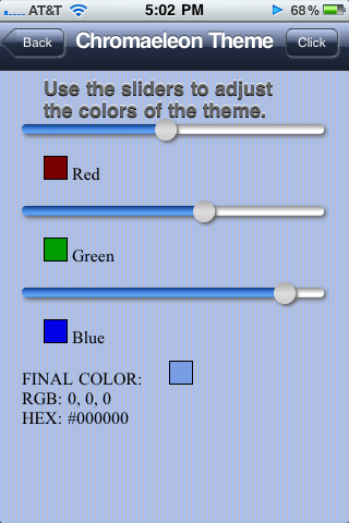
OK, before you think I’m crazy, especially you folks from the design community, let me explain. I came up with a basic theme technique. I call it chromaeleon &mdash because the app’s chrome can change colors like a chamaeleon. The way this works is, instead of solid color gradients, you create gradients with transparent values of black and white. Behind this you have a background color which shows through the transparent gradients. This way, when the user drags the sliders, the background colors update and the look of the interface changes. Now in the real world you’d want to provide a way for the user to save their color choice. You could save the choice to localStorage. Then when the app loads, it checks to see it the user saved a color choice, if not, it goes to the default. Sorry, I didn’t do all of that. Just the part to update the background colors. Here’s what it will look like:

iPhone Chromaeleon Interface

The structure we’re going to use is pretty must standard as we’ve used elsewhere, a header, a section, some buttons.

<body>
	<header>
		<a href="http://css3wizardry.com" class="button back"><span class="pointer"></span><span>Back</span></a>
		<h1>Chromaeleon Theme</h1>
		<span class="button">Click Here</span>
	</header>
	<section>
		<h2>Use the sliders to adjust the colors of the theme.</h2>
		<div class="colorRow">
			<div id="redSlider" class="slider">
				<div class="thumb"></div>
			</div>
			<div id="redColor" class="colorOutput"></div>
			<span> Red</span>
		</div>
		<div class="colorRow">
			<div id="greenSlider" class="slider">
				<div class="thumb"></div>
			</div>
			<div id="greenColor" class="colorOutput"></div>
			<span> Green</span>
		</div>
		<div class="colorRow">
			<div id="blueSlider" class="slider">
				<div class="thumb"></div>
			</div>
			<div id="blueColor" class="colorOutput"></div>
			<span> Blue</span>
		</div>
		<div class="colorRow finalResult">
			<span>Final Color: </span>
			<div id="rgbColor" class="colorOutput"></div>
			<br />
			<span>RGB: </span><span id="rgbResult">0, 0, 0</span>
			<br />
			<span>HEX: </span><span id="hexResult">#000000</span>
		</div>
	</section>
</body>

So, for the header and the buttons, we need to change their default gradients, as I mentioned above, to have RGBA transparency values. This is my basic gradient:

background-image: 
	-moz-linear-gradient(top, 
		rgba(255,255,255,.5), 
		rgba(30,30,30,.65) 50%, 
		rgba(0,0,0,.7) 50%, 
		rgba(0,0,0,.8)); 
background-image: 
	-webkit-gradient(linear, left top, left bottom, 
		from(rgba(255,255,255,.5)), 
		color-stop(0.5,rgba(30,30,30,.65)), 
		color-stop(0.5, rgba(0,0,0,.7)), 
		to(rgba(0,0,0,.8)));

And for the hover state of the button, we use this gradient:

background-image: 
	-webkit-gradient(linear, left top, left bottom, 
		from(rgba(0,0,0,.1)), 
		color-stop(0.5,rgba(0,0,0,.5)), 
		color-stop(0.5, rgba(0,0,0,.6)), 
		to(rgba(255,255,255,.2)));
background-image: 
	-moz-linear-gradient(top,
		rgba(0,0,0,.1), 
		rgba(0,0,0,.5) 50%, 
		rgba(0,0,0,.6) 50%, 
		rgba(255,255,255,.2));

Now to change the color, all we need to do is introduce a new method to our existing code:

/**
*
* Method to update chrome colors according to the RGB value of the sliders.
*
*/
$.updateInterfaceColors = function() {
	$("header").css("background-color: rgb(" + $.rgbColor[0] + "," + $.rgbColor[1] + "," + $.rgbColor[2] + ")");
	$$(".button").forEach(function(button) {
		button.css("background-color: rgb(" + $.rgbColor[0] + "," + $.rgbColor[1] + "," + $.rgbColor[2] + ")");
	});
	$("section").css("background-color: rgb(" + $.rgbColor[0] + "," + $.rgbColor[1] + "," + $.rgbColor[2] + ")");
	$(".pointer").css("background-color: rgb(" + $.rgbColor[0] + "," + $.rgbColor[1] + "," + $.rgbColor[2] + ")");
};

To execute this method, we invoke it in the slide mouse event handlers for each slider, and for touch-based mobile devices we invoke it in the updateSliderTouch method:

/**
*
* This is for the red slider's mouse interaction, you'd do the same for the green and blue sliders' setup scripts as well.
*/
// Set up three sliders for Red, Green and Blue:
$.slider("#redSlider", { 
	onDrag : function() {
		$("#redSlider").setColorFromSlider("red");
		$.updateInterfaceColors();
	},
	// onDragEnd function necessary to remove hover state off of slider thumb when drag ends.
	onDragEnd : function() {},
	top : -6
});
/**
*
* This is for touch-enabled devices. You invoke the $.updateInterfaceColors() method just once inside the updateSliderTouch method's definition, at the very end.
*/
Element.prototype.updateSliderTouch = function( color ) {
	this.style.left =  curX + 'px'; 
	if (color === "red") {
		$("#" + color + "Color").css("background-color: rgb(" + curX +",0,0)");
		$.rgbColor[0] = curX;
	}
	if (color === "green") {
		$("#" + color + "Color").css("background-color: rgb(0," + curX +",0)");
		$.rgbColor[1] = curX;
	}
	if (color === "blue") {
		$("#" + color + "Color").css("background-color: rgb(0,0," + curX +")");
		$.rgbColor[2] = curX;
	}
	$("#" + color + "Slider").css("-webkit-background-size:" + (curX + 1) + "px 9px, 100% 9px");
	$("#" + color + "Slider").css("background-size:" + (curX + 1) + "px 9px, 100% 9px");
	$("#rgbColor").css("background-color: rgb(" + $.rgbColor[0] + "," + $.rgbColor[1] + "," + $.rgbColor[2] + ")");
	$("#rgbResult").fill($.rgbColor[0] + ", " + $.rgbColor[1] + ", " + $.rgbColor[2]);
	$("#hexResult").fill("#" + $.rgb2hex($.rgbColor[0]) + $.rgb2hex($.rgbColor[1]) + $.rgb2hex($.rgbColor[2]));
	$.updateInterfaceColors();
};

This works great on desktop Safari, Chrome and even Firefox (Yay!), and fine on the iPad. For iPod Touch or iPhone you need to load it in portrait mode. it’s a bit cramped due to the size of the sliders. I needed them to be at least 255px long for the RGB values, and then borders, box shadows and the extra space for the thumbs made them barely fit in the iPhone’s and iPod Touch’s default width. Try hitting the plus icon at the bottom of the browser and save it to you device’s desktop. Then run it from there, you’ll have more vertical space. You can try this out online or download the source code. Enjoy!

Range Slider with CSS and JavaScript

Works on desktop Safari, desktop Chrome, desktop Firefox 3.5 – 4, iPhone, iPod Touch, iPad.

In this post I’m going to show how to make a range slider using HTML, CSS and JavaScript that works with both a mouse and a finger. The mouse-enabled version required a small drag-and-drop JavaScript framework. Fortunately I had already put that together several years back. After spending some time playing around with touch events on mobile Webkit, I was able to come up with a way to implement horizontal dragging for the range slider.
range slider

I’m not going to go into details about my mouse-enable drag-and-drop framework. You can popup it open and read the copious comments in the example. However, I will explain how I implemented the touch-enabled drag for the slider.

The structure for a slider is fairly straightforward. You need a track and a thumb:

<div id="redSlider" class="slider">
	<div class="thumb"></div>
</div>

Since the structure is so simple, you might be wondering how we give it the look. The thumb gets border radius to make it round, along with a box shadow and a background-gradient, including a blue background gradient for hover. The slider track is styled with two background gradients, the bottom-most gradient is the default grey which swans the width of the slider. Layered on top of the same track is a second, bluish gradient. By using CSS3’s background sizing property, we will dynamically resize it as the slider’s thumb is dragged.

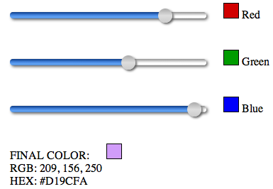
Of course, just dragging a slider thumb back in forth is not suck a big deal. I therefore created three sliders implemented as RGB pickers. By dragging each thumb, you add or subtract from a red, green or blue value. Down below you’ll see the final RGB and Hex values.
RGB Slider

Here are the basic styles for the slider:

.slider {
	display: inline-block;
	-webkit-box-sizing: border-box;
	-moz-box-sizing: padding-box;
	box-sizing: padding-box;
	-webkit-box-shadow: 2px 2px 4px #666;
	-moz-box-shadow: 2px 2px 4px #666;
	box-shadow: 2px 2px 4px #666;
	height: 9px;
	width: 277px; 
	padding: 1px;
	-webkit-border-radius: 4px;
	-moz-border-radius: 4px;
	border-radius: 4px;
	background-image: 
		-webkit-gradient(linear, left top ,left bottom,
		   from(#0a3a86),
		   color-stop(.5, #4c8de7),
		   color-stop(.95, #6babf5),
		   to(#0a3a86)),
		-webkit-gradient(linear, left top ,left bottom,
			from(#919191),
			color-stop(.5, #f0f0f0),
			color-stop(.5, #fff),
			color-stop(.95, #fff),
			to(#919191));
	background-image: 
		-moz-linear-gradient(top,
		   #0a3a86,
		   #4c8de7 50%,
		   #6babf5 95%,
		   #0a3a86),
		-moz-linear-gradient(top,
			#919191,
			#f0f0f0 50%,
			#fff 50%,
			#fff 95%,
			#919191);
	background-repeat: no-repeat, repeat-x;
}
.thumb {
	position:relative;
	-webkit-box-shadow: 2px 2px 3px #666;
	-moz-box-shadow: 2px 2px 3px #666;
	box-shadow: 2px 2px 3px #666;
	height:20px;
	width:20px;
	left: 0px; 
	top: -6px;
	-webkit-border-radius: 10px;
	-moz-border-radius: 10px;
	border-radius: 10px;
	background-image: 
	   -webkit-gradient(linear, left top, left bottom,
		   from(#aaa),
		   color-stop(.5, #ddd),
		   to(#ccc));
	background-image: 
	   -moz-linear-gradient(top,
		   #aaa,
		   #ddd 50%,
		   #ccc);
	cursor: move;
	-webkit-tap-highlight-color: transparent;
}
.thumb:hover, .thumb.hover {
	background-image: 
	   -webkit-gradient(linear, left top, left bottom,
		   from(#6297f2),
		   color-stop(.5, #0251ae),
		   to(#6297f2));
	background-image: 
	   -moz-linear-gradient(top,
		   #6297f2,
		   #0251ae 50%,
		   #6297f2);
}

Notice the slider’s background gradient style. The first background gradient will be the top-most. The last will be the bottom-most. But the top-most is going to be the blue part of the track that appears to the left of the thumb as it is dragged away from the left start of the range slider.

We also need some styles to set the initial states of the three thumbs. Notice that I’ve used background sizing to control the two background gradients. The first is for the blue top-most gradient, the second is for the full width grey gradient.

#redSlider .thumb {
	left: 121px;
}
#redSlider {
	-webkit-background-size: 123px 9px, 100% 9px;
	-moz-background-size: 123px 9px, 100% 9px;
	background-size: 123px 9px, 100% 9px;
}
#greenSlider .thumb {
	left: 156px;
}
#greenSlider {
	-webkit-background-size: 158px 9px, 100% 9px;
	-moz-background-size: 158px 9px, 100% 9px;
	background-size: 158px 9px, 100% 9px;
}
#blueSlider .thumb {
	left: 230px;
}
#blueSlider {
	-webkit-background-size: 232px 9px, 100% 9px;
	-moz-background-size: 232px 9px, 100% 9px;
	background-size: 232px 9px, 100% 9px;
}

So, I’ve defined two gradients with different background repeats: background-repeat: no-repeat, repeat-x; and background sizing with values such as: 123px 9px, 100% 9px. 9px is the height of the slider track. The bottom-most gradient has a width of 100%, and the top-most bluish one gets a width of 123px. By using these values, with very little markup, we can create visually and functionally complex structures.

/**
* Touch enabled support:
*/
/**
*
* Method to set the colors of color swatches and width of the slider progress track when the slider thumb is dragged.
*/
Element.prototype.setupSliderTouch = function( event ) {
	event.preventDefault();
	var el = event.target;
	var touch = event.touches[0];
	curX = touch.pageX - this.parentNode.offsetLeft;
	if (curX <= 0) { 
		curX = 0;
	}
	if (curX > 255) {
		curX = 255;
	}
};
Element.prototype.updateSliderTouch = function( color ) {
	this.style.left =  curX + 'px'; 
	if (color === "red") {
		$("#" + color + "Color").css("background-color: rgb(" + curX +",0,0)");
		$.rgbColor[0] = curX;
	}
	if (color === "green") {
		$("#" + color + "Color").css("background-color: rgb(0," + curX +",0)");
		$.rgbColor[1] = curX;
	}
	if (color === "blue") {
		$("#" + color + "Color").css("background-color: rgb(0,0," + curX +")");
		$.rgbColor[2] = curX;
	}
	
	$("#" + color + "Slider").css("-webkit-background-size:" + (curX + 1) + "px 9px, 100% 9px");
	$("#" + color + "Slider").css("background-size:" + (curX + 1) + "px 9px, 100% 9px");
	
	$("#rgbColor").css("background-color: rgb(" + $.rgbColor[0] + "," + $.rgbColor[1] + "," + $.rgbColor[2] + ")");
	$("#rgbResult").fill($.rgbColor[0] + ", " + $.rgbColor[1] + ", " + $.rgbColor[2]);
	$("#hexResult").fill("#" + $.rgb2hex($.rgbColor[0]) + $.rgb2hex($.rgbColor[1]) + $.rgb2hex($.rgbColor[2]));
};

$("#redSlider > .thumb").bind('touchmove', function(event) {
	this.setupSliderTouch(event);
	this.updateSliderTouch("red");
});
$("#greenSlider > .thumb").bind('touchmove', function(event) {
	this.setupSliderTouch(event);
	this.updateSliderTouch("green");
});
$("#blueSlider > .thumb").bind('touchmove', function(event) {
	this.setupSliderTouch(event);
	this.updateSliderTouch("blue");
});

Basically, I attach a touchmove event to the slider thumbs. The event listener passes the event to the setupSliderTouch method. The first thing the setupSliderTouch method does is to prevent the default interaction from taking place, such as page scrolling. We want the user to be able to move the thumb without scrolling the page. From the event passed in to setupSliderTouch we get the touch event and calculate its x coordinate on the screen. To calculate the touch’s position in relation to the slider, we subtract the left offset of the slider from the pageX of the touch. This gives us the left-most edge of the slider’s thumb. We store this as curX. We check the value of curX. If it is less than zero, we set it back to zero. We do this because this value will be used to set the position of the thumb and one of the RGB values. We don’t want either the thumb being dragged off of the left edge of the slider, nor a value less than zero, since RGB values start at zero. We do the same thing when the curX value is greater than 255 for the same reasons.

The updateSliderTouch method uses the value of the slider’s thumb to calculate and update RGB and Hex values, giving the user visual feedback as the thumb is dragged. Then we use the value of curX to update the background size of the blues background gradient on the slider track:

$("#" + color + "Slider").css("-webkit-background-size:" + (curX + 1) + "px 9px, 100% 9px");
$("#" + color + "Slider").css("background-size:" + (curX + 1) + "px 9px, 100% 9px");

That’s all there is to it. You can try this out online using desktop Safari, Chrome, or Firefox for the mouse version, or on an iPhone, iPod Touch or iPad for the touch version. Or you can download the source code, which I recommend, so you can dig into the CSS and JavaScirpt.

Update: September 15, 2010
If you’re trying this out on an iPhone, I noticed that there seems to be a very slight delay before an initial touch is registered on the screen. This means that in order to slide the thumb, you need to press and hold for a very brief moment before sliding, otherwise no touch gets registered and nothing happens. This doesn’t seem to happen when performing the same action on the iPad. Touches seem more responsive.

Activity Indicator with CSS3

Works on desktop Safari, desktop Google Chrome, Android, iPhone, iPod Touch and iPad.

You’ve seen them. The things on the screen that mean you’ve got to wait for some activity to complete. They’re called activity indicators. They’re usually several pieces arranged in a circle. They spin around. And if things go really bad, you could be watching them spin for quite some time. Hopefully not.
activity indicator

Usually people make these with images. There are even Web sites dedicated to making this spinning baubles for you in animated gif format. Except that gif stink. Pngs look better. I’m going to show you two ways to implement an activity indicator. One starts off with an image that has been converted into 64 bit data. We’re talking about dataurls here. Dataurls eliminate the need for separate images. It’s the same image but reduced to data which you can paste directly in your document. Heck, you can paste it directly into your CSS file so you never have to worry about losing an image or rewriting the image path when you move the CSS. Cool, huh? And if you start with a large image, you can scale it down for small screens and low resolution devices, and scale it up for hi res devices, like the iPhone and iPod Touch retina display. Cooler still, you can make the activity indicator completely out of HTML and CSS, no images, no dataurl. And by using a scale transform, you never have to worry about resolution. It will always render smoothly.

So, let’s look at dataurls. The concept is simple. Instead of having a resource reside as an external file, you convert it into a 64 bit data sample which you can include in your document. In the case of an image, it’s basically embedding it in your HTML/CSS. You can encode images as dataurls in many ways, using PHP, Python, etc., or you can simply upload a file to a Web site that will conveniently do it for you. A dataurl looks something like this (Note: I trimmed off the data to fit here):

data:image/png;base64,iVBORw0KGgoAAAANSUhEUgAAATEAAAEwCA+

For an image, you would do something like this:

<img src="data:image/png;base64,iVBORw0KGgoAAAANSUhEUgAAATEAAAEwCA+...">

When you create your first dataurl you’ll probably be shocked at how big the resulting code is. Don’t worry. Somehow this winds up being more efficient for download and rendering than a traditional image. Besides being the source for an inline image, you could also embed the dataurl into your CSS as a background image. As I mentioned, my original image was large to allow for scaling up or down without loss of quality. I therefore add in some resizing to the CSS for the size of the element and the size of the background image:

.activityIndicator {
	/*
	The original height is:
	height: 304px;
	width: 305px;
	*/
	height: 40px;
	width: 40px;
	-webkit-background-size: 40px 40px;
	margin: 0px auto;
	background-image: url("data:image/png;base64,iVBORw0KGgoAAAANUb...");

This is what I used to produce the image above. Now we need to animate it. That’s actually quite easy, just a couple of lines of CSS:

.activityIndicator {
	/*
	The original height is:
	height: 304px;
	width: 305px;
	*/
	height: 40px;
	width: 40px;
	-webkit-background-size: 40px 40px;
	margin: 0px auto;
	background-image: url("data:image/png;base64,iVBORw0KGgoAAAANUb...");
	-webkit-animation-duration: 1s;
	-webkit-animation-iteration-count: infinite;
	-webkit-animation-timing-function: linear;
	-webkit-animation-name: spinnerAnim;
}
@-webkit-keyframes spinnerAnim {
	0% { -webkit-transform: rotate(0deg); }
	100% { -webkit-transform: rotate(360deg); }
}

By using the keyframe animation, we can implement the continuously spinning activity indicator without using JavaScript. But, as I mentioned, dataurls tend to be verbose and are rather unsightly. I therefore came up with a reproduction of the activity indicator using only HTML and CSS3. At the end of this post are links to the working file. Download or view source of the online document to see what the dataurl looks like. It’s not pretty, but it is efficient. However, by reproducing the same image using markup and CSS, we can achieve the same result with even less code. The markup isn’t terribly complex, two parent contains and twelve blades:

<div id="activityIndicator">
	<div>
		<div class="blade"></div>
		<div class="blade"></div>
		<div class="blade"></div>
		<div class="blade"></div>
		<div class="blade"></div>
		<div class="blade"></div>
		<div class="blade"></div>
		<div class="blade"></div>
		<div class="blade"></div>
		<div class="blade"></div>
		<div class="blade"></div>
		<div class="blade"></div>
	</div>
</div>

That’s really all we need, the rest is done with CSS3 properties. You’ll notice that all the blades have the same class “blade.” We don’t need to give each one anything special because we can use CSS3 selectors to indicate each blade individually. To do this we’ll use the :nth-child selector. We first give all the blades some generic styling. Then we start from the second blade using the CSS3 nth-child selector: .blade:nth-child(2), then .blade:nth-child(3), etc. Since there are twelve blades, we need to rotate each one 30 degrees more than the previous. We also need to change the color by approximately 21.25% to go from and rgb value of 0 to 255. Since rgb values expect positive integers between 0 and 255, we need to round the float off to the nearest whole number. As you can see, CSS3 selectors allow us to create complex structures with minimal markup and CSS.

#activityIndicator {
	position: relative;
	width: 130px;
	height: 130px;
	margin: 0 auto;
	-webkit-perspective: 500;
	-webkit-animation-duration: 1s;
	-webkit-animation-iteration-count: infinite;
	-webkit-animation-timing-function: linear;
	-webkit-animation-name: spinnerAnim2;
}
@-webkit-keyframes spinnerAnim2 {
	0% { -webkit-transform: rotate(0deg) scale(.29); }
	100% { -webkit-transform: rotate(360deg) scale(.29); }
}
#activityIndicator > div:first-of-type {
	margin-left: 58px;
	margin-top 0;
	width: 50%;
	height: 50%;
}
#activityIndicator .blade {
	position: absolute;
	height: 40px;
	width: 14px;
	background-color: rgba(234,234,234, .30);
	-webkit-border-radius: 10px;
	-webkit-transform-origin-x: 50%;
	-webkit-transform-origin-y: 165%;
}

#activityIndicator .blade:nth-child(2) {
	-webkit-transform: rotate(30deg);
	background-color: rgba(212,212,212, .70);
}
#activityIndicator .blade:nth-child(3) {
	-webkit-transform: rotate(60deg);
	background-color: rgba(191,191,191, .70);
}
#activityIndicator .blade:nth-child(4) {
	-webkit-transform: rotate(90deg);
	background-color: rgba(170,170,170, .70);
}
#activityIndicator .blade:nth-child(5) {
	-webkit-transform: rotate(120deg);
	background-color: rgba(149,149,149, .70);
}
#activityIndicator .blade:nth-child(6) {
	-webkit-transform: rotate(150deg);
	background-color: rgba(128,128,128, .70);
}
#activityIndicator .blade:nth-child(7) {
	-webkit-transform: rotate(180deg);
	background-color: rgba(106,106,106, .70);
}
#activityIndicator .blade:nth-child(8) {
	-webkit-transform: rotate(210deg);
	background-color: rgba(85,85,85, .70);
}
#activityIndicator .blade:nth-child(9) {
	-webkit-transform: rotate(240deg);
	background-color: rgba(64,64,64, .70);
}
#activityIndicator .blade:nth-child(10) {
	-webkit-transform: rotate(270deg);
	background-color: rgba(42,42,42, .70);
}
#activityIndicator .blade:nth-child(11) {
	-webkit-transform: rotate(300deg);
	background-color: rgba(21,21,21, .70);
}
#activityIndicator .blade:nth-child(12) {
	-webkit-transform: rotate(330deg);
	background-color: rgba(0,0,0, .70);
}

You can try this out online or download the source code.

Update: September 14th, 2010
I forgot to mention one thing. If you look at the styles on #activityIndicator .blade you’ll notice the last two property definitions:

	-webkit-transform-origin-x: 50%;
	-webkit-transform-origin-y: 165%;

By setting the transform origin x value to 50% we fix the horizontal rotation to the blade’s center. By setting the transform origin vertical value to 165% we define the turning point at that distance from the start of the blade. Together these values cause the blades to rotate around leaving and empty circular space in the center, thus reproducing the appearance of the png image.

iPhone Modal Popup with HTML5, CSS3 & JavaScript

Works on Desktop Safari, Desktop Google Chrome, iPhone, iPod Touch, iPad. Note that I’ve included some styling for Firefox, even though it has no presence to speak of in the mobile space. In particular, Firefox 4 beta still lacks support for CSS3 keyframe animation, although that will make it into a later update.

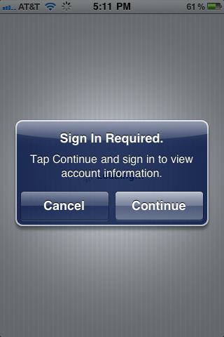
If you’ve used an iPhone, iPod Touch or iPad, then you’re familiar with the modal popup dialog boxes that the native system uses. Here’s a typical iPhone popup:
Native iPhone modal popup

Notice the white radial gradient behind the popup. I was able to replicate this, but when the user was on a long document and scrolled down to do something that would trigger a popup, I could find no way to center that radial gradient based on the vertical page scroll. I therefore went with a whitesh blur around the popup itself using a CSS3 box shadow. Here’s what my HTML5/CSS3 version looks like:

Originally I thought I would use just one popup per app, re-assigning values to the popup’s part each time the popup was invoked. However I ran into the problem of events from different and I failed to find an elegant way to resolve this. I therefore came up with a scheme where you initialize a popup at the view level, allowing each view to have a custom popup. The initializing script creates the popup and injects it as the last child of the view. The setup script creates the markup for the popup and populates it with values passed as an argument to the initializing script. The setup script also adds basic functionality to the buttons so that clicking either of them will close the popup. The setup script also creates a screen cover which traps events to prevent user interaction with what is behind the popup until it is closed.

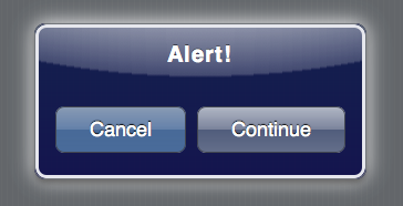
The setup script accepts a single argument—an object literal containing key/values pairs to populate the popup. In order for the setup script to create a popup, you must at least pass a value for a valid view in your Web app. This would be like selector: "#Popup". If no other values are passed, the script will produce a basic popup that looks like this:
Basic popup

I used the ChocolateChip mobile JavaScript library to add the interactive functionality to the popup. Here’s the JavaScript that creates the markup and functionality for the popup:

/** 
* 
* A method to initialize a modal popup. By passing a valid selector for a view, this method creates a view based popup with the properties supplied by the options argument. It automatically binds events to both popup buttons to close the popup when the user clicks either. If a callback is passed as part of the opts argument, it gets bound to the "Continue" button automatically.
*
* @method
* 
* ### setupPopup
*
* syntax:
*
*  $.setupPopup({selector: "#News", title: "Subscribe", cancel: });
*
* arguments:
* 
*  - string: string A valid selector for the parent of the tab control. By default the an object literal.
*  - string: string An object literal which can have the following properties:
	title: a string defining the title in the popup.
	message: a string defining the popup message.
	cancelButton: a string defining an alternate name for the cancel button.
	continueButton: a string defining an alternate name for the confirm button.
	callback: a function to run when the user touches the confirm button.
	If no title is supplied, it defaults to "Alert!".
	If no cancelButton value is supplied, it defaults to "Cancel".
	If no continueButton value is supplied, it defaults to "Continue".
* example:
*
*  $.setupPopup({selector: "#buyerOptions"});
*  $.setupPopup({
		selector: "#Popup",
		title: 'Attention Viewers!', 
		message: 'This is a message from the sponsors. Please be seated while we are getting ready. Thank you for your patience.', 
		cancelButton: 'Skip', 
		continueButton: 'Stay for it', 
		callback: function() {
			$('#popupMessageTarget').fill('Thanks for staying with us a bit longer.');
			$('#popupMessageTarget').removeClass("animatePopupMessage");
			$('#popupMessageTarget').addClass("animatePopupMessage");
		}
	});
*
*/
$.setupPopup = function( opts ) {
	if (opts.selector) {
		var selector = opts.selector;
	} else {
		return false;
	}
	var title = "Alert!";
	if (opts.title) {
		var title = opts.title;
	}
	var message = "";
	if (opts.message) {
		var message = opts.message;
	}
	var cancelButton = "Cancel";
	if (opts.cancelButton) {
		cancelButton = opts.cancelButton;
	}
	var continueButton = "Continue";
	if (opts.continueButton) {
		continueButton = opts.continueButton;
	}
	var popup = '<div class="screenCover hidden"></div>';
	popup += '<section class="popup hidden"><div>';
	popup += '<header><h1>' + title + '</h1></header>';
	popup += '<p>' + message +'</p><footer>';
	popup += '<div class="button cancel">' + cancelButton + '</div>';
	popup += '<div class="button continue">' + continueButton + '</div></footer></div></section>';
	$(selector).insertAdjacentHTML("beforeEnd", popup);
	// Bind event to close popup when either button is clicked.
	$$(selector + " .button").forEach(function(button) {
		button.bind("click", function() {
			$(selector + " .screenCover").addClass("hidden");
			$(selector + " .popup").addClass("hidden");
		});
	});
	
	if (opts.callback) {
		var callbackSelector = selector + " .popup .continue";
		$(callbackSelector).bind("click", function() {
			opts.callback();
		});
	}
	
};

And here is an initialization of a popup:

$.setupPopup(
	{
		selector: "#Popup",
		title: 'Attention Viewers!', 
		message: 'This is a message from the sponsors. Please be seated while we are getting ready. Thank you for your patience.', 
		cancelButton: 'Skip', 
		continueButton: 'Stay for it', 
		callback: function() {
			$('#popupMessageTarget').fill('Thanks for staying with us a bit longer.');
                        // Remove this class in case the popup was opened previously.
			$('#popupMessageTarget').removeClass("animatePopupMessage");
                        // Then add the class to trigger an animation of the message being displayed.
			$('#popupMessageTarget').addClass("animatePopupMessage");
		}
	}
);

Now that a popup has been created and populated with the desired values, we need a way to show it. Before actually showing the popup, the $.showPopup method display a screen cover which captures user interaction and thereby prevents the interface behind the popup from being accessed until the popup is dispelled. The showPopup method accepts one argument, a selector indicating a uniquely identifiable node that contains the popup as a descendant.

$.showPopup = function( selector ) {
	var screenCover = $(selector + " .screenCover");
        // Make the screen cover extend the entire width of the document, even if it extends beyond the viewport.
	screenCover.css("height:" + (window.innerHeight + window.pageYOffset) + "px");
	var popup = $(selector + " .popup");
	$(selector + " .popup").style.top = ((window.innerHeight /2) + window.pageYOffset) - (popup.clientHeight /2) + "px";
	$(selector + " .popup").style.left = (window.innerWidth / 2) - (popup.clientWidth / 2) + "px";
	$(selector + " .screenCover").removeClass("hidden");
	$(selector + " .popup").removeClass("hidden");
};

With this method defined we can now show the popup as need. Here’s a script that attaches an event handler to a button with a class of “openPopup” for a popup somewhere among the descendant nodes of a node with an id of “Tabs”:

$("#Tabs .openPopup").bind("click", function() {
	$.showPopup("#Tabs");
});

OK, so we have the markup and functionality for the popup, but we don’t have the look. We’ll take care of that next. In order to create the unique look of the iPhone popup, I use several layers for encasing borders and composited transparent background gradients. Originally I had two gradients, the dark blue linear gradient and the whitish radial gradient, layered on top of each other as multiple backgrounds. But Google Chrome had a problem rendering the underlying linear gradient, ignoring its transparent alpha values and rending the colors as opaque. I was therefore forced to break them out into separate elements. The end result is the same. When the popup is created by the setup script, it is given a class of “hidden.” This defines its scale as 0% and its opacity as 0%. When we execute the showPopup method, it removes that “hidden” class. Because the popup has basic transitions properties defined on it, its scale and opacity transition from zero to full, making it appear to popup out of no where. The scripts also always make sure that the popup is centered in the viewport, regardless of where it was displayed when scrolling down a long document.

For their modal popups, Apple always indicates the default button, what would be equivalent to a submit or OK button, with slightly lighter colors so that it stands out from the other button, which is the equivalent of a cancel/close button. I have the buttons located in a footer and I use CSS3’s flexible box model styles to make the buttons position and size them selves according to available space.

/* Modal Popup Styles */
section.popup {
	width: 75%;
	max-width: 300px;
	border: solid 1px #72767b;
	-webkit-box-shadow: 0px 4px 6px #666, 0 0 50px rgba(255,255,255,1);
	-moz-box-shadow: 0px 0px 1px #72767b,  0px 4px 6px #666;
	box-shadow: 0px 0px 1px #72767b, 0px 4px 6px #666;
	-webkit-border-radius: 10px;
	-moz-border-radius: 10px;
	border-radius: 10px;
	padding: 0px;
	opacity: 1;
	-webkit-transform: scale(1);
	-webkit-transition: all 0.25s  ease-in-out;
	position: absolute;
	z-index: 1001;
	margin-left: auto;
	margin-right: auto;
	background-image: 
		-webkit-gradient(linear, left top, left bottom,
			from(rgba(0,15,70,0.5)),
			to(rgba(0,0,70,0.5)));
}
section.popup.hidden {
	opacity: 0;
	-webkit-transform: scale(0);
	top: 50%;
	left: 50%;
	margin: 0px auto;
}
section.popup > div {
	border: solid 2px #e6e7ed;
	-webkit-border-radius: 10px;
	-moz-border-radius: 10px;
	border-radius: 10px;
	padding: 10px;
	background-image: 
	   -webkit-gradient(radial, 50% -1180, 150, 50% -280, 1400,
		   color-stop(0, rgba(143,150,171, 1)),
		   color-stop(0.48, rgba(143,150,171, 1)),
		   color-stop(0.499, rgba(75,88,120, .9)),
		   color-stop(0.5, rgba(75,88,120,0)));
	color: #fff;
	text-shadow: 0px -1px 1px #000;
}
section.popup header {
	background: none;
	-webkit-border-top-left-radius: 10px;
	-webkit-border-top-right-radius: 10px;
	-moz-border-radius-topleft: 10px;
	-moz-border-radius-topright: 10px;
	border-top-left-radius: 10px;
	border-top-right-radius: 10px;
	border: none;
	color: #fff;
	text-shadow: 0px -2px 1px #000;
}
section.popup header > h1 {
	letter-spacing: 1px;
}
section.popup footer
{
	display: -webkit-box;
	-webkit-box-orient: horizontal;
	-webkit-box-pack:justify;
	-webkit-box-sizing: border-box;
	display: -moz-box;
	-moz-box-orient: horizontal;
	-moz-box-pack:justify;
	-moz-box-sizing: border-box;
}
section.popup footer > .button {
	-webkit-box-flex: 2;
	-moz-box-flex: 1;
	display: block;
	text-align: center;
	-webkit-box-shadow: none;
	-moz-box-shadow: none;
	box-shadow: none;
	margin: 10px 5px;
	height: 32px;
	font-size: 18px;
	line-height: 32px;
	-webkit-border-radius: 8px;
}
section.popup footer > .button.cancel {
	background-image: 
		-webkit-gradient(linear, left top, left bottom, 
			from(#828ba3), 
			color-stop(0.5, #4c5a7c), 
			color-stop(0.5, #27375f), 
			to(#2e3d64));
}
section.popup footer > .button.continue {
	background-image: 
		-webkit-gradient(linear, left top, left bottom, 
			from(#b0b6c4), 
			color-stop(0.5, #7a839b), 
			color-stop(0.5, #515d7c), 
			to(#636e8a));
}
section.popup footer > .button:hover, .popup footer > .button.hover {
	background-image: 
		-webkit-gradient(linear, left top, left bottom, 
			from(#70747f), 
			color-stop(0.5, #424857), 
			color-stop(0.5, #171e30), 
			to(#222839));
}
.screenCover {
	width: 100%;
	height: 100%;
	display: block;
	background-color: rgba(0,0,0,0.5);
	position: absolute;
	z-index: 1000;
	top: 0px;
	left: 0px;
}
.screenCover.hidden {
	display: none;
}

You can try this out online or download the source code to play around with it.